GARRETT HUNTER – ROOM WITH A VIEW
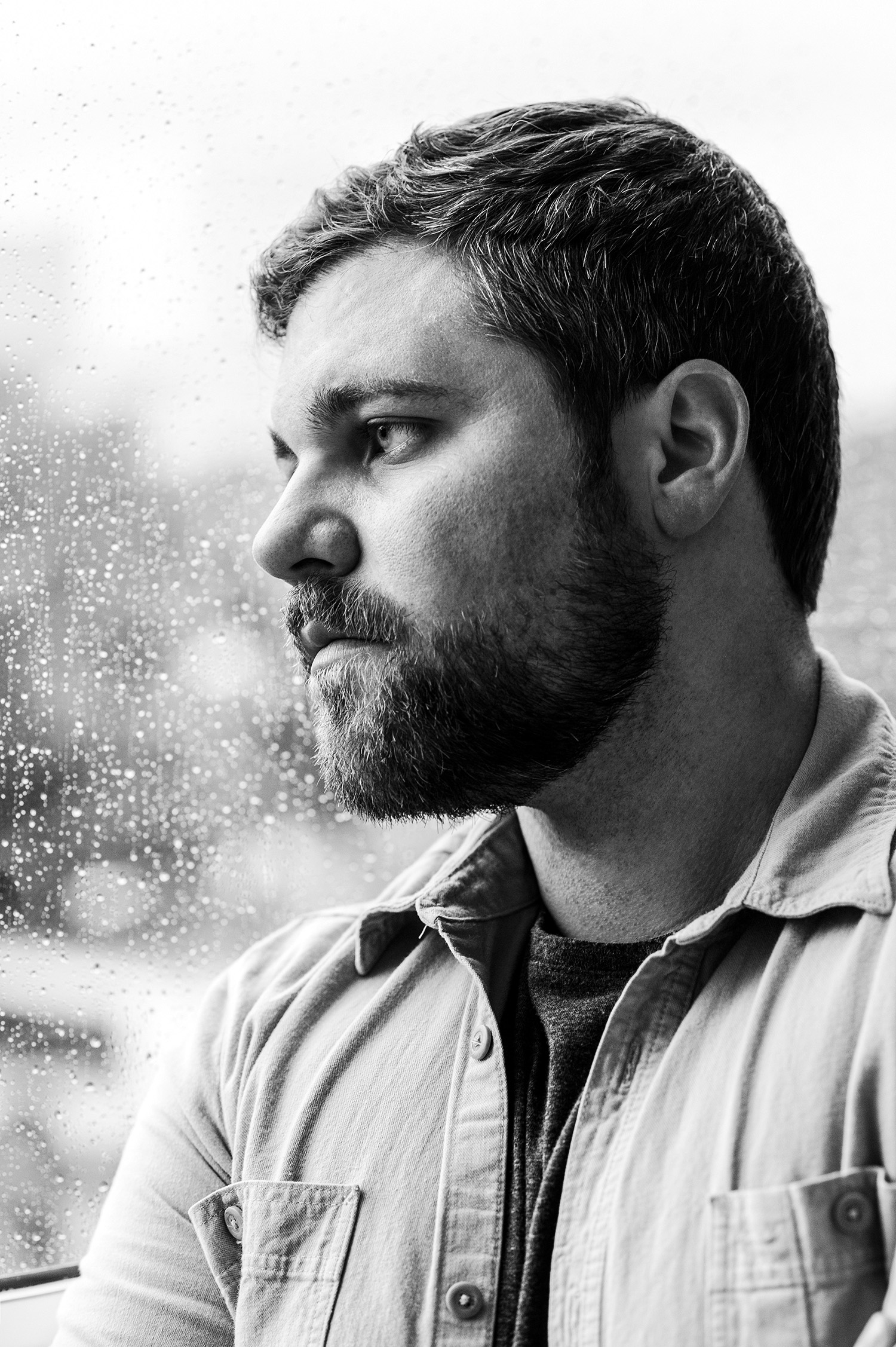
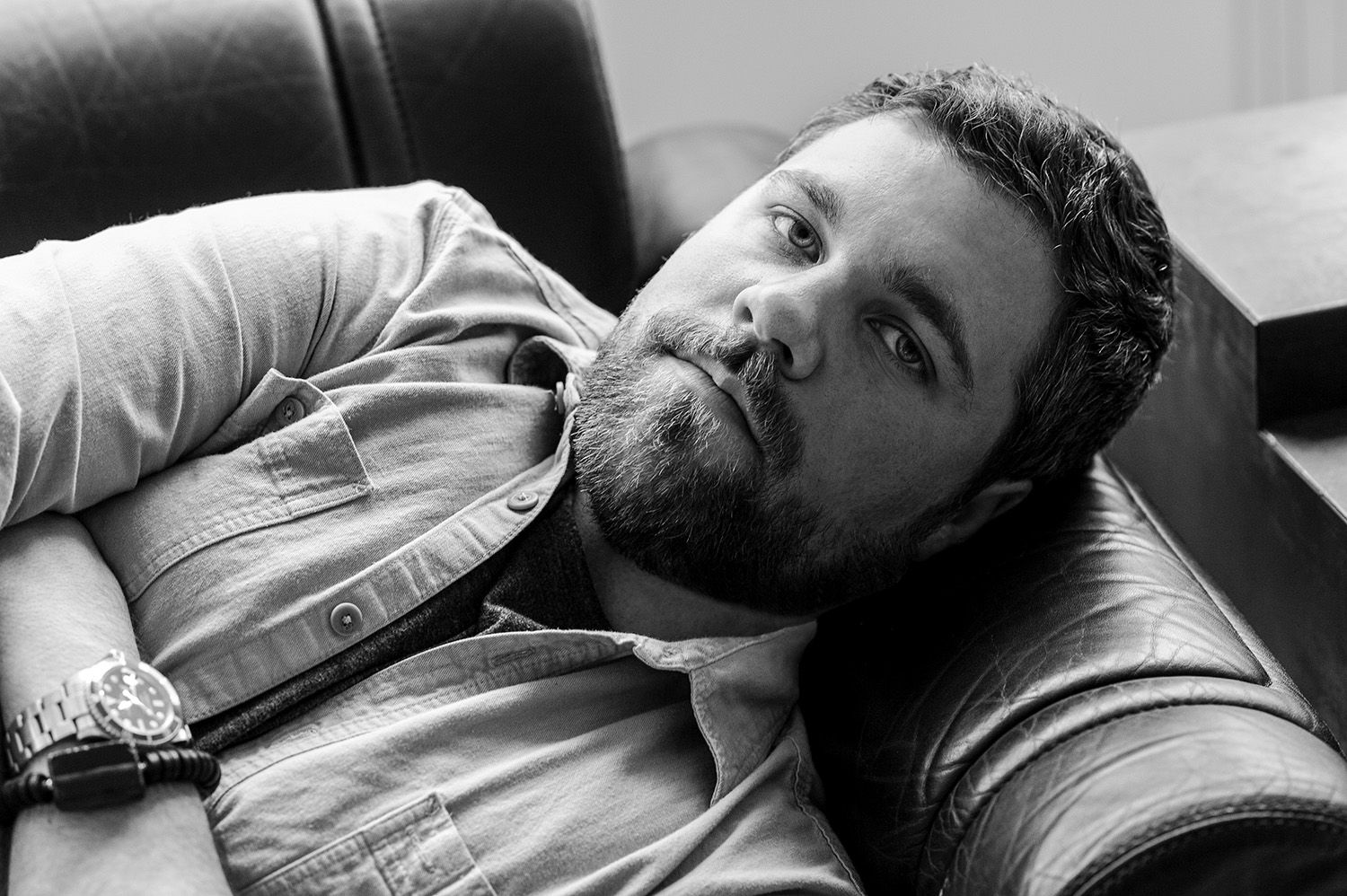
We have found ourselves in Garrett Hunter’s River Oaks home, surrounded by white walls which act as a blank canvas for the pops of color and texture from the artwork and furniture which seem to play off one an- other and fill the space with energy. Light pours from the wall of windows, further illuminating the warm tones of marigold and pink streaking throughout the home. It is clear that Hunter has a very specific and unique point of view once you walk in–he has mixed an antiquated trunk, modern art pieces from famous furniture dealers and designers, as well as a hefty dose of pattern and color which he is known for. Here, straight from the interior designer himself, we are told about his beautiful home, its inspirations, and his personal design aesthetic.
Beautiful design exists in all kinds of compositions, from the exuberance of ‘le goût Rothschild’ to the spatial voids of John Pawson. Often, what distinguishes a great interior designer is not just the ability to assemble together great objects. Rather, it is the context of those objects and the way they are juxtaposed to create a kind of synthesized bliss that makes for a truly great environment. Historically, the most memorable interiors are either hyper-designed to the extreme, or confidently simple and tightly edited. I follow this as my own modus operandi – my work tends to reflect these two philosophies, avoiding everything in the middle; I have absolutely zero interest in ever having a “look” from one project to another.
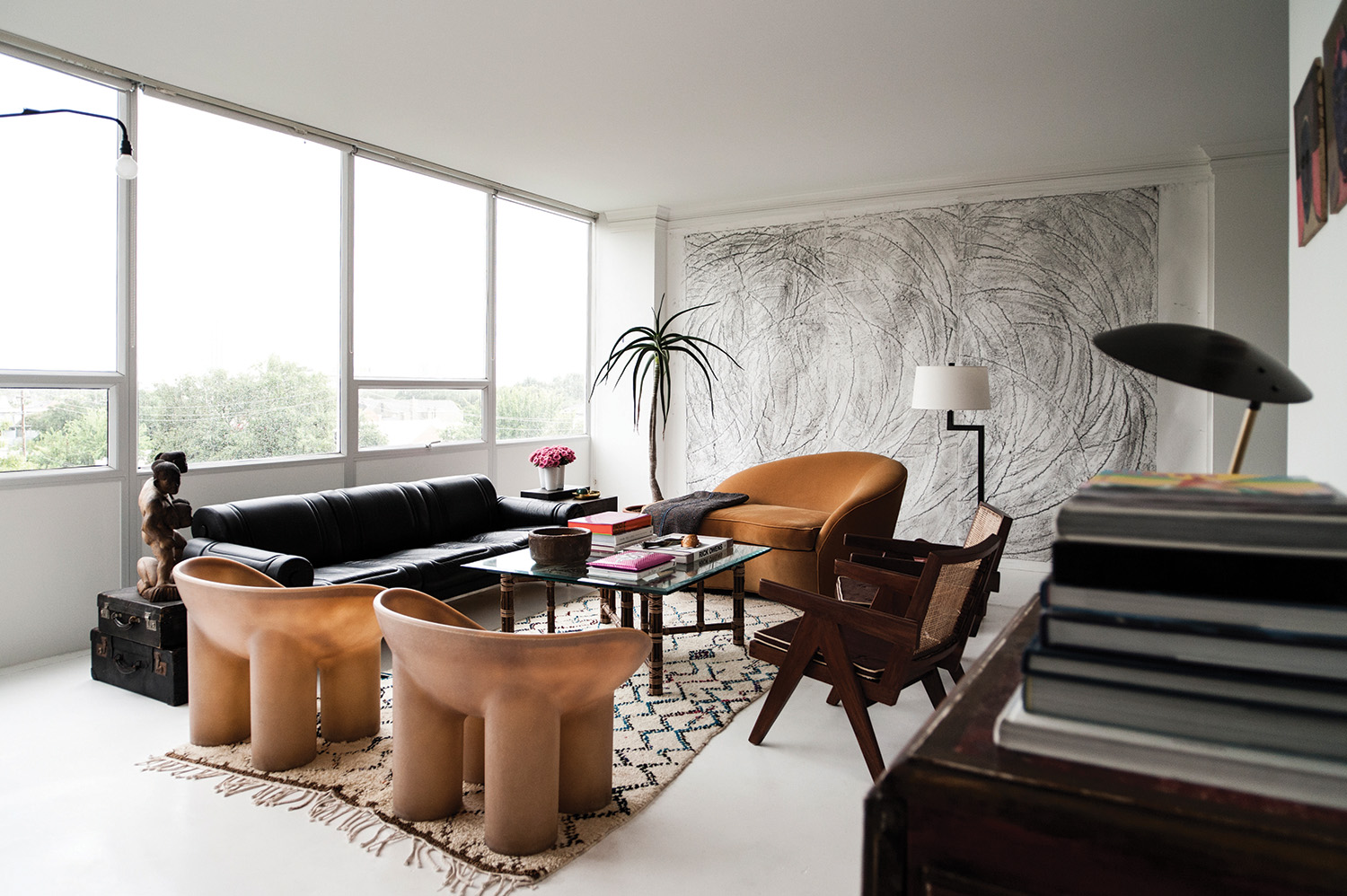
For the home Jaime Loera and I share in a high rise on the edge of Houston’s River Oaks neighborhood, I lean towards an aesthetic that is curatorial and edited, yet exudes a casual tone. The space is composed of a series of pristine light-filled volumes; devoid of extraneous detail with instead an attention to materiality. There are only a handful of elements contributing to the palette: concrete sheathed in white yacht paint, Calacatta marble, black glass and a span of wall-to- wall windows stretching the full length of the south elevation. The rest is comprised of big walls to showcase art. Within such a simple envelope, every piece inserted into the mix commands attention. The cohesion or friction caused from introducing these disparate elements into the space is magnified, and color comes into the equation in the form of the view, the artwork, and the people inside the space. I chose to complement the modernist architecture of the iconic building, but also challenge the clean lines with exotica and a sense of humor.
When one first enters, they are in a foyer-cum-gallery, with black glass sheets laid as flooring, and works on display by Dash Snow, Jules Buck Jones, and Kent Dorn. A piece by John Waters commands the far end of the gallery, pivoting 360 degrees to reveal alternately the numbers ‘7734’ or the word “HELL”. The other end leads into the living room, where a massive eleven foot wide by nine foot tall work on paper by the New York based artist Aaron Young covers the west wall. It speaks to the mix of furnishings in the space, from a leather and steel Maison Jansen sofa from the 1970’s, to a pair of large resin Faye Toogood Roly Poly chairs adjacent to a pair of original Pierre Jeanneret wooden chairs. A Jean Prouvé Potence lamp hovers over the sofa from the east wall, against the wall of glass looking out over the skyline.
The dining room has a large table made of steel and massive oak planks by James Brummett, and was featured in an exhibition I curated in 2015 called Texas Design Now at the Contemporary Arts Museum Houston. There are antique Chinese benches flanking each side, capped off at each end of the table by two unnamed Viennese modernist chairs of plywood and old, green leather. A large-scale work by San Francisco artist Johanna Jackson in pale blue, lavender, and bubblegum pink looks out over the room, and is from my friend Marsea Goldberg’s Los Angeles-based New Image Art gallery.
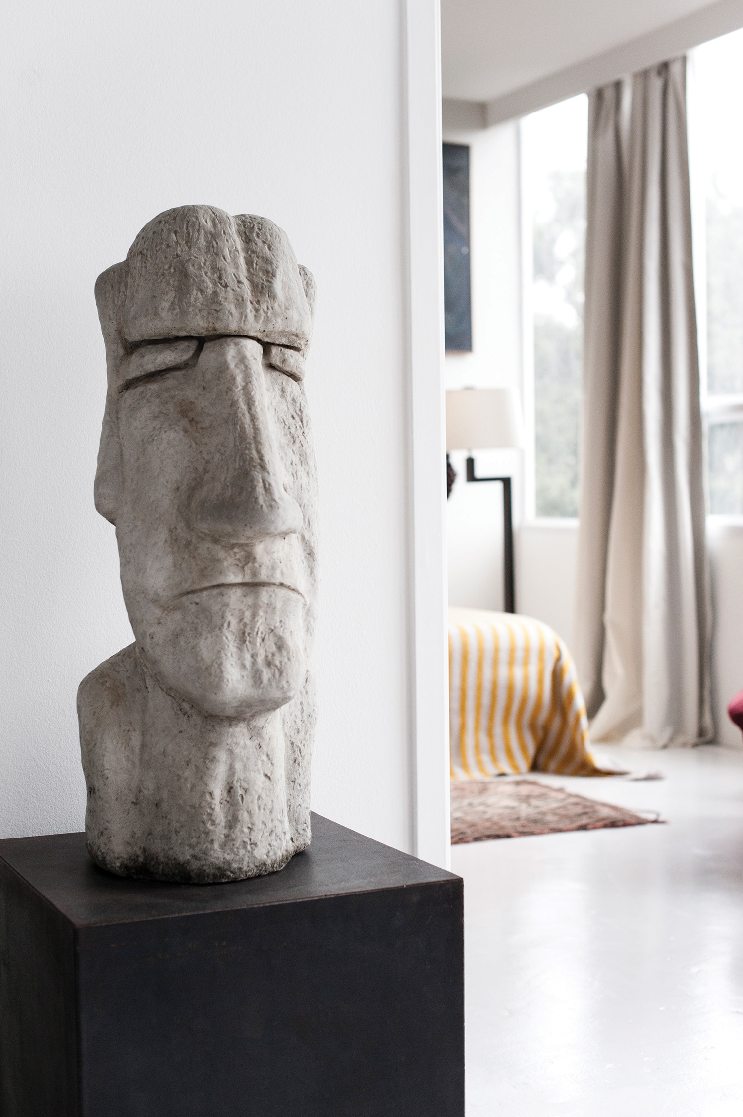 A concrete Easter island head model was a gift from my family sitting on top of a corten steel table.
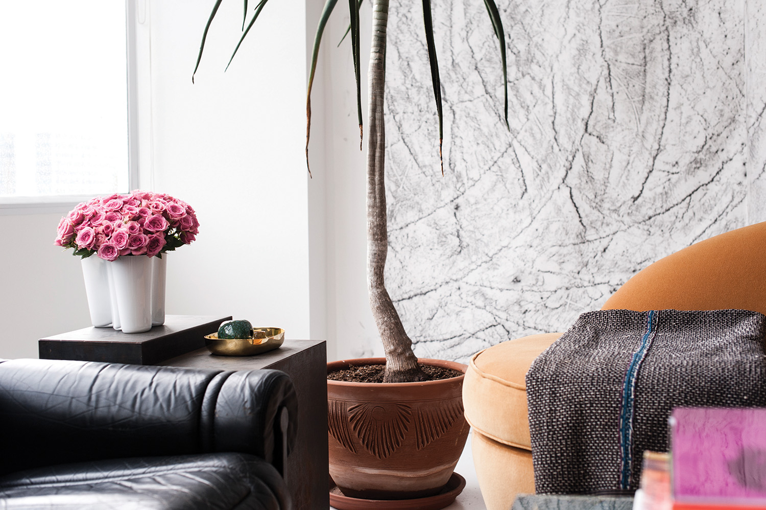 A Maison Jansen sofa from Tienda X and a vintage French settee in velvet. On the settee is an antique Japanese quilt from Carol Piper textiles. Artwork on the back wall by Aaron Young.
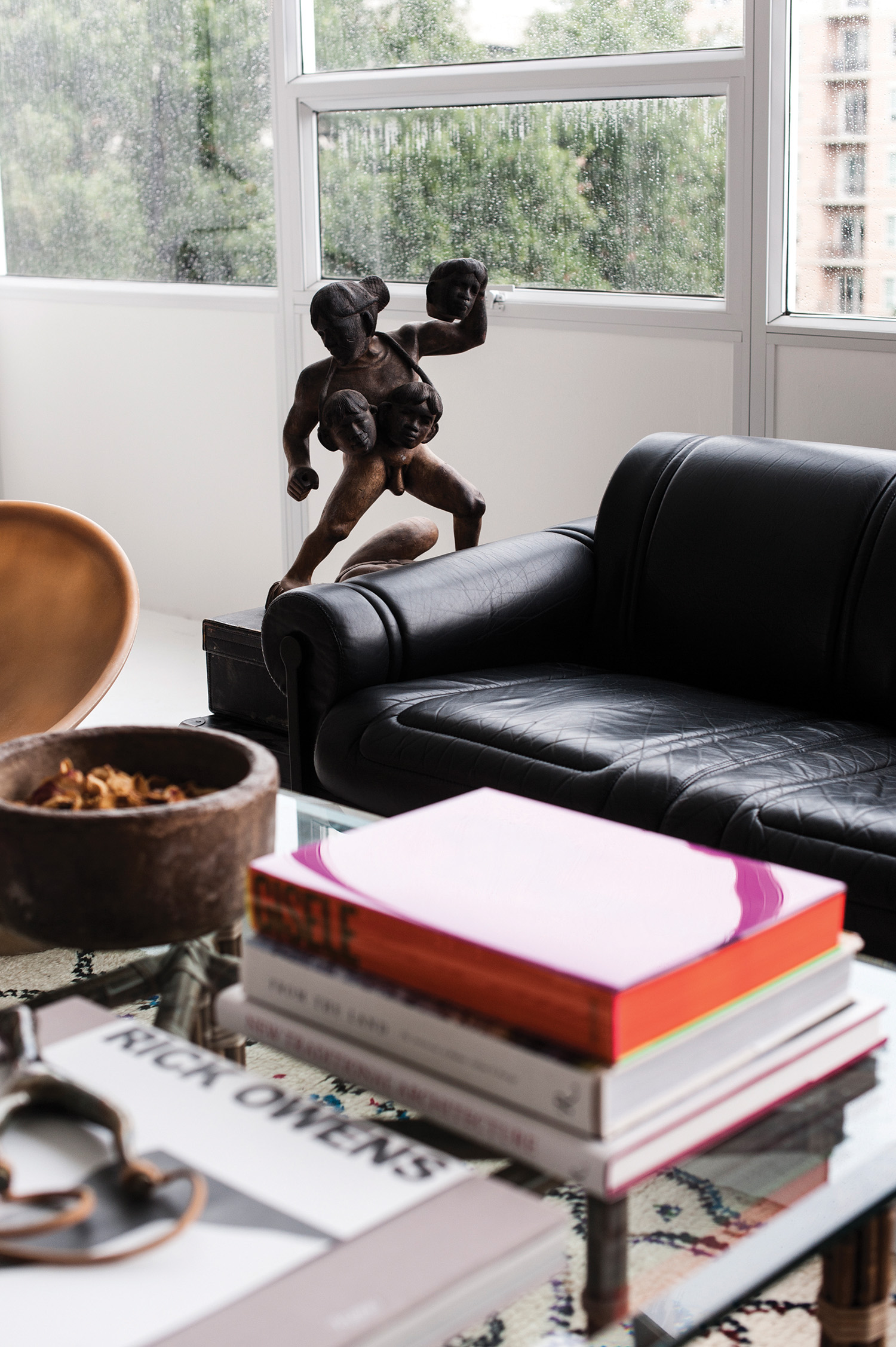
A woodend sculpture of a Polynesian warrior sits atop antique Abercombie & Fitch luggage.
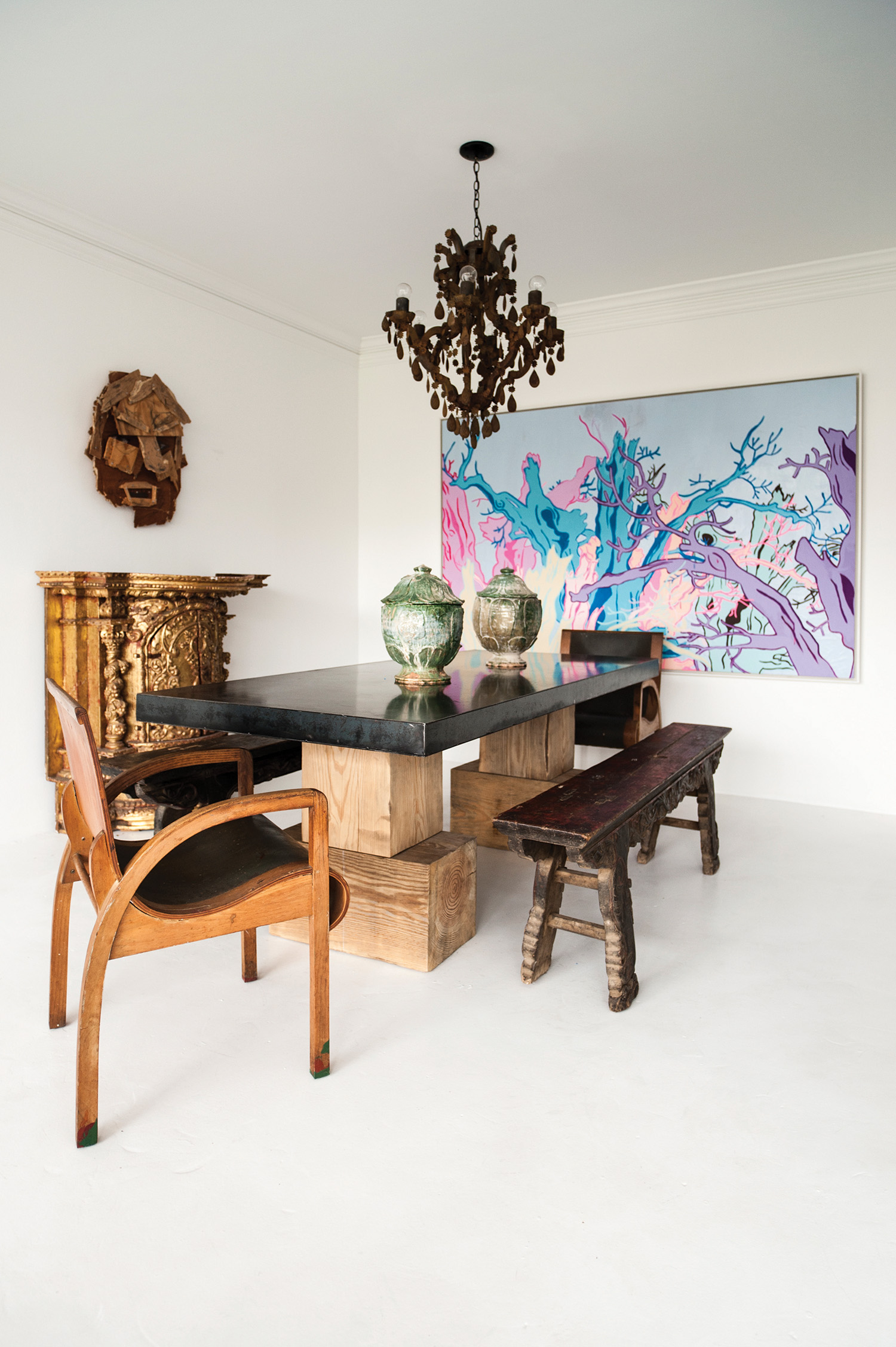
Dining table by James Brummett, the chairs are Viennese modernist, and the benches are 19th C Chinese – all from Tienda X. On the top of the table are Ming dynasty vessels, the gilded console is Peruvian, and painting by San Francisco artist Johanna Jackson from New Image Art in Los Angeles.
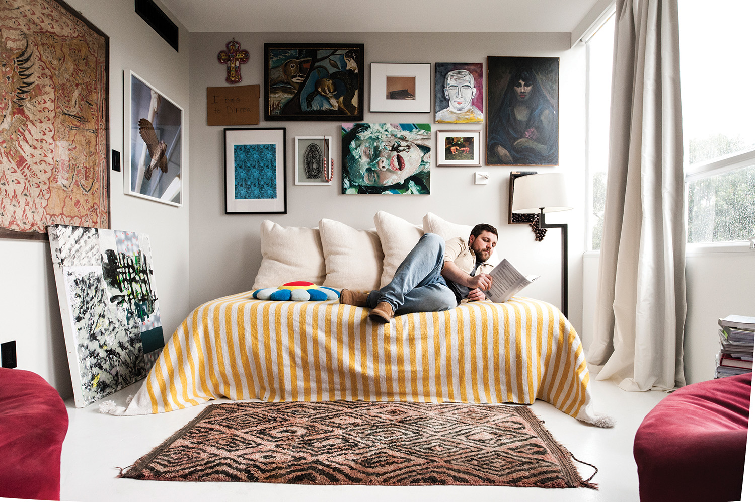
The media room doubles as a guest bedroom, with walls covered salon-style by smaller scale artwork, including pieces by Shane Tolbert, Kelli Vance, Brad Elterman, Jordan Sullivan and a self portrait painting by Jaime. A big, comfy daybed with giant cushions in Larsen wool and a pair of red suede Pierre Paulin chairs are essentially the only furnishings in the room. This room takes on the most intimate feeling of the entire home. I tend to like a moment of compression in the middle of bright, open spaces.
The master bedroom is the sparest room of all, consisting of a bed and a Gio Ponti chair, along with a pair of 1970’s Pace Collection side tables. The bed itself is quite monastic, a platform with no headboard and peach-colored Italian bedding. Centered above is a large antique Indonesian textile housed in a Lucite box. The majority of color in the room comes from a large metal artwork by my mother, photographer Rhonda Hunter. It is a digitally manipulated image of fungi in a forest with intense zaps of red, yellow, and jade.
I must confess, the space is always in a constant state of flux. Around the same time I moved in, architect Michael Landrum and I decided to open a design gallery, called Tienda X. Michael and I frequently collaborate; his aesthetic varies as much as my own, so the gallery is somewhat of a laboratory meets cabinet of curiosities. With a constant rotation of an inventory made up of art, objects, and important design pieces, it allows me to ultimately extend that experimentation into my own home. With that in mind, who knows what it will look like next month?
For more information visit garretthunter.com or email info@garretthunter.com
Photography by Jake Toler | Art Direction by Louis Liu | Introduction by Benjamin Price | Words by Garrett Hunter
