REI KAWAKUBO/COMME DES GARCONS: ART OF THE IN-BETWEEN
Rei Kawakubo is a designer’s designer. Throughout the course of her 44-year long career, her work has showcased her as a premiere fine artist whose medium is fabric. Rei’s work moves beyond the human body, pushing past the boundaries of commerce and fashion and transcending into the poetic and conceptual world of thought. The late designer Lee Alexander McQueen said of Rei, “I think that every designer you ask will be influenced by Rei in one way or another but what makes them a good designer is them moving the Rei concept on for their own label – the tulle over a suit, masking a jacket over a coat, pearls trapped inside layers of fabric – moving it forward, not just taking it, digesting it and regurgitating it the same way.” Kawakubo, though short of stature and reserved in nature, is a goliath in the fashion world whose influence has extended through every level, down to the world of high street (Comme des Garcons’ collaboration with H&M is one of the most successful and well regarded to date). She has been accredited to influencing Martin Margiela, Ann Demeulemeester, and has affected the worlds of technology, architecture, interior design, and many other creative industries due to her innovative thinking and the hands-on approach she takes to every aspect of her brand: from store design to web interface.
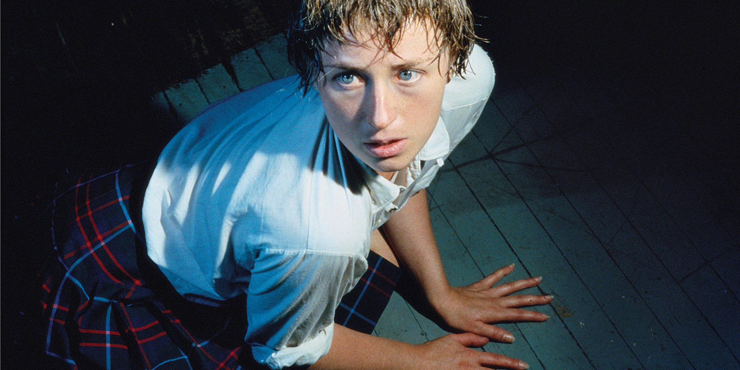
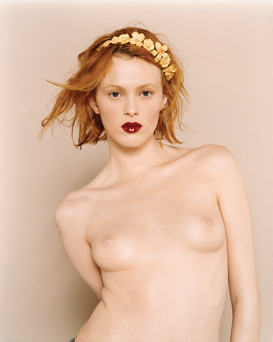
 Rei Kawakubo (Japanese, born 1942) for Comme des Garçons (Japanese, founded 1969), Body Meets Dress-Dress Meets Body, spring/summer 1997; Comme des Garçons. Photograph by © Paolo Roversi; Courtesy of The Metropolitan Museum of Art.
Kawakubo began her career as an outsider to the fashion world, studying fine art and literature at Keio University in Tokyo, this experience led to a deep understanding of the arts, poetry, and philosophy which can be seen in every garment and presentation that Kawakubo creates. After finishing her education, Kawakubo found herself working in the advertising department for a textile company, then as a freelance stylist, and subsequently designing for and launching her own label Comme des Garcons in 1973. Her label arrived on the Japanese fashion scene at the same time as Yohji Yamamoto and Issey Miyake, but what set her designs apart was her outsider view of fashion as a vehicle of sculpture and fine art rather than being formally trained in the classical ways of making clothing. In the early 1980’s she created an uproar at her debut Paris fashion show where journalists labeled her clothes ‘Hiroshima chic’ due to her frayed fabrics, distressed garments, dark color palette, and general aversion to traditional beauty.
Since the 1980’s, Kawakubo and Comme des Garcons have revolutionized the world of art, fashion, and design. The house has collaborated with many notable brands such as H&M, Converse All Star, Nike, Moncler, Chrome Hearts, Louis Vuitton, Supreme, and many others. Every fashion, art, and cultural influencer in the industry has been touched by Rei’s work in one way or another. Previous IRIS cover star and world famous milliner, Stephen Jones, once said in an interview, “Now, if you ask any designer who their favorite designer is, or who do they most respect, they will say Rei Kawakubo. I think that’s because she is a true original. She’s stuck to her guns. She does difficult things that are beautiful.” The work of Comme des Garcon is so richly layered throughout the decades that the upcoming retrospective exhibition delineates just an aspect of the beautiful work she has created.
Rei has always denied traditional titles of “fashion designer” or “artist, but prefers the more humble and interpretive epithet “clothes maker.” Recently, however, she’s begun to consider fashion as a form of art, and it is no doubt that the garments of Comme des Garcons are a fusion between art and fashion. This is a new inbetween space for Rei, at least on the level of self-awareness. Andre Bolton, the Head Curator of the exhibition, remarked: “She’s long occupied and explored another in-between space— Fashion/Commerce. From the outset of her career, Rei always viewed the creation of fashion and the business of fashion as a unified project. If, as Andy Warhol proposed, “Business Art is the step after Art,” Rei is its fashion manifestation. In this respect, Rei is an enigma, since her artistic practice remains legible and assertive, even in the context of its commerciality. Ultimately, it’s within this elastic zone between Fashion/Commerce that Rei’s “art of the in-between” occupies and most powerfully expresses itself.”
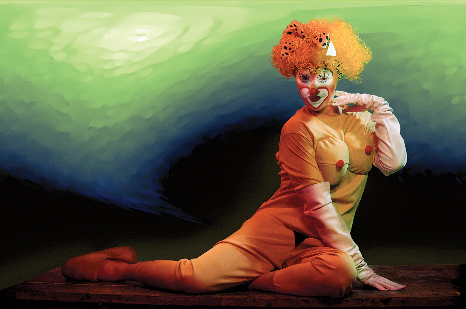
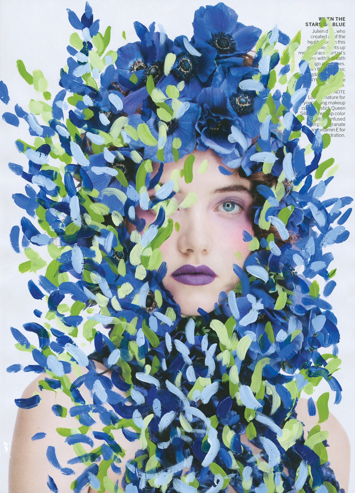
 Rei Kawakubo (Japanese, born 1942) for Comme des Garçons (Japanese, founded 1969), Blue Witch, spring/summer 2016; Courtesy of Comme des Garçons. Photograph by © Paolo Roversi; Courtesy of The Metropolitan Museum of Art.
On display through September 4, 2017, the exhibition at the Metropolitan of Art’s Costume Institute is entitled Rei Kawakubo/Comme des Garçons: Art of the In-Between. The retrospective exhibition is an examination of Kawakubo’s fascination with interstitiality, or the space between boundaries. This in-between space is revealed in Kawakubo’s work as an aesthetic sensibility, establishing an unsettling zone of oscillating visual ambiguity that challenges conventional notions of beauty, good taste, and fashionability. Rei Kawakubo, speaking of her own design choices, said, “I have always pursued a new way of thinking about design…by denying established values, conventions, and what is generally accepted as the norm. And the modes of expression that have always been most important to me are fusion…imbalance… unfinished… elimination…and absence of intent.” Not a traditional retrospective, this thematic exhibition will be The Costume Institute’s first monographic show on a living designer since the Yves Saint Laurent exhibition in 1983. The Director of the Metropolitan Museum of Art, Thomas P. Campbell, remarks that “In blurring the art/fashion divide, Kawakubo asks us to think differently about clothing. Curator Andrew Bolton will explore work that often looks like sculpture in an exhibition that will challenge our ideas about fashion’s role in contemporary culture.”
Kawakubo has broken the barrier between art and commerce by constantly searching for “newness”. Andre Bolton remarked that, “For Rei, however, her clothes are simply expressions of her endless search for originality or what she calls “newness.” In 1979—two years before her Paris debut—Kawakubo declared in an interview wit The New York Times: “I felt I should be doing something more directional, more powerful … [so] I decided to start from zero, from nothing, to do things that have not been done before, things with a strong image.” The concept of starting from nothing, a constant quest for reinvention, has ingrained itself into Rei’s design process. This is a mantra that guides Rei’s design decisions and creates fashions that not only stand apart from the genealogy of clothing but also resist and confound interpretation. She blurs the lines between garment and sculpture by obliterating our preconceived notions of the “shirt” or the “dress.”
Rei rarely has given any interviews. In fact, in one now fabled interview she reportedly drew a circle in black ink on a sheet of white paper and walked out; this served as an “explanation” to her then-collection Body Meets Dress — Dress Meets Body. Susannah Frankel, the fashion journalist who witnessed this performance, interpreted Rei’s answer as a demonstration of the collection’s indecipherability. Through the symbol of a circle, Rei was expressing the essential meaning of every collection: emptiness. Rei seems to enjoy confounding the editors, critics, and consumers of her work by offering obscure titles that serve to only muddy the waters of understanding. Bolton says of this Kawakubo phenomenon, “At best, they provide a code to be deciphered; at worst they serve as a red herring designed to divert, distract, and ultimately bewilder. Rei’s titles, like the collections themselves, can be read as Zen koans or riddles devised to expose the futility of interpretation. In Zen philosophy, koans are designed to confound the intellect by rendering analytical reasoning impossible. The most famous koan is mu, which roughly translates as emptiness. (…) It’s also central to the work of Rei, who as early as 1985 declared in Interview magazine: ‘The void is important.’”
Comme des Garcons is made up, conceptually, of space and emptiness. Most designers work to create volume and use materiality to take up space, but for Rei it is oftentimes more important to highlight the void — the space between. The exhibition’s title, “The Art of the In-Between”, comes from this poetic absence of space and Rei’s masterful hand at balancing tension between eight recurring themes: fashion/anti-fashion; design/not design; model/multiple; then/now; high/low; self/other; object/subject; and clothes/not clothes; all of which are explored in the Met’s retrospective exhibition in organized zones. “In her work, Rei breaks down the false walls between these dualisms, exposing their artificiality and arbitrariness.” remarks Bolton informing about the inspiration behind the curation.
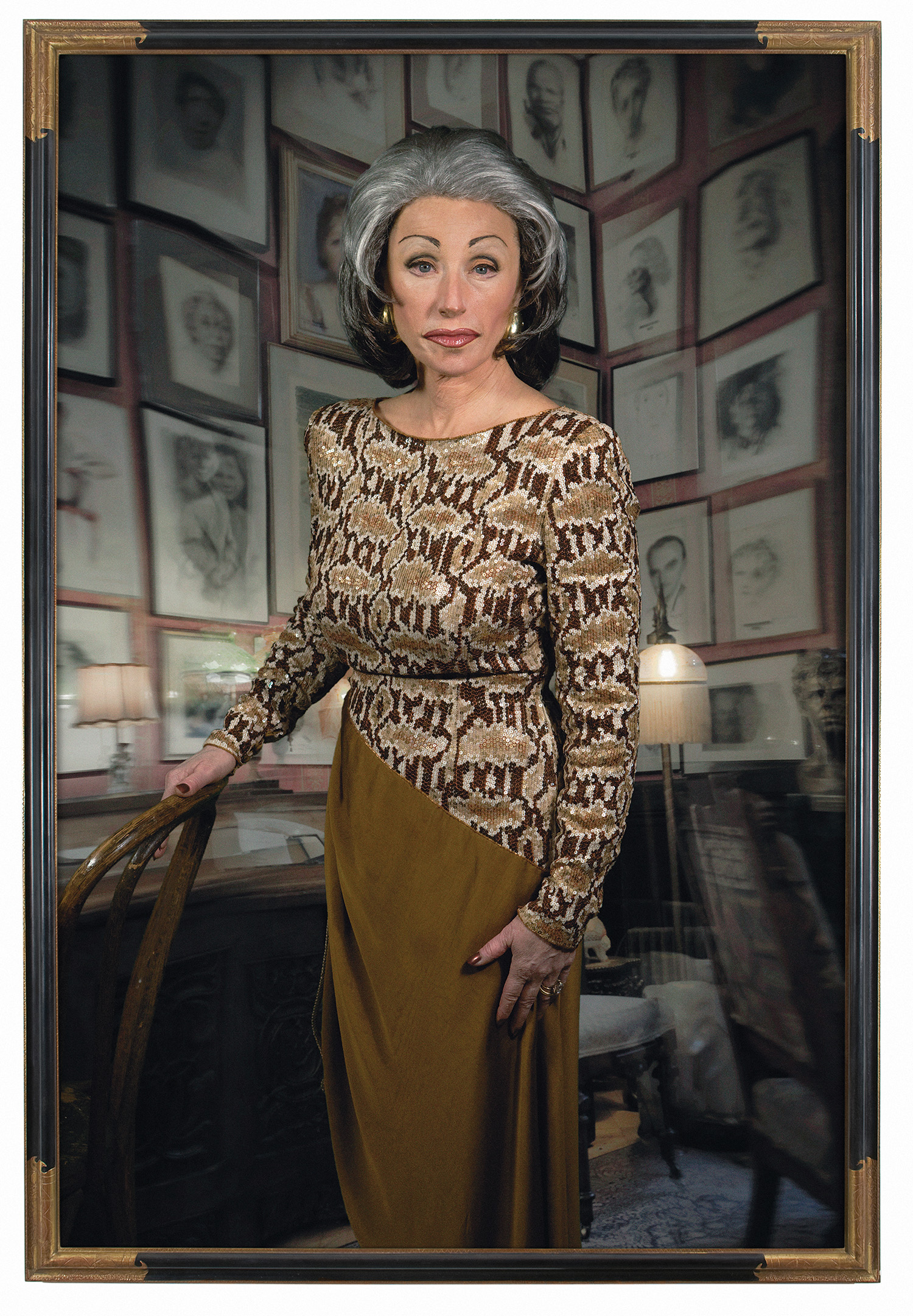
 Rei Kawakubo (Japanese, born 1942) for Comme des Garçons (Japanese, founded 1969), Blue Witch, spring/summer 2016; Courtesy of Comme des Garçons. Photograph by © Paolo Roversi; Courtesy of The Metropolitan Museum of Art.
The first section of the sprawling exhibition—“Fashion/Anti-fashion”—centers on the early work of Comme des Garcons which debuted in Paris in the early 1980’s. The Parisian press had very strong reaction to the work owing to Rei’s apparent repudiation of Western fashion and its conventions. Bolton remarks, “These collections are significant for introducing the concepts of mu or emptiness, expressed through Rei’s monochromatic— principally black—color palette, and ma or space, expressed through outsized, loose-fitting garments that created a void between skin and fabric, and between body and clothes. (…) Wabi and sabi are aesthetic principles rooted in Zen Buddhism and are closely associated with the art of the tea ceremony. Wabi denotes decay and transience, while sabi denotes poverty and simplicity.” In Rei’s work, these Zen concepts are expressed through her work as asymmetrical forms, irregular finishes and trims, and imperfect creations.The tailoring and technical mechanics of dress-making are very important to Rei because they highlight the importance of the unfinished. Rei is the archetypal modernist designer. This modernism is most ardently expressed in her constant search for originality and “newness”. Rei is fascinated by the tension between originality and reproduction and between elite and popular culture, drawing parallels to other avant-garde modernists such as Warhol, Duchamp, and many other fine artists who play with similar themes.
Rei’s revolutionary experiments in fashion, art, and commerce have led to a natural hybridization in “in-betweenness,” which are taken to their logical conclusion in the final section of the exhibition—“Clothes/Not Clothes.” Focusing on Rei’s last eight collections, this wing of the retrospective represents her most radical, profound, and poetic ideas and creations that have never before existed in fashion. Rei’s previous collections have their confrontational novelty; however, they insist on existing as “apparel”. “These clothes are divorced from the delimiting requisites of utility and functionality and exist as purely aesthetic and conceptual expressions. The garments featured in “Clothes/Not Clothes” share qualities with sculpture as well as conceptual and performance artworks” explains Bolton.
In celebration of the opening, The Met’s Costume Institute Benefit, also known as The Met Gala, took place on Monday, May 1, 2017. The evening’s festivities were co-chaired by Tom Brady, Gisele Bundchen, Katy Perry, Pharrell Williams, and Anna Wintour. Rei Kawakubo and Ambassador Caroline Kennedy served as Honorary Chairs. The event is The Costume Institute’s main source of annual funding for exhibitions, publications, acquisitions, and capital improvements. The exhibition features approximately 150 examples of Kawakubo’s womenswear designs for Comme des Garçons, dating from the early 1980s to her most recent collection. Kawakubo breaks down the imaginary walls between these dualisms, exposing their artificiality and arbitrariness. Her fashions demonstrate that interstices are places of meaningful connection and coexistence as well as revolutionary innovation and transformation, providing Kawakubo with endless possibilities to rethink the female body and feminine identity.
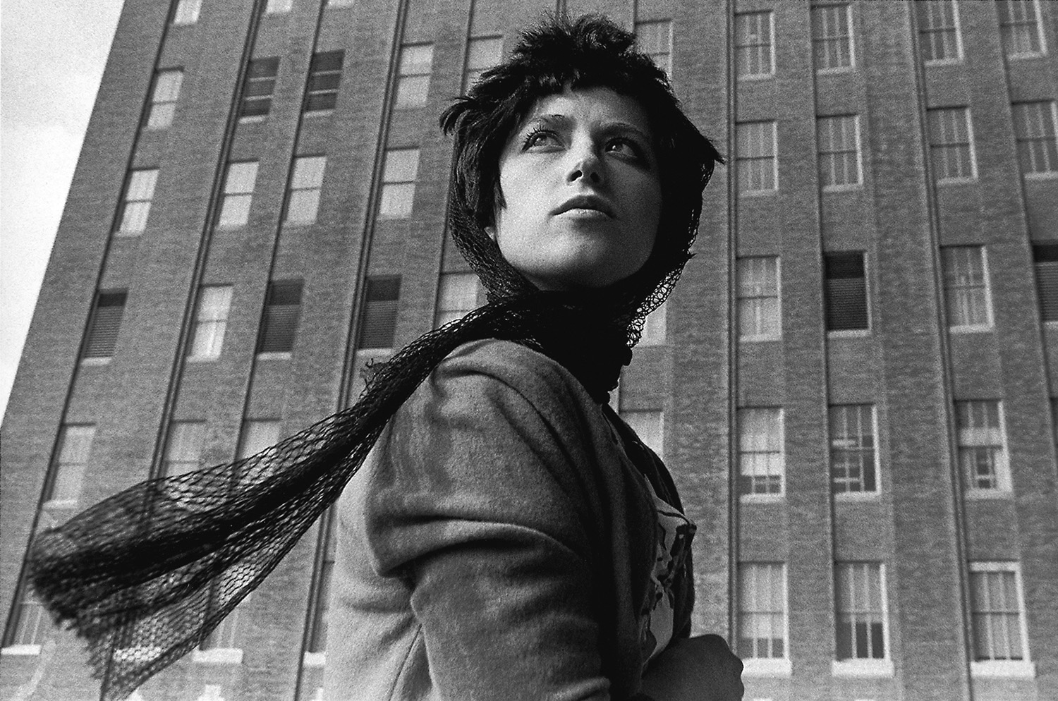
 Rei Kawakubo (Japanese, born 1942) for Comme des Garçons (Japanese, founded 1969), Body Meets Dress-Dress Meets Body, spring/summer 1997; Comme des Garçons. Photograph by © Paolo Roversi; Courtesy of The Metropolitan Museum of Art.
Exhibition Dates: May 4-September 4, 2017|Exhibition Location: The Met Fifth Avenue|1000 5th Ave, New York, NY 10028|1(800)662-3397
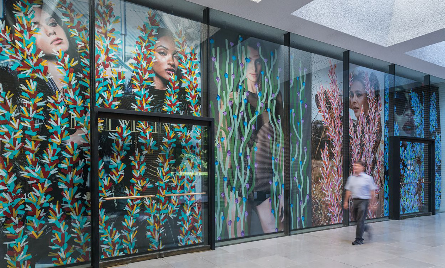
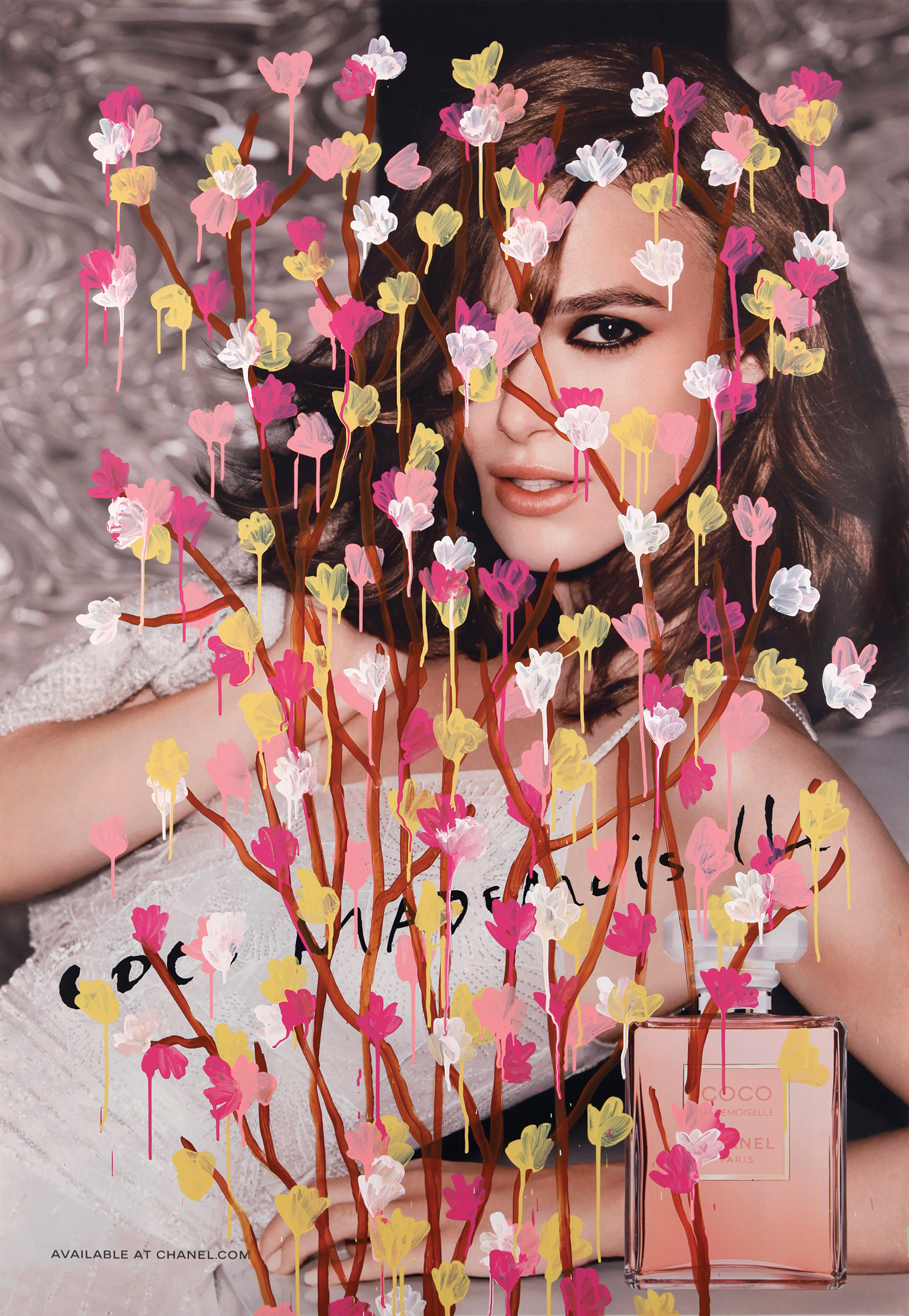
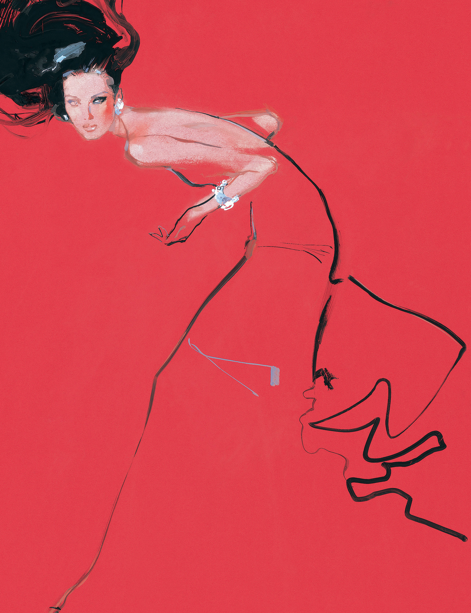
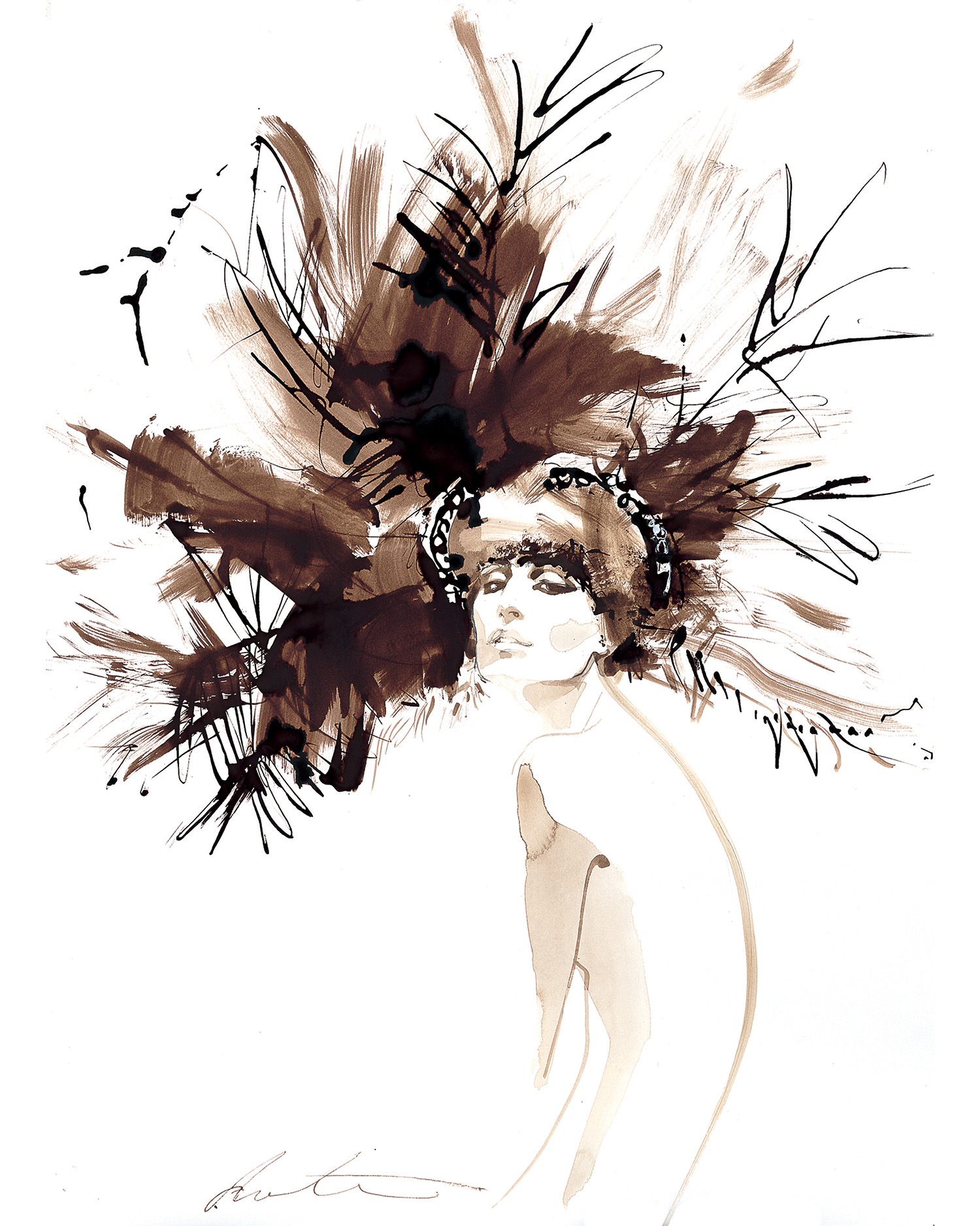
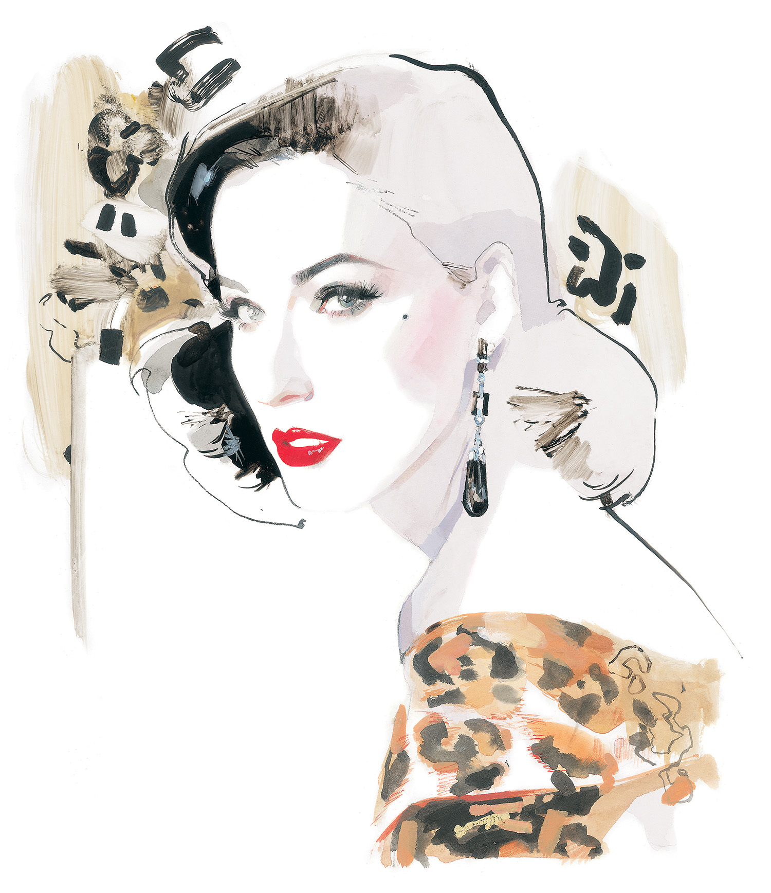
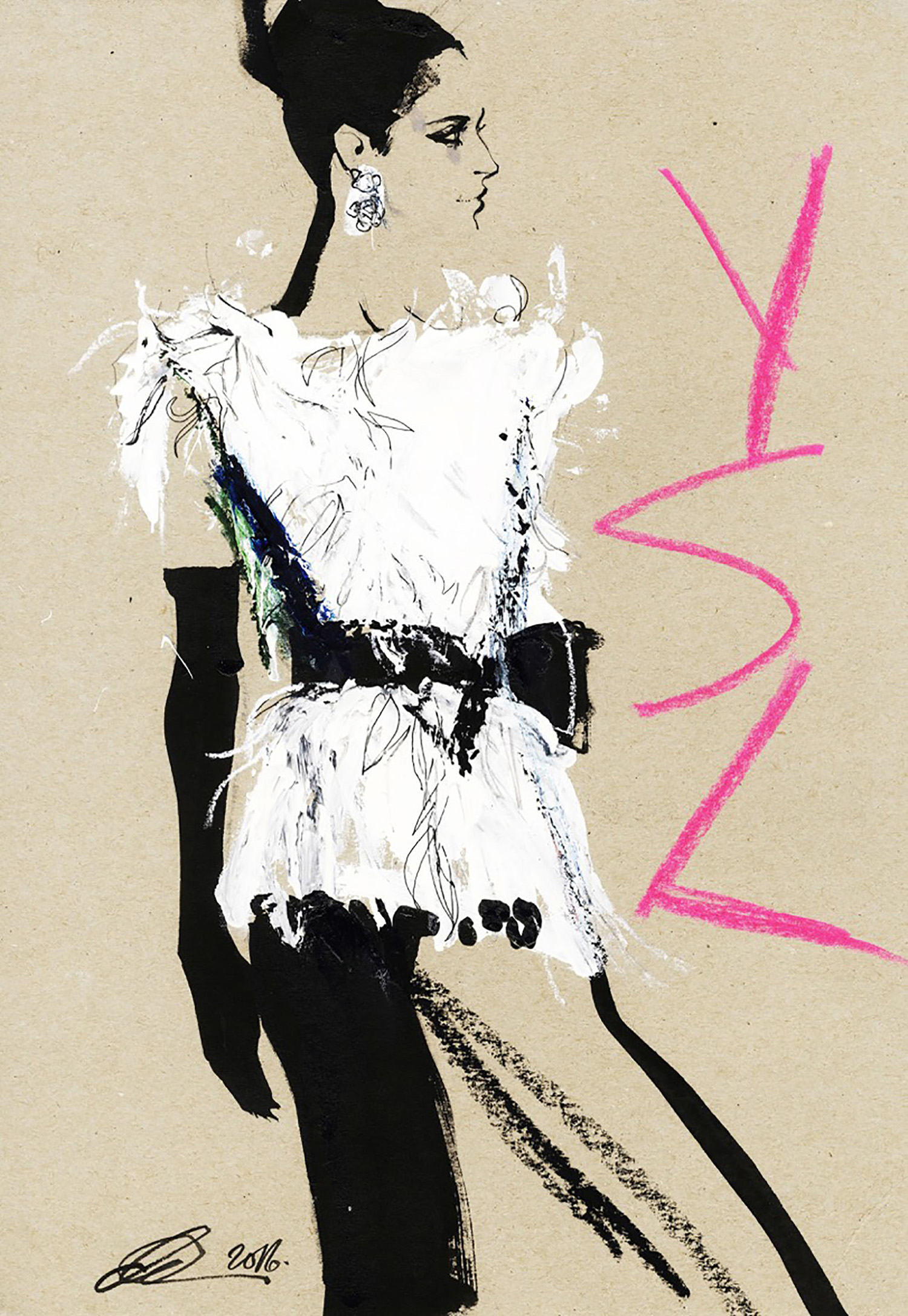
 Untitled (Gisele Bundchen by Patrick Demarchelier for Chanel), acrylic on bus-stop shelter advertisement, 68.5 x 47.5 inches, 2015
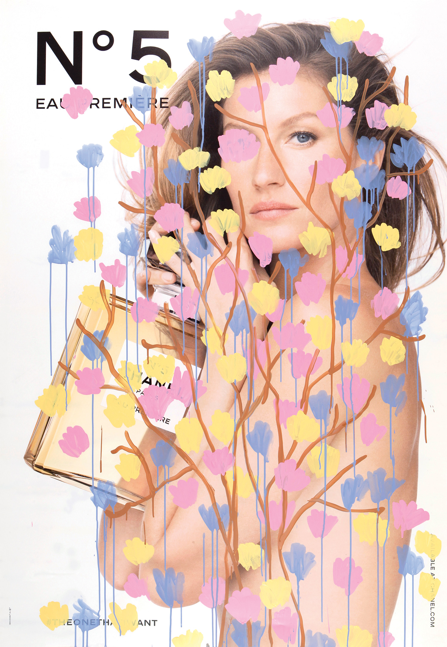