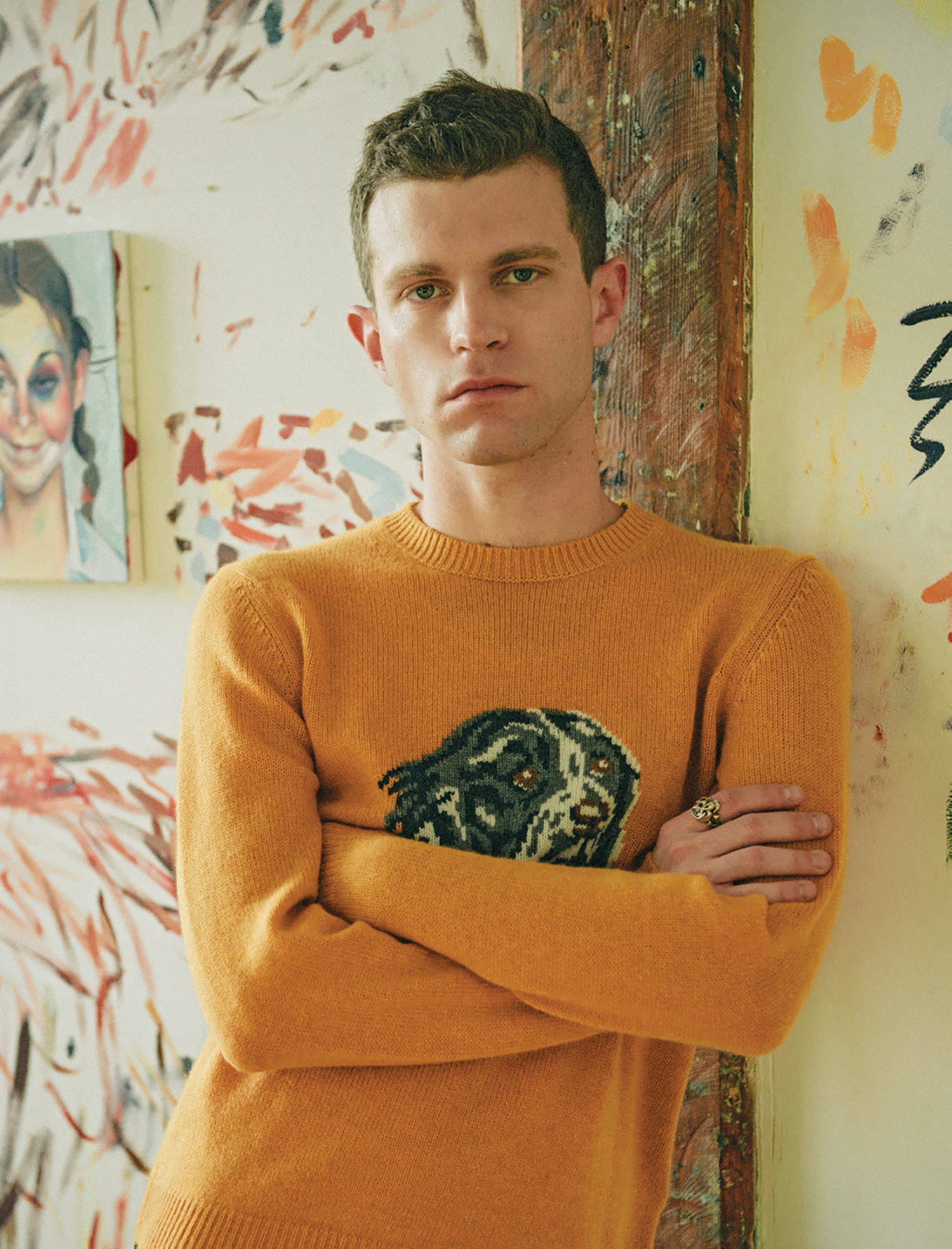
MATTHEW STONE

Beginning his career with an involvement in numerous counter-cultural movements, and rising to notoriety as a founding member of the South London art collective, !WOWOW!, Artist and Art Shaman Matthew Stone is bringing bodies together through his life-sized digital paintings.

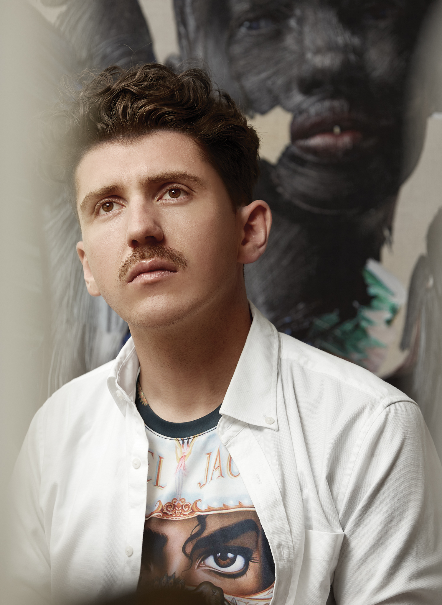
Photography by Wikkie Hermkens | Styling by Sonny Groo | Interview by Ashleigh Kane

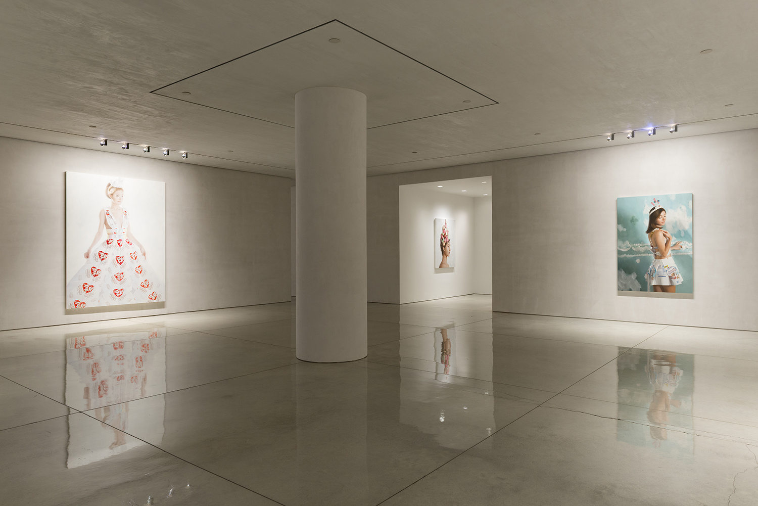
In the early 00s, Matthew Stone took the teachings of Andy Warhol’s Factory era and the concept behind Joseph Beuys’ Social Sculpture and transplanted them to London, where he and a group of friends had just graduated from Camberwell College of Arts. Consciously eschewing the rental market, they founded !WOWOW! and housed it, and themselves, in an abandoned store in South London with a revolving roster of exhibitions, residencies, studios and parties. “When I was young, I had a really strong vision of how I wanted to live my life”, Stone recalls over the phone from his studio in Hackney, “and I was specifically interested in squatting.” Having grown up with his family in a cottage on a canal in Bath, England with no permanent source of electricity – just a generator which Stone says was often not in use – it’s not hard to understand his draw towards other people. Now 35, content with living alone and much less the party animal he once was, Stone’s work is still crowded with bodies. He contributes to his own series titled “Interconnected Echoes” whereby he interviews the people he admires, has participated in several group as well as solo exhibitions, photographed the cover of FKA Twigs’ M3LL155X album cover, and most recently exhibited his life-sized digital paintings at Somerset House under the title Healing With Wounds.

Here he talks to IRIS Covet Book about connection, spirituality, and shares some invaluable advice for young artists.

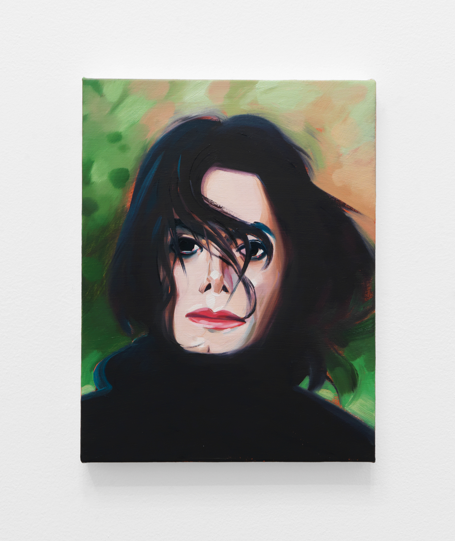
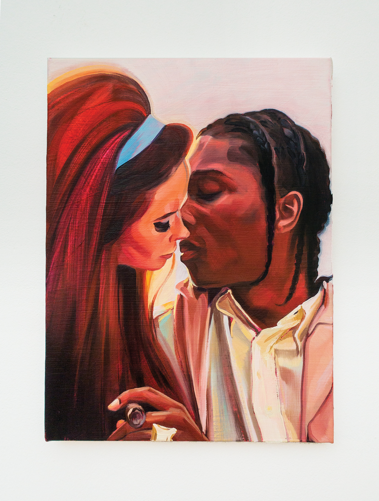
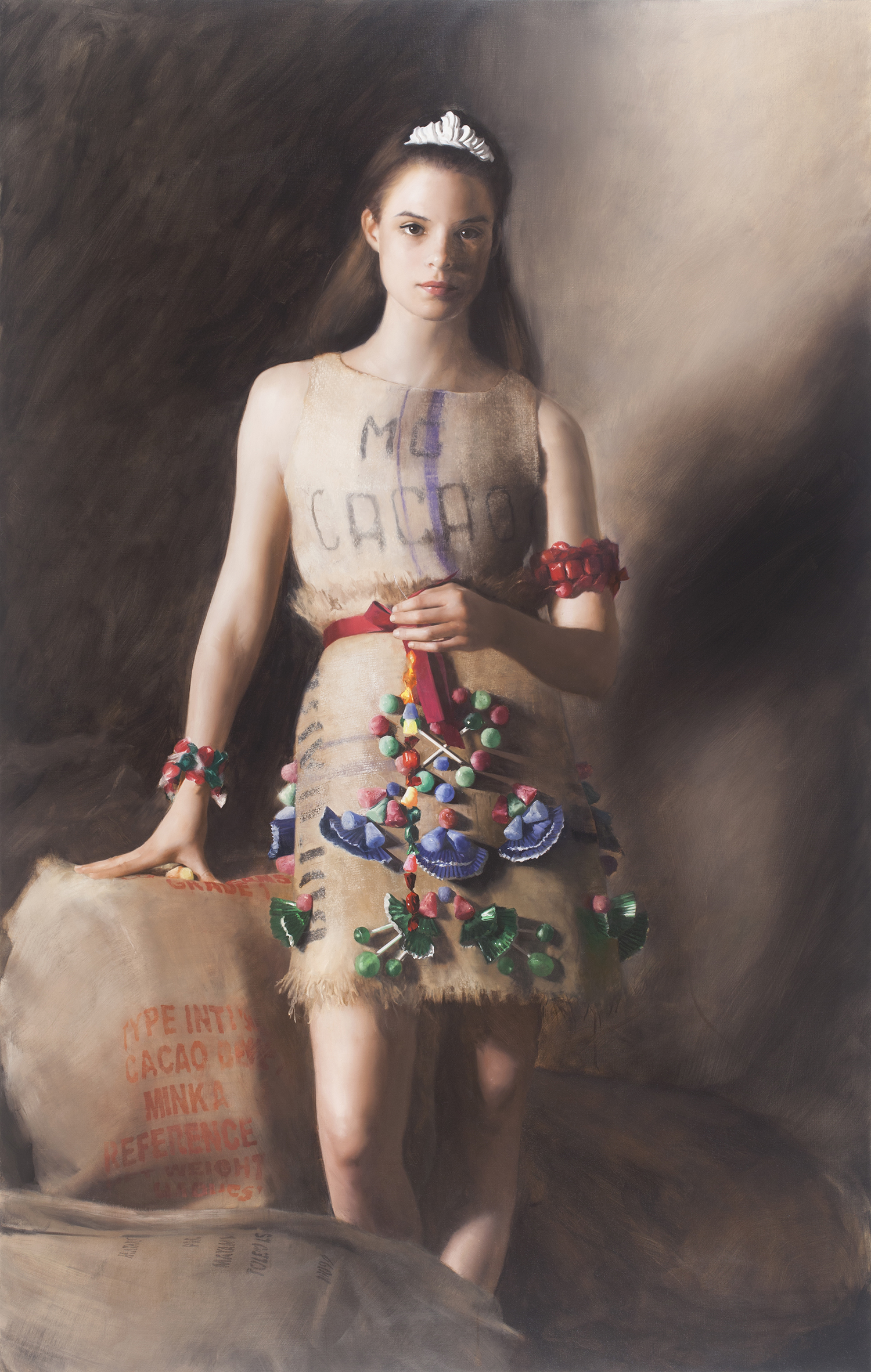
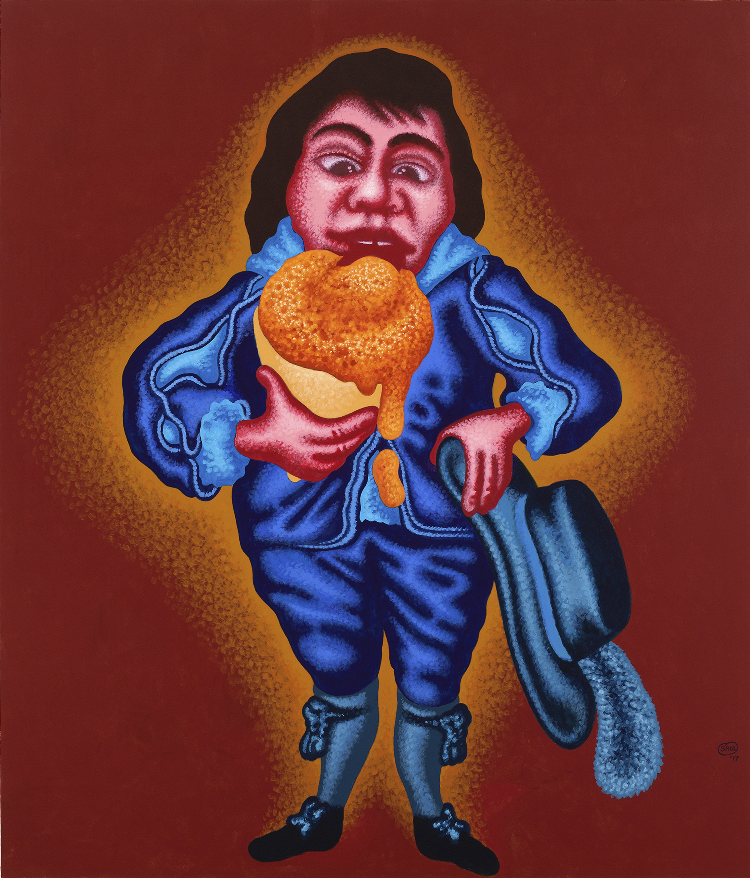
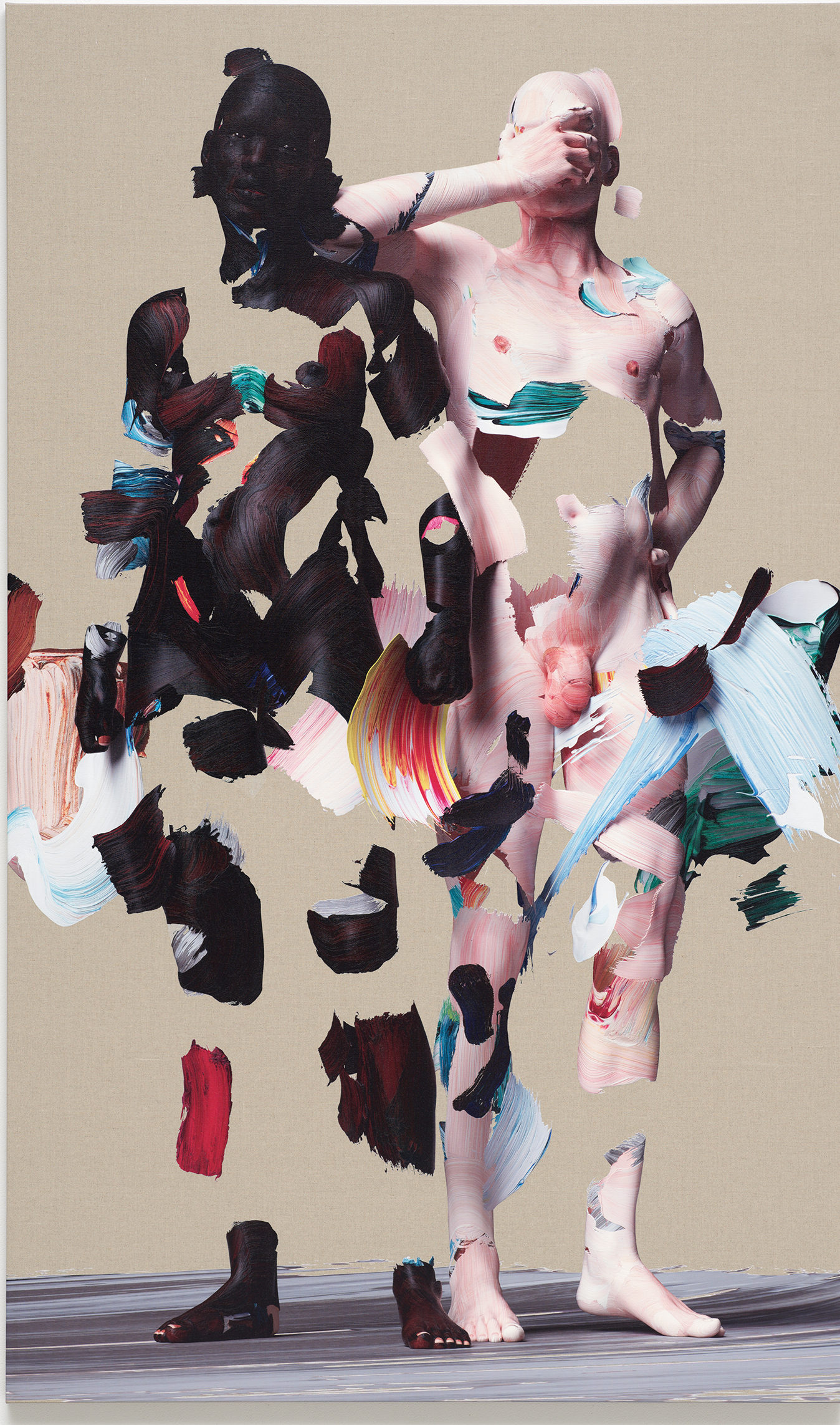
Upper World Portrait, 2017

Can you talk about the process in which you make your paintings?

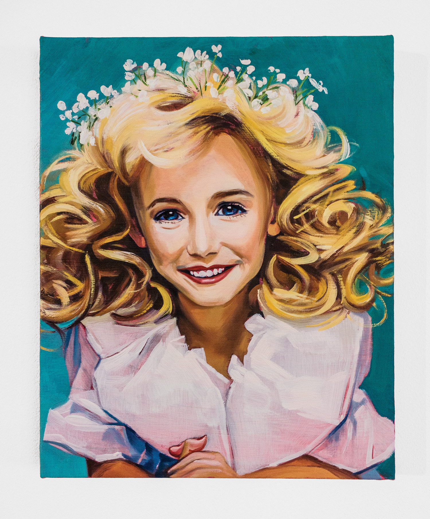
I physically paint and then photograph the strokes individually and create really high-resolution images of each brush stroke. Then I cut them out in Photoshop and use them to texture 3D models that I make of people. I’m working in 3D CGI software and using virtual cameras and lighting setups. Then with a printer, they’re finally printed onto linen with a technique that I developed. I only ever print each once so they live like actual paintings in the sense that there is only one of them.

Why did you want to work in a digital realm?

I didn’t want to make something that was backwards facing. I wanted people to look at them in a way that they look at contemporary imagery, in that they have not seen something else exactly like it before. To look at it with that freshness, with those eyes, and then start thinking about their bodies and each other. For a long time, I wondered whether that was through photography, or pushing photography into sculpture. With this technique, I feel like I’ve nailed the method (laughs) and now I can get on with just making paintings. The majority of the work was developing the technique and there were years when I worked on it without showing anyone any development. I went through waves of development without over-excitedly sharing it with everybody, and that was a big education for me.

One of the reasons that I’ve stopped doing lots of other different things and focused on the paintings is because I’ve realized that I can do everything I need to do within other realms, within this world of painting. Because of the way that I work in 3D virtual space, I can’t help but think of them, when I hang them on the wall, as a window into that space. Increasingly, I’m doing things in life-size so as you look at them, you’re looking into a virtual reality or mixed reality.

The people who appear in the paintings are not based on real people, they are completely invented like avatars that I’ve posed and painted. But those figures have started reappearing through different images, so it’s almost as if I’m investing in these metaphysical beings that live in the world that is my painting.

You came to London from Bath at age 18 and began to study at Camberwell College of Arts. What artists did you admire back then?

I wrote my dissertation on the spiritual content in Andy Warhol’s work and argued that you could read a religious trajectory in his work. Then I came across Joseph Beuys and was really interested in his work from a performative perspective. Through him, I developed these ideas around the artist as Shaman.

Were you always intrigued by spirituality?

My mum was a Catholic and as a result – and as a reaction to that – she was very much like, ‘You are not going to be indoctrinated in any way.’ We were left to work that stuff out on our own. Looking back, I had an interest from a very young age in mysticism; The X Files and UFOs, which I feel were very much of the times.

Photography by Wikkie Hermkens | Styling by Sonny Groo

Can you talk about the out of body experiences that you have had?

They’re not something that I had a ton of but there are some significant ones – and I wish I could go into them at will, but I can also go into altered trance-like states. I used to do a series of performances where I would perform under the stage name “The Art Shaman” and the structure of the performance was that I would get a cover band to play Paint It Black by The Rolling Stones, and I would use the song to enter altered states.

What was the significance of Paint It Black?

Maybe something about the drumming. It has this rhythmic pull. In a sense, me talking about myself as a Shaman stemmed from that period. At that time it was very playful, essentially. But people, other artists, have found it intensely problematic. Someone wanted me to publicly apologize – which is almost as pretentious as me calling myself a Shaman (Laughs).

Why did it bother people?

I think they thought that it shouldn’t be a self-bestowed title. There’s definitely a question about using something like that – like spiritual appropriation – but, for me, the word itself, in its contemporary usage, describes behavioural patterns that are different on every continent and so it doesn’t feel super specific as a term, it feels quite general. I’m not trying to cut into any tradition that I’m not a part of. It’s more in an abstract sense that I’m trying to push the boundaries, or trigger thoughts, about the role of the artists and whether that extends beyond an individual creating expensive objects.

I use it to trigger intellectual debate because increasingly I’m interested in intuitive moments of thinking. There are certain points when I’ve thought – because of explaining it, over and over again – ‘why am I doing this?’ and that maybe I should just say that it was a phase, but I realized that me having said it had its own resonance and power anyway and that I have to live with the consequences of that – whether or not they are uncomfortable. More recently, I feel like I’ve gotten a bit more of a practical and personal practice that relates to it – there’s more humility. But I’m not going to take it off my Instagram account.

After university, !WOWOW! was founded. Did that come about because of situational circumstances or was it planned?

When I was young, I had a really strong vision of how I wanted to live my life and I was specifically interested in squatting. In college, I was obsessed with reading about Warhol’s Factory and had this idea of collaborative and collective living. I was thinking about Joseph Beuys’ Social Sculpture, which was the idea of an evolving artwork that was multi-author – it was all of society.

Once we graduated, we were like ‘let’s not pay rent, let’s go and squat!’ and so we started it and invited people in and it spiraled from there. My hope at that time was that people would perceive some of my activities within it as being a kind of living artwork and certainly not one that I’m the only author of. I was really interested in the idea of presenting a network of people as an artwork and I always had a great reticence to concretely transfer that to a gallery – in terms of installing people into a gallery. So yes, it felt like something that was situational in a sense because if you took it out of the environment that it had sprung from, it would become an illustration of it.

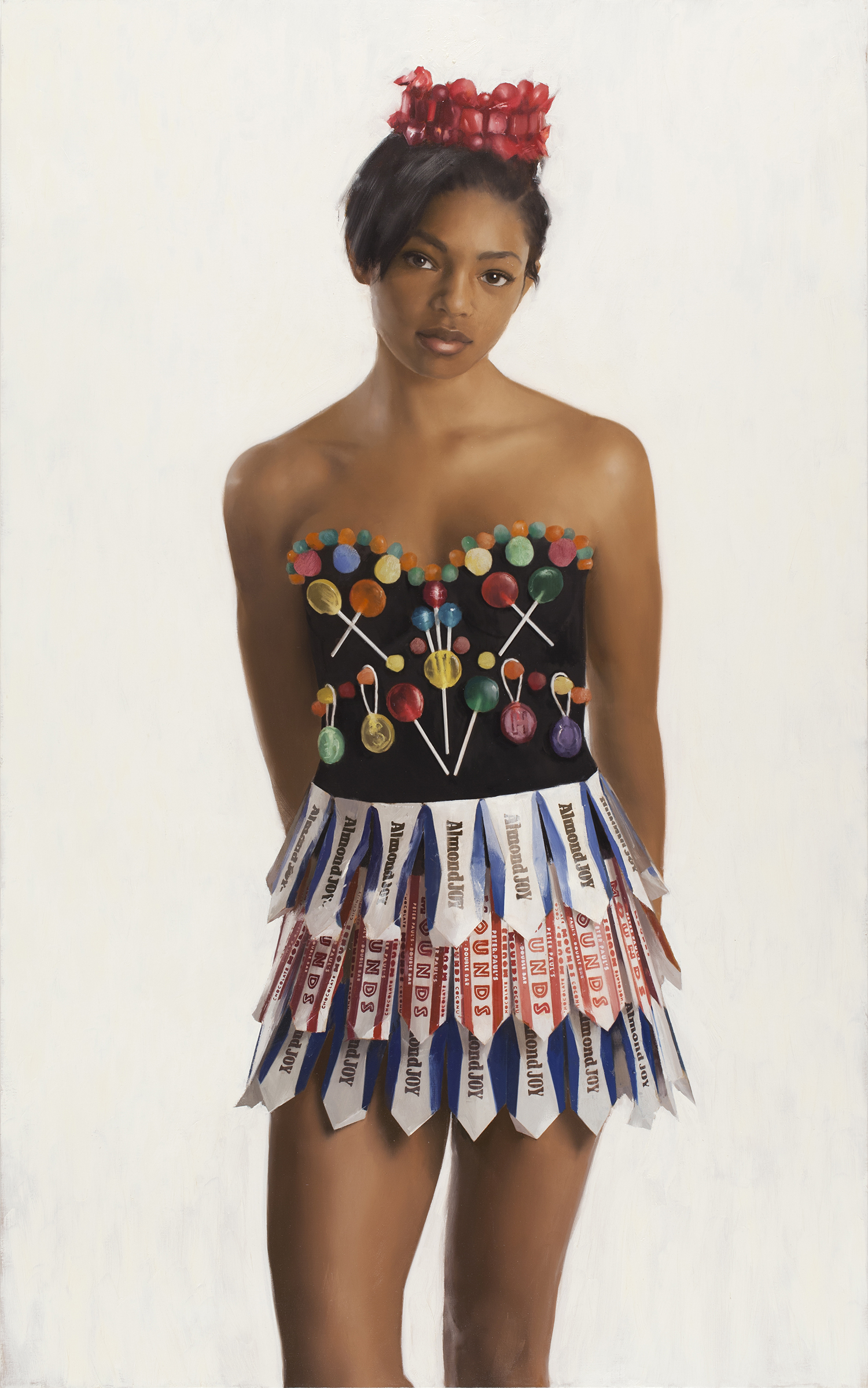
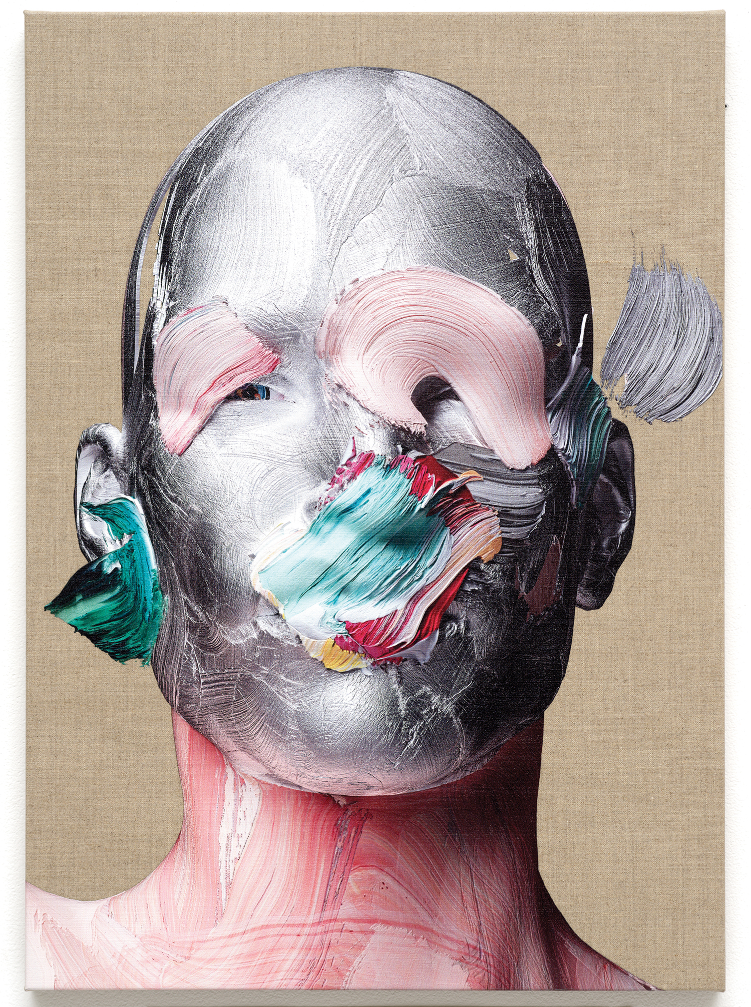
Feminine Teachers, 2017

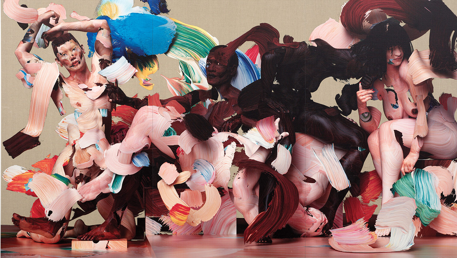
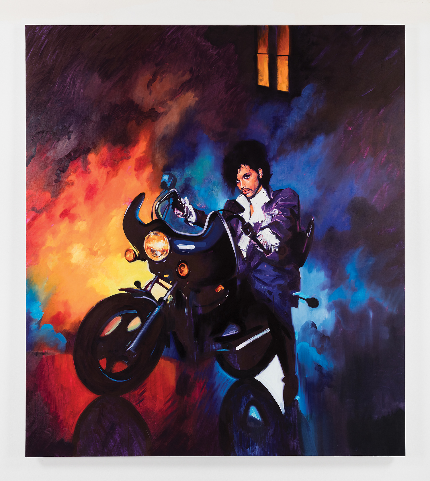
Other People’s Energy, 2017

You mentioned earlier that you want to see if the artist can be more than someone who is just making expensive objects. What do you think the role of the artist is today?

Everyone as an individual has a political responsibility, so obviously, that includes artists. I don’t think my work has ever really been about art or the art world. Obviously, it emerges from the history of art and in lots of ways my work is very much about the history of religious art in terms of the use of the body and flesh, but I feel like my work has always been about interactions between people. Looking at the idea of collaboration over competition. Coexistence and compromise in conflict and how complex networks of power and connection occur. When I was younger I felt like I had the answers for things, but as I go on my thinking changes. Now I know that my thinking will probably change again in the future. I feel, with my work, I’m trying to frame the development of that thinking more than my thinking specifically.

Healing With Wounds featured the Somerset House show titled Utopia. Is utopia something you explore in your work?

I’ve always been interested in the idea of being engaged in developing ideas or using creativity to envision a more just world, but I’ve never claimed to be an activist. Essentially my thinking about optimism and utopias has always been about questioning if these dialogues are useful? Is it better to acknowledge the violence that already exists by making violent work? Or should I, as an artist, focus on promoting visions of a post-violent world? I’ve looked at art and culture that has explicitly been violent and understood it as potentially being part of a critique of violence, but instinctively, I’ve never said, “well I’m going to make violent imagery because that is a way to show people that it’s a bad thing.” I feel uncomfortable thinking in that way and I don’t know if that’s because I’m naive and I can’t deal with reality, or it’s because that type of imagery can be traumatic and does little to destabilise violence.

I go back and forth between thinking about how the power structures unfold in the images I make and how they deal with violence and what they suggest. More recently, I’m realizing that there is a lot of ambiguity in the ways in which you can read the body language of the people in my paintings. That’s quite important because I don’t think the world needs simple illustrations like “violence is bad” because the world is more complex and intelligent than that. If I can create anything where when people look at it and think about what’s happening, then that feels like the more useful contribution. Ultimately, when people look at my work, I want them to feel something and I want them to think about what they feel.

What advice do you have for young people coming up?

I always say, “listen very carefully to the advice that you give others because we verbalize our own insecurities when we criticize other people, when we give them advice.” The other thing is, “pay attention to your own mistakes, they might be the only original ideas you have.”

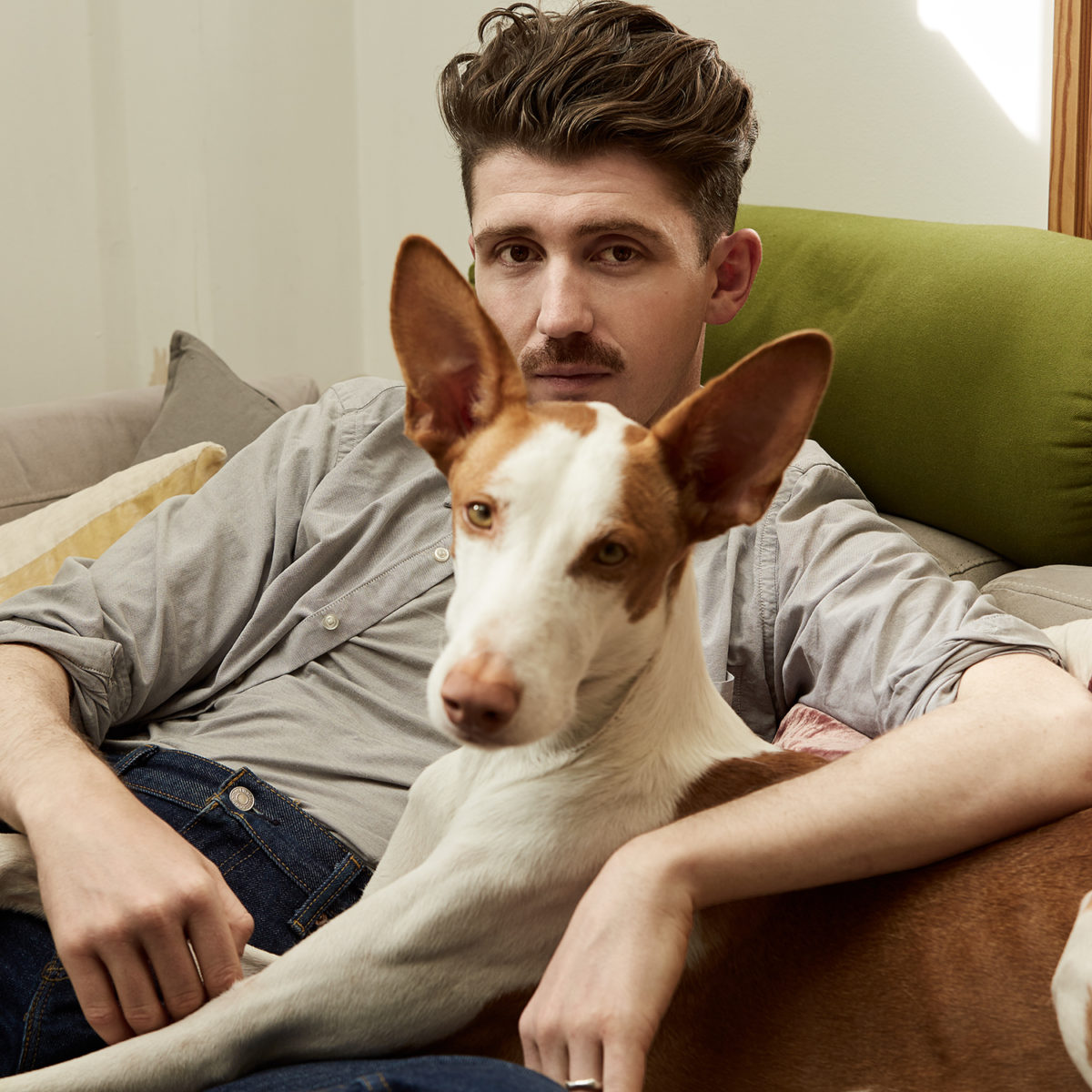
Matthew Stone with his dog Beau. Follow Beau @beauthehound

All artwork © Matthew Stone images courtesy of Choi&Lager
For more information visit matthewstone.co.uk

THOMAS COLE’S JOURNEY: TRANSATLANTIC CROSSING AT THE MET

The Mountain Ford, 1846, Image Courtesy of the Metropolitan Museum of Art

_

Text by: Rishabh Manocha
All artwork by Thomas Cole, courtesy of the Metropolitan Museum of Art

Last month (Jan 30, 2018) witnessed the opening of an unprecedented exhibition, celebrating the life and legacy of English-born American artist Thomas Cole. The title Transatlantic Crossings signifies his immigrant status to the fledgling new country – the United States.

It is also reflective of embarking on a purposeful journey. The latter years would reveal Cole’s significant contribution to American art.

Cole’s forte of landscape painting is sublime, romantic and deeply piercing. The beauty of the American wilderness is a predominant theme of his work. But, what lies beneath that unfettered beauty is truly penetrating. From purely lyrical depictions of the landscape, of which he was a pioneer in the new continent, much of his critical work comprised of incremental narratives, often dichotomous in nature.  These narratives talk about man’s penchant of incessant desires. Born in the heyday of industrialization, Cole witnessed first hand the shocking effects of mass production on the ecological cycle. The soot ridden valleys and smoke of chimneys indeed played a pivotal role in shaping his understanding of man’s relationship to nature.

One of Cole’s most acclaimed works, The Course of Empire depicts mankind’s emergence, prosperity, and eventual diminishment. From the reeds of landscape, to the material pomp and glory of man, and finally to the disappearance into the same enigma of landscape, Cole depicts the course of so-called “civilization”.  It is almost as if the series depicts the course of empire, but pays ode to the permanence of landscape.

Yet another exemplary work is The Oxbow. Here, Cole depicts the tamed nature of landscape in juxtaposition to the lush and rampant existence of nature. The cropped fields of Massachusetts set against the northwestern forests depict American landscape as a panoramic refreshment.

As one looks at Cole’s work and himself as the patron of the Hudson River School, one begins to delve deeper into the subject of dichotomy. It is apparent in his first generational roots as an immigrant, having founded the first institution of its kind in the United States. It is apparent in his usage of landscape as means to distinguish the contrived and the natural. And, it is apparent in his choice of human depictions in composition, most times either sparse or plenty.

The exhibition also includes direct comparisons between his work, and the work of his contemporaries JMW Turner and John Constable. The influence is indeed apparent, but the perspective is rather anew. It isn’t though his work isn’t impressionistic  in technique like Turner’s or largely painterly like Constable’s. However, his work is more than just the interplay of paint and canvas. It is but an assessment that’s made through each landscape. The exhibition runs through May 13, 2018.

_

Landscape with Tower (from McGuire Scrapbook),  Image Courtesy of the Metropolitan Museum of Art

View from Mount Holyoke, Northampton, Massachusetts, after a Thunderstorm—The Oxbow, 1836, Image Courtesy of the Metropolitan Museum of Art

The Titan’s Goblet, 1833, Image Courtesy of the Metropolitan Museum of Art

 For more information regarding this exhibition and more, please visit www.metmuseum.org

STUDIO VISITS – SAM MCKINNISS

In 2016, Brooklyn-based artist Sam McKinniss made waves in the art world with his sophomore solo show, Egyptian Violet, which featured a memorable, moody portrait of the late musical phenomenon Prince. Known for his signature romantic and sometimes campy color-saturated paintings of baby animals and pop stars, McKinniss walks the line between high and low-brow culture.


 Sweater and Pants by Coach, Shoes and Socks Artist’s Own
Portrait Photography by Tiffany Nicholson | Interview by Anna Furman

Thirty-one-year-old painter Sam McKinniss grew up in a small town in central Connecticut where, as he told me, “there’s an apple orchard and a lot of golf courses and trees and lakes to jump in.” The now Brooklyn-based artist oscillates between sincere admiration for his subjects and a gleeful, ironic take on pop culture–blurring the lines between low and high cultural signs. Disney characters, B-level celebrities, ’80s pop stars, and true-crime characters filter into his work through careful brushstrokes and lush color palettes. In the studio, he listens to baroque opera and pop music (Rostam, SZA, St. Vincent), exclusively.

McKinniss speaks with a sort of world-weary droll, but comes off as anything but–he is attentive to his subjects, and treats each portrait with measured thoughtfulness. On a balmy day in late September, I spoke with McKinniss about his collaboration with singer/songwriter Lorde, the far-reaching influence of late ’60s hippie subcultures, and his upcoming show Daisy Chain in Venice Beach.

Michael Jackson, 2017

Prince (Under the Cherry Moon), 2016

Hi! What are you working on today?

I just started a painting of a lamb smelling some flowers. It’s kind of cute. I recently finished a portrait of JonBenét Ramsey, which might have led me to paint this lamb. She just seems too young to be that made up and that glamorous. She looks so innocent and now she’s so dead–a lamb seems like it would be a nice contrast to her figure.

Maybe generic pictures of cute animals on the internet offset some of the darker, meaner subjects out there or give us some sort of emotional retreat from more violent material.

Tell me about your studio practice.

I like to work every day and I like having a set work day schedule, so I try and start between 10 and 11 and leave by 6 or 7. That way I have time to draw or think out problems, and then look hard at the paintings and decide how they need to be fixed. If I’m going to paint, I need at least four uninterrupted hours. Lately, I’ve been trying to slow down. I want to be a little more thoughtful and courteous to the material. For a couple of years, I would whip through paintings, sometimes finishing one small piece a day. But I’m happier when I take my time and the paint looks better.

What do you mean by “better”?

I mean it in terms of mark-making. Composition–how you design, how you set a picture inside of a rectangle– definitely benefits from taking more time. Every time I hit the canvas with a brush loaded with paint, it’s a succinct moment in real space and time. It can be just one, you know, flick of the wrist. If it’s done exactly right, it looks effortless and the paint can articulate a physical attribute. I’ve noticed that when I’m more patient with a painting, I experience those moments more often. I can touch the canvas with the brush and it sets up gorgeously and it looks like it was just breathed on there. And the paint looks good! It’s important to me that the paint looks good–I want it to be seductive. I want the paint to call attention to itself, almost in an amorous or erotic way. I want the paint to be desired; it has to attract people. It’s sexy when it looks good.

You painted Lorde for her Melodrama album cover. How did that cover project come about?

Last year, a mutual friend put us in touch and she wrote me an email asking if she and I could get together to talk about the album she was working on. She came and visited my studio, saw the work I was making for Egyptian Violet and then described her vision for Melodrama, for which she had total creative control. I agreed to do the cover, which was sincerely a lot of fun for me. The process turned into a very meaningful collaboration.


Sweater and Pants by Coach, Shoes and Socks Artist’s Own

If you were to create an album cover image for another musician, dead or alive, who would you choose?

Prince. But what I’d really like is for someone to soundtrack one of my exhibitions. I won’t say who.

You have an upcoming show at Team Gallery in Venice Beach, opening this winter. It’s called Daisy Chain. Where did that name come from?

Well, I like it as a cliché. Poetically or melodically or something, it appeals to me. Also, in Lana Del Rey’s song ”Summer Bummer”, the lyric is ‘wrap you up in my daisy chain.’ It just seems violent, but also sweet, which basically equals erotic. That album came out in July, which was right when I was getting serious about the focus of this show. ‘Daisy Chain’ just leapt out at me. It seemed appropriate for the kind of pictures that I wanted to look at and make paintings about.

What are the paintings in Daisy Chain about? Are they mostly portraits?

There’s a double-portrait of Lana Del Rey kissing A$AP Rocky that I took from the “National Anthem” music video. There’s a portrait of Drew Barrymore from the mid ’’90s, when she posed nude for Rolling Stone magazine. She’s wearing a pixie cut and her hair is decorated with a daisy chain–like, literally a string of daisies. There’s also a portrait of Joan Didion wearing chic, oversized sunglasses–she looks sort of old, severe, and mature. It’s a recent photo, not from the ’’60s. And there’s a portrait of Beck taken from the Sea Change album cover, which was made by the artist Jeremy Blake. Oh, I also made a portrait of one of the kids from Lord of the Flies, taken from a paperback book cover re-released in the late ’’80s. It was the cover I had when I was in middle school. It’s one of the kids from the island, and he’s wearing a crown of palm leaves or ferns or something.

Did you tailor the subjects of these paintings to fit into a California narrative or did the location of the show affect which subjects you chose to include?

For sure. I was trying to get closer to a California mood. I reread Joan Didion’s The White Album recently and have been listening to a lot of Lana Del Rey’s Lust for Life album. I read Helter Skelter, the true crime book about Charles Manson’s trial, and thought about how some of the murders were committed in Venice. I’ve been thinking about violent crime, mass murder, and how we’re living through such a violent era right now. I don’t know if it’s more or less violent than 1967, 1968, or 1969, but I am trying to organize a group of pictures that could be said to reference 1969. I’m looking for elements of the youth culture that have impressed itself upon my consciousness. I want to invoke–in a vague or nebulous way, which is my way–style signifiers derived from a hippie subculture. I’m wondering if there is a counter-culture and if there are alternatives to our dominant political discourse. Can pop culture have a positive impact on political change? Like, does style equal progress, or can it? I don’t have any answers, but the direction that I’m focused on is one that asks if these celebrated figures affect more than just our understanding of style.

Lana & Rocky, 2017

JonBenét, 2017

In your 2016 show Egyptian Violet, the portrait of Prince was understood to be the focal point of the collection. Is there a painting in Daisy Chain that is comparable – as in the rest of the show hinges around it?

I don’t know if that’s for me to say. I knew the painting of Prince was going to create a stir and that people were going to remember it, but I didn’t know that critics or members of the art world were going to decide that it was the focal point of the show. It has been meaningful, for lack of a better word, to try and conceive of a new show after Egyptian Violet. Egyptian Violet was a darker palette and definitely more of a nighttime art show, whereas Daisy Chain is a little sunnier and a bit more daytime. The floral motif marches through work in both and a daisy is certainly a nice contrast to a violet.

I read that you used to work in a floral shop. Can you tell me about the first three jobs you had?

I worked for a florist for a long time when I was in college, and that was really fun. I did a lot of the dumb gay retail shit that gay guys often get trapped doing, especially if they have a creative degree like a BFA. I also worked at a used and antiquarian book store for a while. That was a good job, I read a lot of books on my lunch break.

Do you paint certain photos as practice? Are there exercises you do to stay nimble before diving into another work?

I took a lot of time off this summer and got out of New York City. I was in East Hampton for two weeks and made, like, 4 or 5 drawings a day. It helped me get thematically and conceptually organized so that when it’s time to go back to work, when I walk into the studio, I know what kind of work I want to make. I like to reacquaint myself with drawing and remind myself that it’s a worthwhile and enjoyable activity. It’s good for my hand, my eye, my brain. Also, I go to The Met a lot to study the paintings. I look at the same works over and over again to try and learn them. To be intimate with them.

Do you remember the last thing you took a screengrab of?

Yesterday I screen-grabbed an image from the New York Times front page of video coverage of the Las Vegas shooting. Horrific. Like a frontier scene by Frederic Remington. Awful. I rarely use photojournalism for my work but I admire it quite a lot.

Have there been any words used to describe your paintings that you either disagree with or were surprised by?

To be fair, no. I think all criticism is fair. I don’t think that an artist totally owns a work after he or she puts the work out into a public arena. Some people understand my work to be about nostalgia. That’s fine. There’s totally an argument for that, but I don’t relate to it. I don’t feel nostalgic for when I was a teenager or for any other time in my life, and it’s certainly not why I make paintings. All the images are taken from some moment that I remember, but I don’t know that memory is the same thing as nostalgia.

Is there a subject that you are interested in making work, but haven’t quite figured out how to approach yet? In other words, what subject is next?

Sure. I do a lot of image-gathering and these images kick around in computer folders. Sometimes I print them out and they sit in literal, physical folders on my studio desk. I shuffle through them periodically. I really want to do a painting of Arnold Schwarzenegger from Terminator 2. It just seems really gross and of the moment–in terms of popular celebrity culture making a parlay into national politics. I’ve been thinking about it for at least two years because it seems loaded, even though it’s kind of a cute movie. It just seems really loaded to paint the former Republican governor of California as The Terminator. Or, Maria Shriver’s ex-husband.

That would be a good title for the piece. “Maria Shriver’s Ex-Husband.”

Yeah (laughs) ‡


Sweater  by Coach

Hair by Austin Burns using Oribe, Makeup by Agata Helena @agatahelena using NARS Cosmetics, Art Direction by Louis Liu, Editor Marc Sifuentes, Production by Benjamin Price

All artwork © Sam McKinniss, images courtesy of the artist
For more information visit sammckinniss.com

WILL COTTON EXHIBITION – MARY BOONE GALLERY


INSTALLATION : Mary Boone Gallery, New York.  September 2017.

On Thursday 7 September 2017, Mary Boone Gallery opened at its Fifth Avenue location an exhibition of new paintings by Will Cotton. The attractive elsewhere promised in the child’s board game Candy Land continues to serve Will Cotton as a metaphor for adult desire, temptation, and indulgence.


WILL COTTON
“Cocoa Queen”
85” by 54” (215 cm by 137 cm)
oil/linen
2016
COPYRIGHT: WILL COTTON.
COURTESY: MARY BOONE GALLERY, NEW YORK.
(MBG#11949)

The paintings in the current exhibition meld this imaginary world with reality, as Cotton has invited his studio models to participate in a collective fantasy by selecting their own costumes from among a number that he has created. These dresses are constructed from contemporary commercial packaging materials for cacao beans, candy, donuts, and sugar. The alluring bright colors and bold graphics of these familiar brands are as captivating and comforting as the frosting crowns and lollipop trimmings are implausible and exotic.

WILL COTTON
“Departure”
75” by 50” (190 cm by 127 cm)
oil/linen
2017
COPYRIGHT: WILL COTTON.
COURTESY: MARY BOONE GALLERY, NEW YORK.
(MBG#12053)

In the most recent painting “Departure”, Cotton alludes to an impending shift in the place his figures occupy. This model turns away from the viewer, one raised arm shielding her eyes from the glare of sun and cool blue water. Her outfit, made of cane sugar bags, blends in color and pattern with the deck on which she sits. She gazes toward an idling seaplane, the peppermint-striped letters of the carrier name mostly obscured but presumably Candyland Airways. The painting is an orchestration of layers of red and white, and the only thing edible is the model’s crown. A bag is packed, a plane awaits – perhaps the model is really reaching for her crown, ready to relinquish it and leave behind her realm where sweetness is the most prized attribute.

WILL COTTON
“Hostess”
65” by 46” (165 cm by 116 cm)
oil/linen
2016
COPYRIGHT: WILL COTTON.
COURTESY: MARY BOONE GALLERY, NEW YORK.
(MBG#11929)

The exhibition, at 745 Fifth Avenue, is on view through 28 October 2017. For further information, please contact Ron Warren at the Gallery, or visit  www.maryboonegallery.com.

WILL COTTON
“Joyous”
80” by 50” (203 cm by 127 cm)
oil/linen
2017
COPYRIGHT: WILL COTTON.
COURTESY: MARY BOONE GALLERY, NEW YORK.
(MBG#12052)

PETER SAUL “FAKE NEWS” EXHIBITION – MARY BOONE GALLERY

INSTALLATION : Mary Boone Gallery, New York.  September 2017.

On 9 September 2017, Mary Boone Gallery opened at its Chelsea location Fake News, an exhibition of new paintings by Peter Saul.

PETER SAUL
“Donald Trump in Florida”
78” by 120” (198 cm by 305 cm)
acrylic/canvas
2017
COPYRIGHT: PETER SAUL.
COURTESY: MARY BOONE GALLERY, NEW YORK.
(MBG#12030)

Peter Saul has maintained his over sixty-year career as an affront to good taste, political correctness, and Academic standards. His unmistakable paintings mash elements of Pop, Surrealism, comics, editorial cartoons, and adolescent doodles – they break down preconceptions of serious art and are impossible to forget.

PETER SAUL
“Quack-Quack, Trump”
78” by 120” (198 cm by 305 cm)
acrylic/canvas
2017
COPYRIGHT: PETER SAUL.
COURTESY: MARY BOONE GALLERY, NEW YORK.
(MBG#12031)

Saul’s high esteem among both his peers and much younger artists comes from this enduring conviction to define on his own terms what constitutes the appropriate subject matter and style for painting. In the current exhibition, Saul tackles art history and its celebrities, as well as a present-day aspirant and his conundrums. Rembrandt’s 1642 masterpiece is re-imagined as an unthreatening militia of costumed ducks in Nightwatch II, Gainsborough’s beloved portrait subject cools off in Blue Boy with Ice Cream Cone, and the Texas Revolution takes a gruesome turn in Return to the Alamo. Donald Trump in Florida and Quack-Quack, Trump depict our presiding President in a variety of ignoble situations, oblivious to the imminent catastrophe presented in Global Warming, the Last Beer.

PETER SAUL
“Return to the Alamo”
78” by 120” (198 cm by 305 cm)
acrylic/canvas
2017
COPYRIGHT: PETER SAUL.
COURTESY: MARY BOONE GALLERY, NEW YORK.
(MBG#12023)

Saul’s send-up of politics and former United States presidents is a highlight of the first comprehensive survey exhibition in Europe of his work that is being held at the Schirn Kunsthalle in Frankfurt, Germany, from 2 June through 3 September 2017.

The Mary Boone Gallery exhibition, at 541 West 24 Street, remains on view through 28 October 2017. For further information, please contact Ron Warren at the Gallery, or visit www.maryboonegallery.com.

PETER SAUL
“Blue Boy with Ice Cream Cone”
84” by 72” (213 cm by 183 cm)
acrylic/canvas
2017
COPYRIGHT: PETER SAUL.
COURTESY: MARY BOONE GALLERY, NEW YORK.
(MBG#12059)