WINDOW SHOPPING

Photography by Ruo Bing Li
Styling by Krisana Sotelo @ The Only Agency
Model Alexandra Elizabeth @ The Society

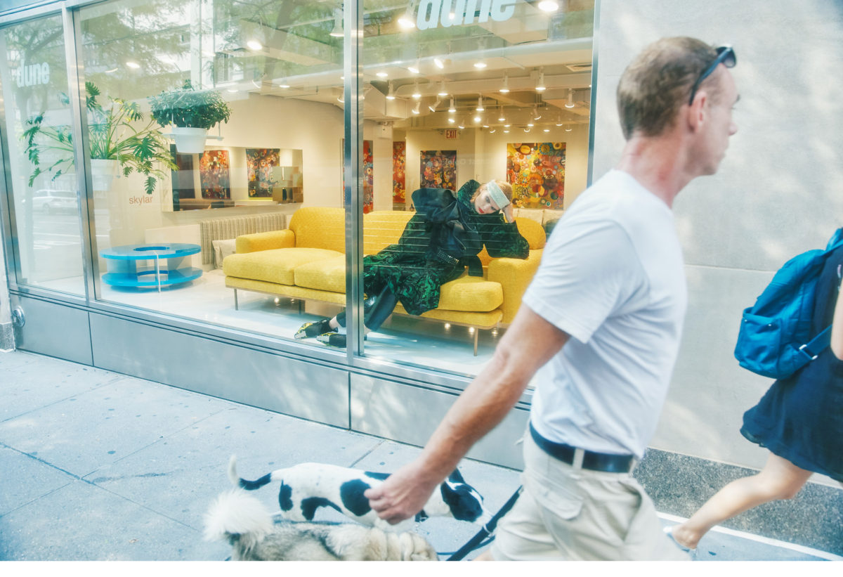
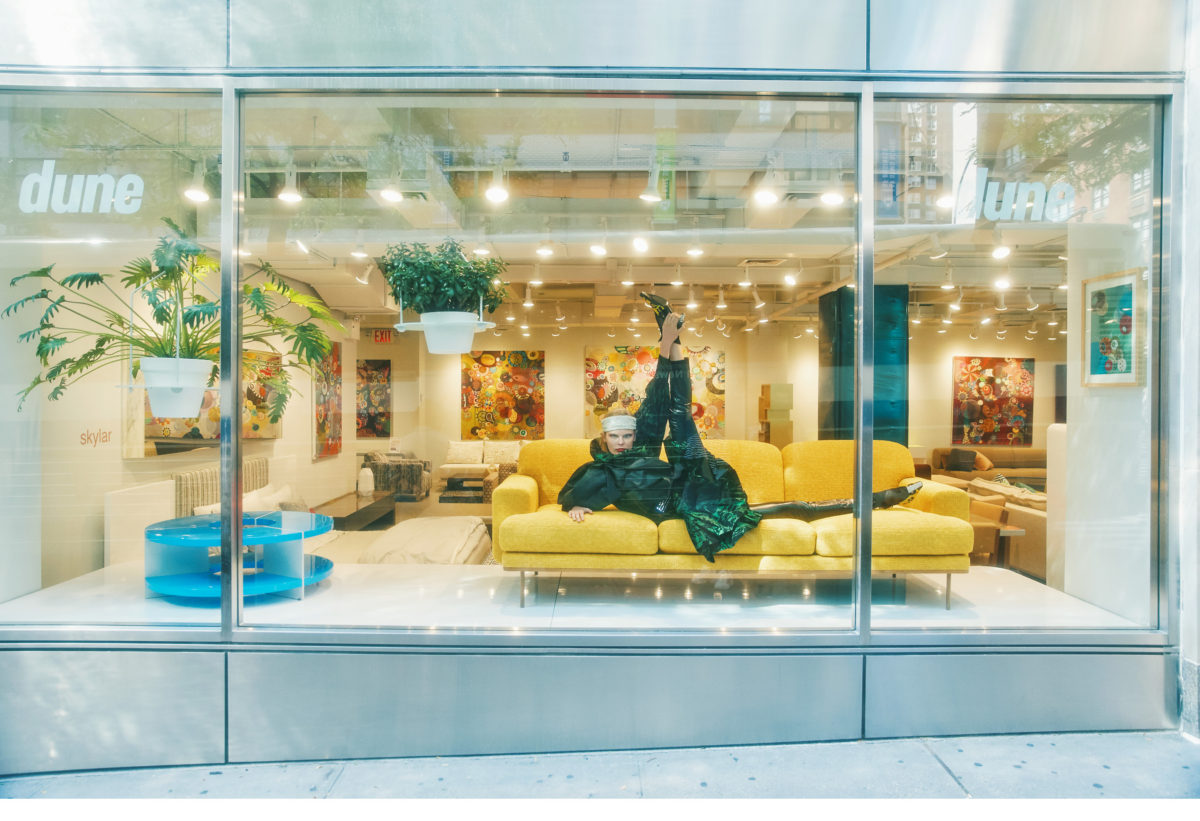
Silk green and black print dress and silk black belt worn over the shoulder by Marc Jacobs, Vinyl body corset by Alexander Wang, Crystal headband and kitten heels by Tom Ford, Spandex liquid leggings Stylist own

Sofa – Cloud by Richard Shemtov, Table – Double Zero by Richard Shemtov

Green and black print, silk dress and black silk belt worn over the shoulder by Marc Jacobs, Vinyl body corset by Alexander Wang, Crystal headband and kitten heels by Tom Ford, Spandex liquid leggings Stylist own

Sofa – Cloud by Richard Shemtov, Table – Double Zero by Richard Shemtov

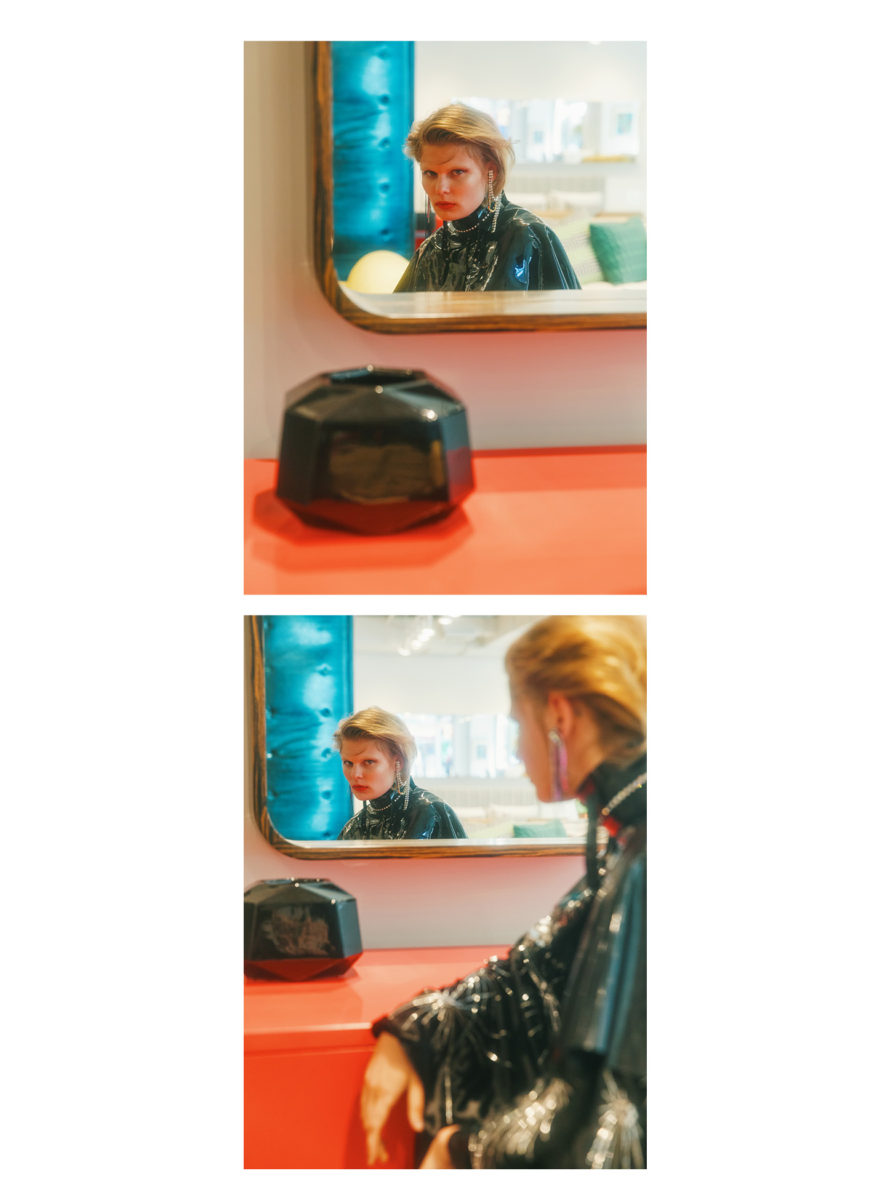
Black velvet embroidered cape by Erdem, black latex cape + crystal and latex belt worn over the neck by Tableaux Vivents, crystal earrings and hair clip by Area

Mirror – Ledge by Michael Solis, Desk – Halo by Karim Rashid

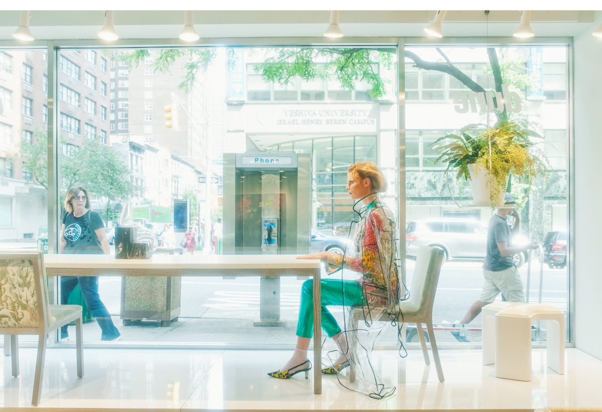
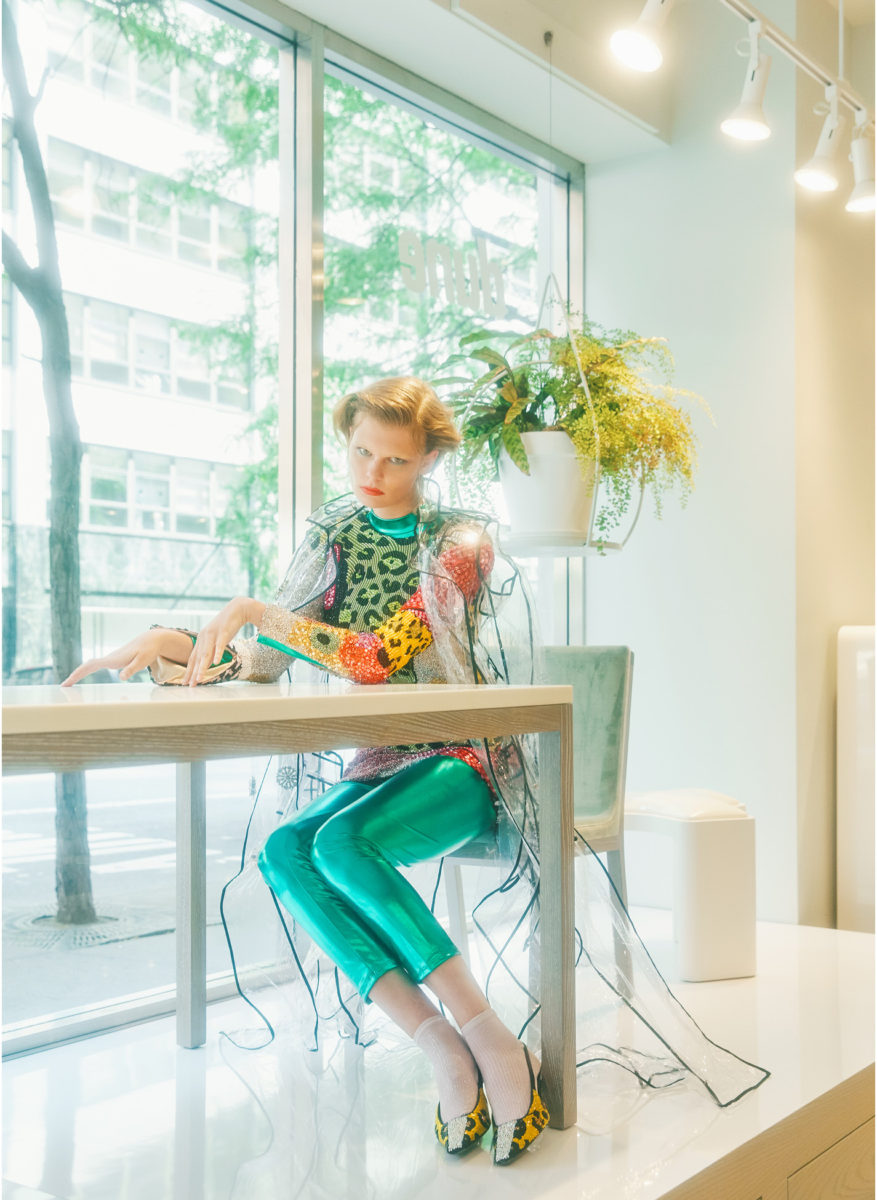
Crystal embroidered colorful dress by Tom Ford, clear vinyl jacket by Philipp Plein, crystal embroidered kitten heels by Tom Ford, green spandex liquid full bodysuit stylist own, pastel pink pop socks by Maria La Rosa

Dining Table and Chairs – Margot by Sarah Fels, Stool – Jedi by Richard Shemtov

Crystal embroidered colorful dress by Tom Ford, clear vinyl jacket by Philipp Plein, crystal embroidered kitten heels by Tom Ford, green spandex liquid full bodysuit stylist own, pastel pink pop socks by Maria La Rosa

Dining Table and Chairs – Margot by Sarah Fels, Stool – Jedi by Richard Shemtov

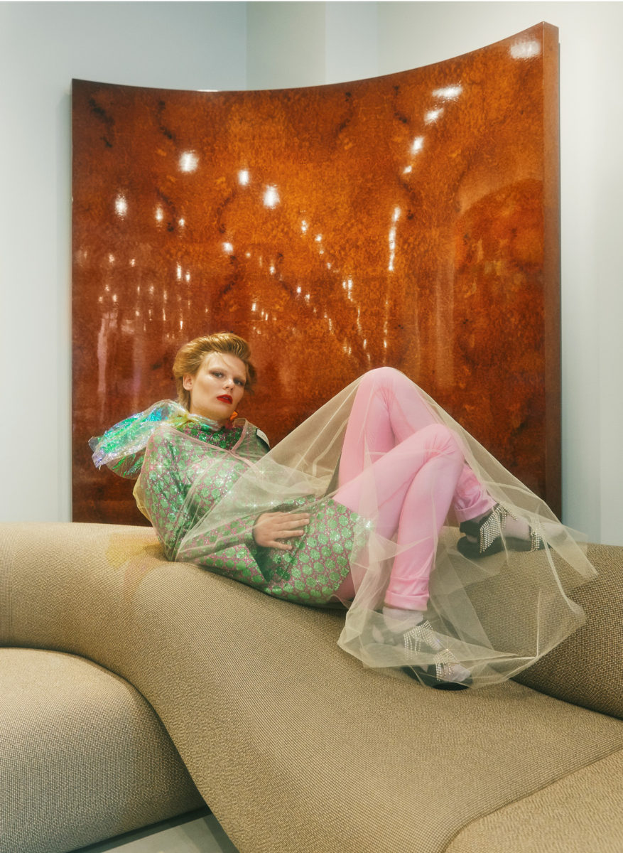
Green and pink sequin dress with nude body cape by Gucci, Pink spandex leggings stylists own, pink pop socks by Falke, crystal sandal by Area

Sofa – landscape by Nina Edwards Anker

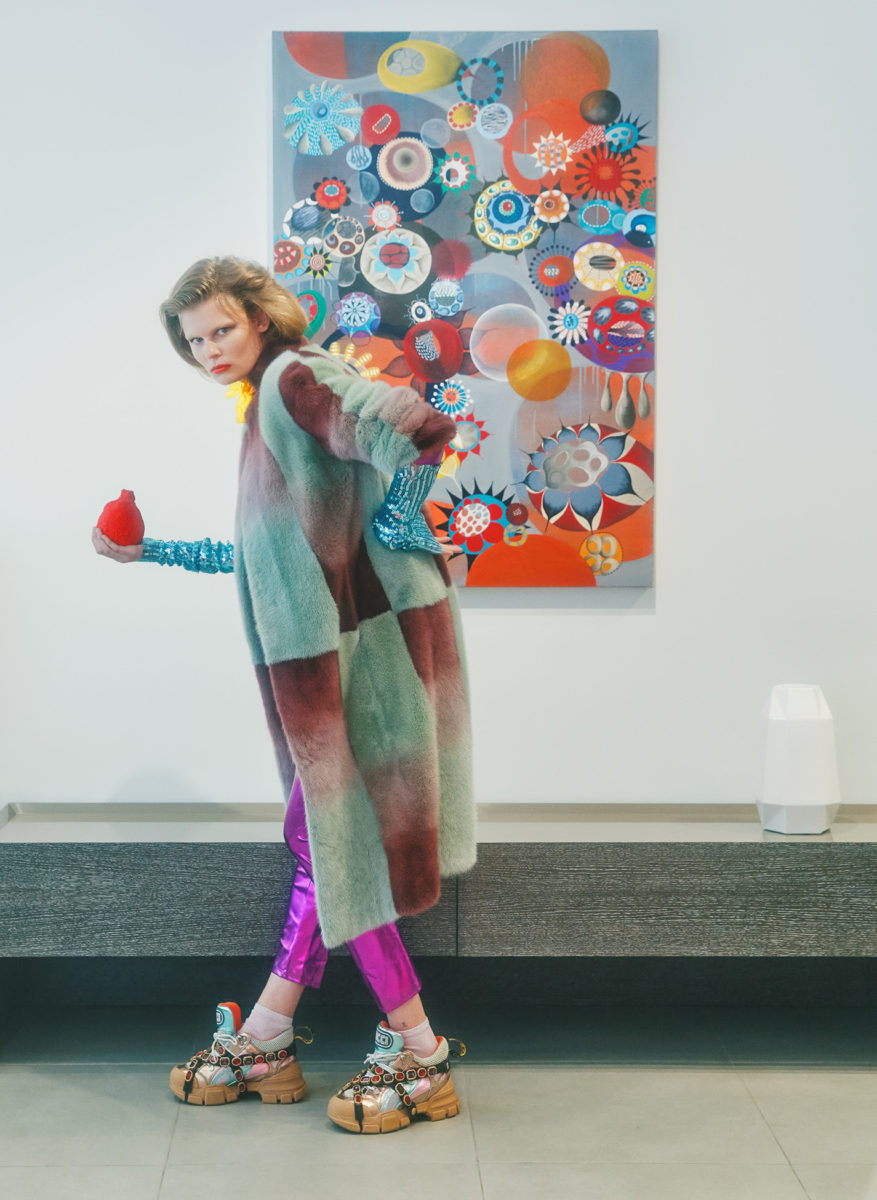
Pastel fur coat by Sies Marjan, turquoise sequin arm bands by DSquared2, purple latex liquid full bodysuit stylist’s own, pink pop socks by Maria La Rosa, crystal sneakers by Gucci

Cabinet – Fu Console by Nick Dine

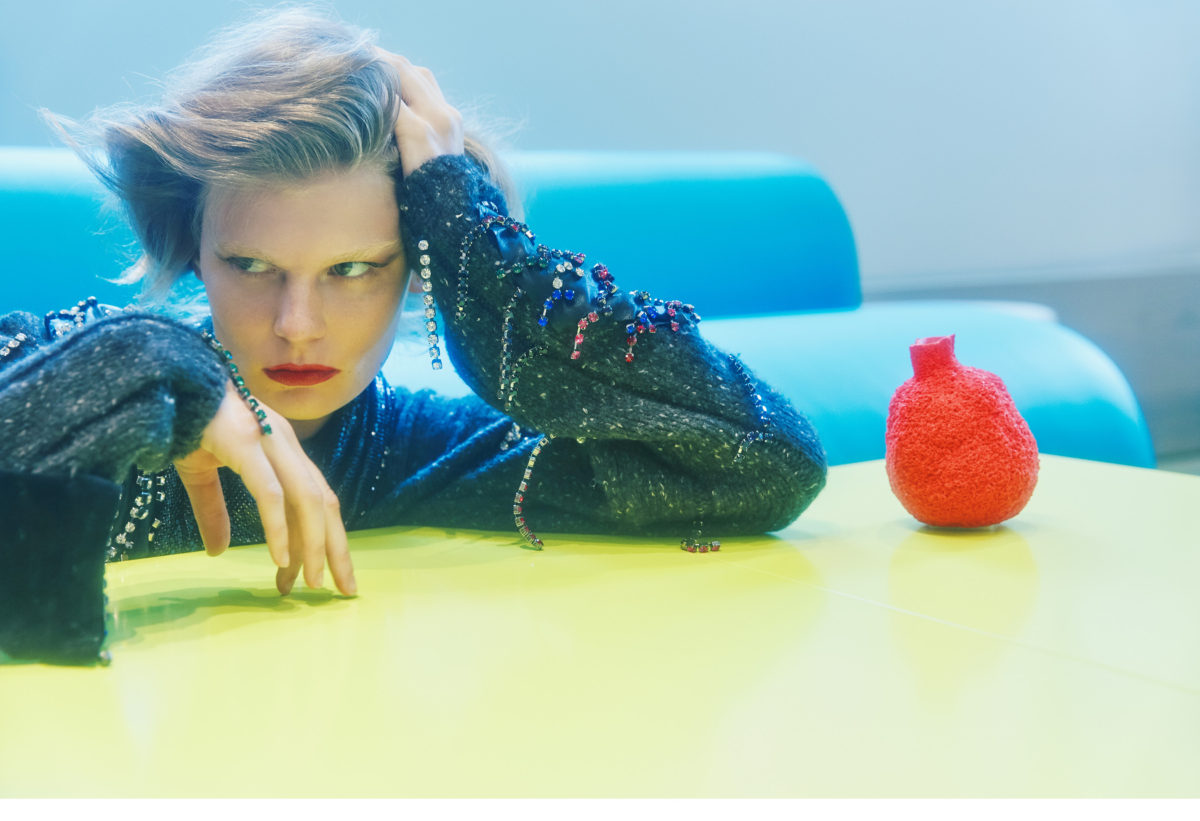
Grey wool sweater with stones by Christopher Kane, metal mesh skirt worn around the neck by Paco Rabanne

Sofa – Deluxe by Richard Shemtov, Table – Four Forty by Michael Solis

Grey wool sweater with stones by Christopher Kane, metal mesh skirt worn around the neck by Paco Rabanne

Sofa – Deluxe by Richard Shemtov, Table – Four Forty by Michael Solis

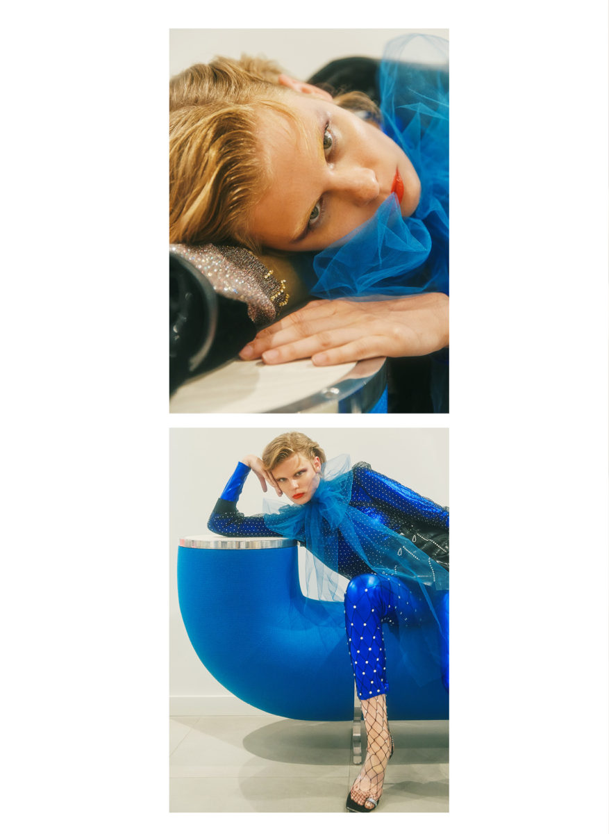
Crystal and tulle sheer top by Givenchy, latex skirt with crystals by Tableaux Vivents, blue spandex liquid full bodysuit stylist own, crystal and mesh stockings by Area, vinyl and leather heel by Alexander Wang

Bench – Pipeline by Harry Allen

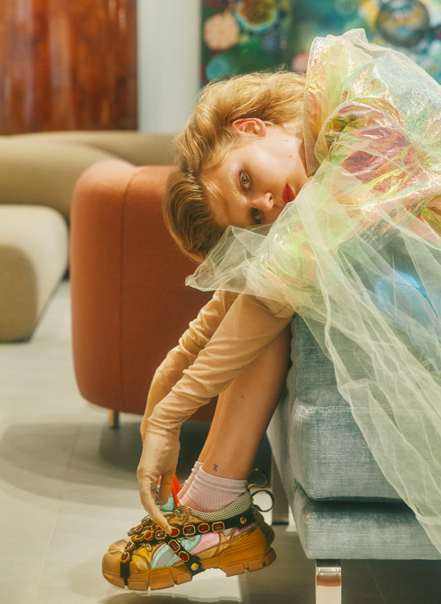
Iridescent vinyl jacket by Area, mesh nude gloves by Carolina Amato, pink pop socks by Maria La Rosa, crystal multi-colored sneakers by Gucci

Sofa – Stealth by Richard Shemtov

Makeup by Liset Garza @ The Wall Group using MAC Cosmetics
Hair by Yukiko Tajima @See Management
Production by Benjamin Price of LEO Creatives
Fashion Assistants Patrick Surach and Ashley Wooten
Production intern Louis Kang
Special thanks to Aaron Shemtov of Dune, for more information visit: dune-ny.com

LUKE EDWARD HALL

Charmingly-maximal, Luke Edward Hall’s whimsical take on interiors offers an escape from the mundane white box of minimalism.

Photography by Wikkie Hermkens | Styling by Sonny Groo | Interview by Dustin Mansyur
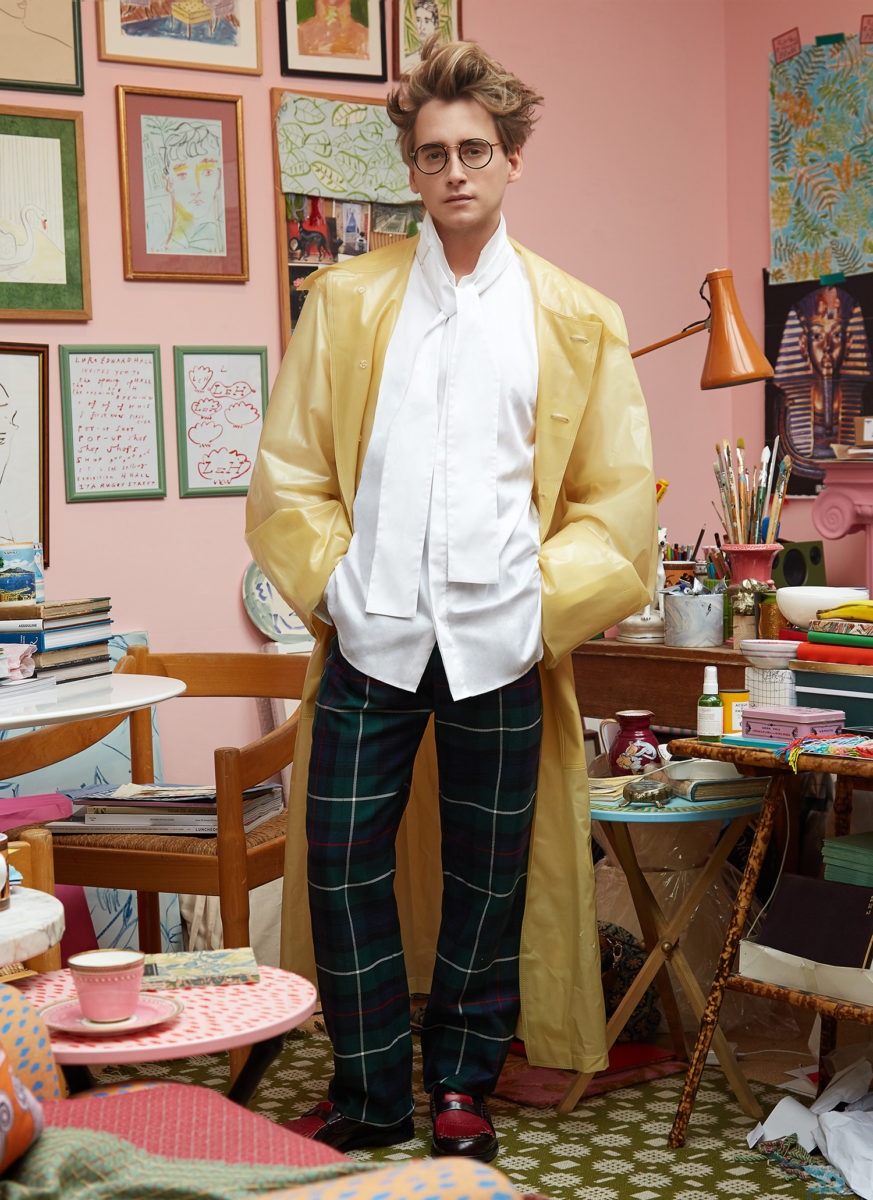
Full look by Burberry 

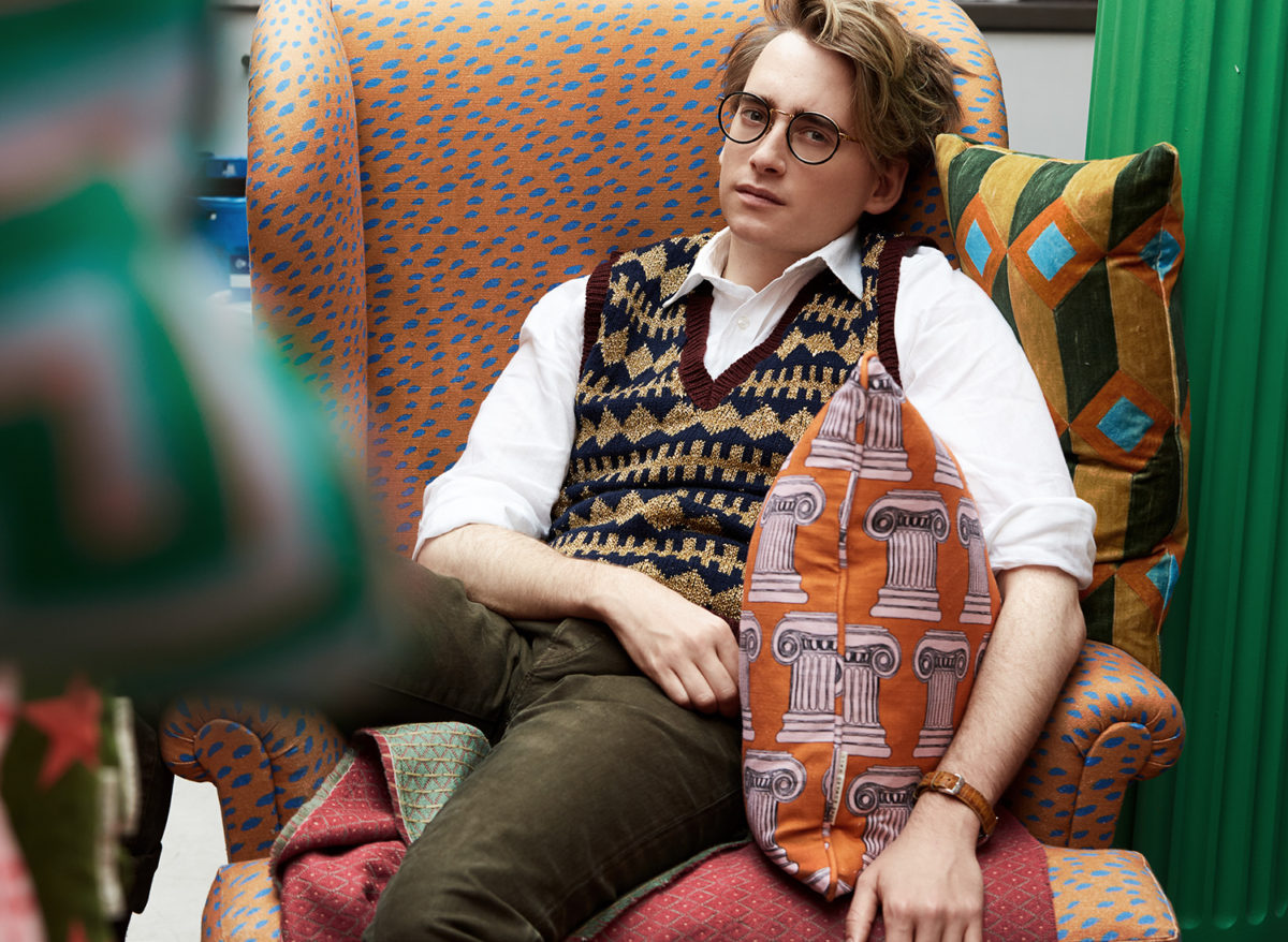
Peruse through Luke Edward Hall’s instagram feed, and one will find a story vibrantlylayered in color-clad interiors, candy-colored hues of hand painted ceramics and drawings, and peppered with images documenting the 27-year-old creative’s quixotic travels. Stylishly dandy and tousle-haired, Hall curates a dreamy world as if seen through the most decadent shade of millennial pink lenses. A visit to his North London studio enforces the idea, with it’s bubblegum-painted walls and scatter of colorful tools and materials strewn across his work table. Daring fabric remnants, bouquets of colored pencils and brushes sprout charmingly in a collection of vintage mugs and vases, vintage photographs, magazine clippings, and the occasional tchotchke clutter the artist’s space like a decorated nest. In the center, a spot is cleared away, just big enough to entertain a drawing in progress.

Hall has been dubbed by Vogue.com as the ‘interior design world’s wunderkind’, a hefty seal of approval for a budding artist and designer. With a variety of blue-chip collaborations with companies like Burberry, Drakes, and Stubbs & Wootton already in his portfolio, Hall is positioned thoughtfully for longevity. His idyllic watercolor brush strokes, and gestural, simplified drawings elicit an understanding of the same subtleties of Matisse or Picasso’s more expressionistic works, while an array of products he’s created in-house suggests similar branding sensibilities of such design heavyweights as Jonathan Adler or Kelly Wearstler. The romance exists in the visual language Hall uses to couple his creative vision with commercial potential, resulting in the fanciful prism of his nostalgia inspired work.

Here IRIS Covet Book offers a glimpse into the auspicious world of Luke Edward Hall.

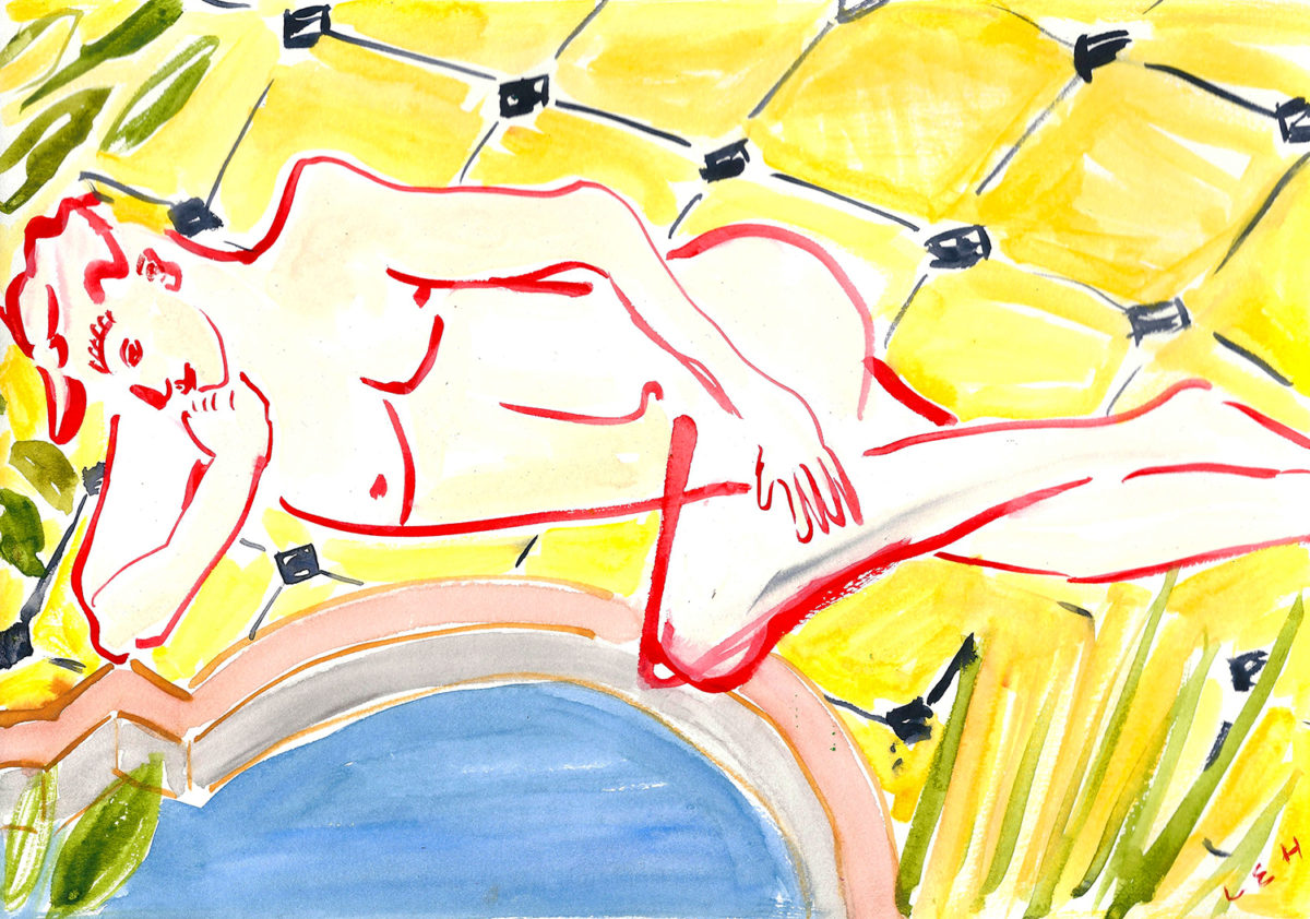
‘Gervase by the Pool’, 2017

You actually studied menswear at Central Saint Martins before you established your studio in 2015. Your career has really blossomed as an artist, but also as a designer of objects. What influenced your decision, or what shifted your focus, I should say rather, post-graduation, so that you went down this career path as opposed to choosing to stay in men’s wear design?

I always had an interest in antiques and interiors as well as fashion. While I was studying menswear, I was also selling antiques online. When I graduated I met an interior designer in London, whose style I really admired. So I ended up going to work for him, and that’s how I got more involved with interiors. It wasn’t something that I decided, it happened quite naturally.

Then what helped you to make the decision to venture out on your own after working with that architect that you mentioned?

I always knew that I wanted to have my own thing. When I was working full time, I started designing fabrics. I began putting more work up online, and I started doing much more drawing. Then, eventually, I got a few commissions — enough that allowed me to set my own thing up. I worked quite hard to get my work out there, so that I could be able to go out on my own.

What avenues did you pursue to increase your exposure?

Obviously, I’ve had a lot of work up on Instagram from the beginning. But, early on, I started making products like cushions, fabrics, and prints of my work. I had a lot of product that I could sell. I just tried to make sure that I had my work out there as much as I could. Eventually it began being published in magazines.

Do you do all of your fabrics in-house or are you licensing your designs through a fabric company?

It’s full-time in-house. Coming from a fashion and interiors background, I always appreciated good fabric. After I sketch up the design, I’ll print them out and work with a factory to produce them in very small runs to be used in my cushions and other products.

Can you describe what your studio’s like? Do you share space with others? What is it like when you are there?

I work with my friends in an art gallery where I have a space in the back. It’s really nice because it’s very close to where I live, five minutes away. I have this corner of a room that I’ve painted pink. It’s where I work on all of my projects.

What’s a typical day in the workroom like for you?

I go in every day because there are lots of new things happening. I always have meetings and a variety of projects to work on. Sometimes I’m working on foreign accounts, sometimes I’m drawing, other times I’m painting pottery or sourcing fabrics.

Voluta and Luca Cushion by Luke Edward Hall

You describe your aesthetic as being informed by a love of history, an appreciation of beauty, and a sense of playfulness. Do you have any specific historical influences that you find inspiring from which you pull inspiration?

I draw inspiration from history because often I’m inspired by the stories. I love looking back at ancient Greek myths and legends, also English folklore. I love reading about times in history, like the 1920s and ‘30s, especially in London. I’m quite nostalgic.

Your work is very sophisticated. How do you draw the line between playfulness and something that’s considered kitsch?

The thing is, I do like a little bit of kitsch, but I don’t want what I do to be so gaudy and outrageously mad that it becomes off-putting. I think you can be playful with color and print without sacrificing elegance and sophistication, which is a nice balance for interiors. I love playing with tradition or history, and trying to achieve the balance of pairing something very old with something very new. Curating the right pieces together is always a fun process.

I feel like today people consider minimalism and modern design as being somewhat synonymous, especially when we’re talking about interior spaces. Your approach is anything but minimal and yet reads as modern. Do you think there is a shift in the consumer market towards a more “decorated” approach?

There’s a general shift toward people being more interested in a more maximal approach, which I think there’s lots of reasons for that. Like with fashion, things come in cycles. I don’t really think of my lifestyle as maximal…it’s more that I just like being surrounded by my “stuff ”. I like having lots of color and pattern, and that look is typically classified as maximalism. The thing with maximalism in the interiors I like, is that it offers a little bit of a fantasy. I guess that’s why I look at the past, as well. I like the idea of creating something magical into which you can escape. The world we live in at the moment is quite grim at times. I think that’s partly why more people are taking to this trend because perhaps they need an escape from the everyday as opposed to living in a white box.

Based on your Instagram, it appears as though you travel a great deal. Is it a source of inspiration as well?

Travel is a huge source of inspiration. Italy is a really inspiring place for me to visit and work; I go there a lot and bring inspiration back. I always feel refreshed after going to the countryside in England because I find the city to be quite intense. Travel for me is just as important as my studio days. When I travel, I end up working every day, and always get re-inspired by the many things I come across.

You’ve collaborated with so many high profile companies already across several different luxury consumer markets, Burberry, Drakes, Christie’s, Stubbs and Wootton, and even Samsung, what have been some of your favorite collaborations to work on and why?

They’ve all been great for their own reasons. I only collaborate when it feels like the right fit. It has to be something that I feel really passionate about and connected with. Burberry is an amazing company to collaborate with because their reach is worldwide. It was very exciting when that opportunity happened. I also have always loved Stubbs and Wootton, so it was really fun to work with them to turn my drawings into embroideries for their slippers. Drakes was also a great collaboration that gave me the opportunity to see my drawings on silk for ties and scarves. It’s a great experience working with other people when they do something really well. It allows me to add my touch to it, and we come together and create something beautiful.

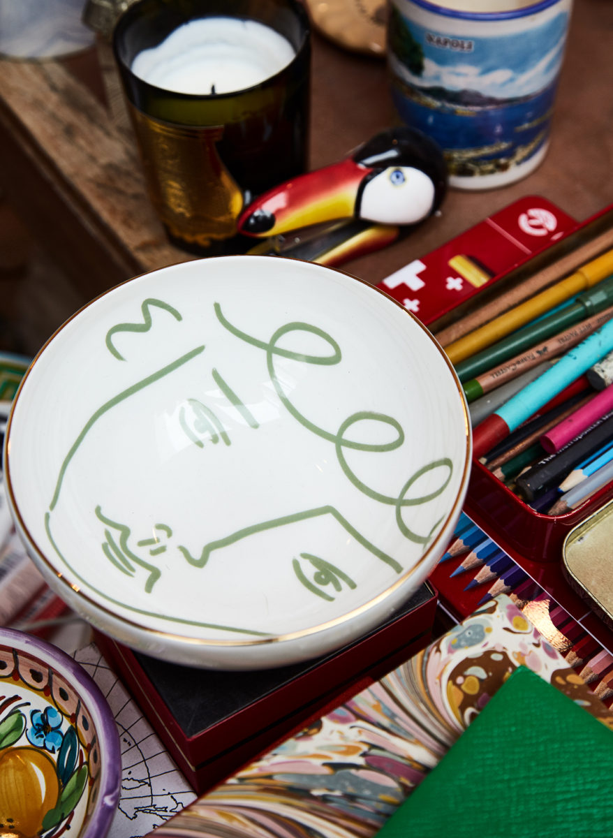
 Luke Edward Hall x The Store ‘Face Bowl’ (available from The Store x Soho House Berlin and The Store x Soho Farmhouse)

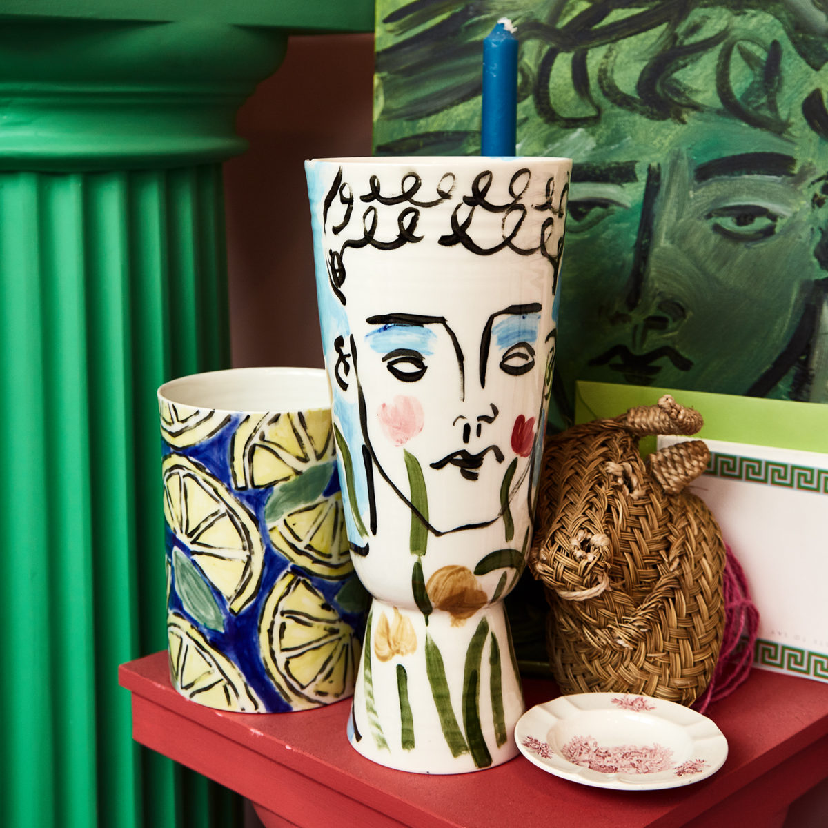
Vases From Left: Lemons, 2016, Flower Prince, 2017 (Personal Collection)

You’re working on many different projects that span different disciplines, do you do all the your own business development or do you work with an agent?

It’s sort of a mixture. I don’t employ anyone. I just work by myself. I have an agent for Europe and they get me more illustration jobs. Most of the work comes to me, though. If the project involves working with a bigger company, I may hire someone short-term if needed, and I have relationships with vendors to produce what needs to be done.

I feel like drawing, itself, is such pure, analog art form. Now, we’re living in a post-digital world, all connected to a screen, advertising ourselves online on whatever platform we can. Do you think that social media and the Internet are simply just an extension of the artist’s tool kit?

I don’t think everyone has to engage in social media. I completely appreciate the people being like, “Oh, I’m not doing it. I’m not doing Instagram,” and that’s totally fine. For me, I like having a visual diary to see and process what I’m working on. I’ve always liked working on blogs and documenting what I’m doing. I’ve received lots of work through Instagram. When I got my first big job, which was for the Parker Palm Springs, it came from Instagram. So I owe a lot to it really, because it’s helped me. If you don’t need it, fine, but it can definitely be a great tool. If you can get greater exposure, then I think, why not make the most of it?

Warhol said, “Being good in business is the most fascinating kind of art.” You have an ecommerce portal on your website, you also have 1stDibs shop, and you did a pop-up shop last year. I’m curious what entrepreneurship means to you. How do you maintain the balance between art and commerce, being commercial without sacrificing your vision?

I’ve always been fascinated by retail. And while I like drawing and painting, I also like making products. When I first started selling antiques online, I’d go buy old antiques and restore them for resale on 1stDibs. I love graphic design and the process of branding things, so creating a variety of products with my artwork was natural. Now, I’m thinking about doing a little exhibition next year, so I’m setting aside time to work on those pieces. Maybe people think, “Oh, well, you’re not a real artist, you’re more of a designer.” I don’t really mind what label I’ve got. I think you can have all of these worlds that fit together, and I quite enjoy doing it.

I saw images online of your pop-up shop. Do you ever think you’ll venture into doing a little shop, a flagship store, for all your creations to live within?

At some point, I will probably do some shop type of thing. The thing is that at the moment I’m doing one-off pieces. I almost went down the route doing more products, but I’m now fixating more on hand-made ceramics, which are hand-painted and all one-off pieces. During the holiday season, I make more pieces and products for online and pop-ups. Right now my focus is on projects like the exhibition next year, which is going to be drawings, prints, and ceramics.

Do you have any advice that you might give to a young person considering to choose this as a career path?

Make sure you feel it pulling your heart; be brave. Go for it and believe in yourself. When something is completely yours, I think people always pick up on that. So do what makes you happy, because that’s what people respond to. You need to couple that with being on it as a business, thinking about social media, and having a bit of a strategy to give you direction. I do think you do need to have both sides – a creative side and a business side – in order to make it a success.

You’ve worked on many of amazing projects and I’m sure you only want more, but what do you envision for yourself in your future?

That’s the thing. I don’t actually have a plan. I’ve got so many exciting stuff happening, like the exhibition next year, and I’m going to carry on doing more interior projects. I’ve only been doing it for two years by myself so there’s still a lot that I want to do. I’d love to do a book and I like the idea you have, maybe, opening some sort of showroom. But for now I’m also just playing it by ear. I’m happy to just let things happen.

For more information visit lukeedwardhall.com

JACOB SUDHOFF AND JERRY HOOKER

Giorgetti Houston was merely a dream project when Jacob Sudhoff & Jerry Hooker first conceived the idea. Inspired by an heirloom-quality chair that the couple had purchased, Sudhoff, CEO and founder of Sudhoff Companies, and Hooker, principal at Mirador Group, imagined something far grander than the lackluster “luxury” condo developments that were sprouting up throughout the Houston market. The marriage of aspirational living with one of the world’s finest Italian cabinet and furniture makers was the couple’s muse when envisioning Houston’s first luxury-branded residential building. To be fitted with cabinetry and closets designed and manufactured by Giorgetti was simply not enough, as the couple visualized an all-encompassing lifestyle for the future residents of the building. High-end furnishings, paneling, lighting, carpeting and accessories curated by the couple and crafted by Giorgetti, will fill in the brushstrokes of the brand’s identity. Even the most seemingly-minor details, such as how the bricks are laid or the color palettes that will transform the spaces, are inspired by individual furniture pieces created by the Italian label. Certain to be one of the most-sought after residences, Giorgetti Houston will boast seven stories and 32 handsomely bespoke homes that will be timeless works of art at the interstice of luxury living.


Here IRIS Covet Book shares a conversation with the real estate and design moguls behind this ambitious and exciting project.

IRIS07_JerryJacob-1

DM: Where are you from originally and how did you both come to call Houston home?

JERRY: I grew up on a farm in Tennessee in the middle of nowhere and waited my whole childhood to get out of rural west Tennessee. After graduating high school, I went to LSU (Louisiana State University) because it was the top-ranked program, which later led me to New York for three years. My older sister and her husband lived in Houston, so I always wanted to call Houston home to be close to family. I just needed my career to catch up to where I wanted to be, before I ultimately moved back here.

JACOB: I grew up in Corpus Christi and moved here in 2010. I’m from south-Texas, born and raised. I always wanted to move to the city, so I looked at New York, Miami, Atlanta, Dallas, and Houston, and I decided on Houston. To break into a new city, I felt Houston was the most accommodating and had the best opportunities. I found that Houston was a welcoming city and I think everybody here will always give you one opportunity to prove yourself. So that was a refreshing aspect about working and starting a career here.

DM: Did you two meet here in Houston, and how long have you both been married?

JACOB: We’ve been together as long as we’ve been in Houston, so a little over six years and married for two years just this past Valentine’s Day.

JERRY: When I was living in New York, one of my closest friends there was from Houston, and he knew Jacob from the past. I had come home to surprise my sister for Christmas that year, and went out with friends for drinks the evening of Christmas Day. That evening, a friend of mine told me, “There’s this new guy in town, and I want you to meet him.” But that was prefaced with, “But he’s dating one of my friends, so stay away.” But that just sounded like a challenge that I could conquer. Ever since then we’ve been together [laughter].

DM: How long have you been working in your respective fields, and what gave you the desire to get into those fields?

JACOB: I’ve been in real estate for 20 years. When I was a kid, I used to enjoy riding my bike around the neighborhood and going through all the open houses. I have a photographic memory, so I used to memorize all the statistics and floor plans of the houses I’d walk through. My grandfather was a realtor and he naturally had an influence on me. At the age of 16, I started working for a broker out of Dallas named, Marilyn Hoffman. When I was a teenager, I used to ride horses. I was at an Arabian horse show in Fort Worth, and ran into her booth where she was selling multi-million-dollar mansions and horse farms. When I was 18 and after I got my real estate license, I worked for two years as her assistant. When I flew up to Dallas for the first time, she picked me up in a Rolls Royce, and we went shopping. I lived in a lower-middle-class family, and being introduced to her lifestyle was like seeing Lifestyles of the Rich and Famous in real life. In fact, she was on that show many times with all her listings, so it was a culture shock for me. While I worked for her, I went on to open an office in Corpus Christi for her.

JERRY: I went to school for urban design, architecture, landscape, and have been in it ever since. I’ve been in this field for about 10 years now. Originally, I was following in my sister’s footsteps because she and her husband were the only financially-successful people in my family. I thought I was going to be a golf course architect, but I soon figured out in the first year of school that that was not my calling in life. From my experience in New York, I discovered a niche by combining my interests in architecture, landscape architecture, and interiors. Naturally, just loving the process of home construction is why now we’re involved in all three disciplines meshed together.

IRIS07_JerryJacob-4

DM: Do you have any professional mentors or someone who’s inspired you in your career and encouraged you to go after your goals?

JERRY: For me a great mentor is someone who has a combination of career success balanced by successes in their personal relationships. My sister has been that consistent person in life and business that I admire. With her relationship, with her family, and also with her business because she is able to balance them all. I always wanted to emulate that.

JACOB: I would say my most recent mentor is my business partner, George Lee, whom I met when I came to Houston. He is a good man that has stepped in and acted like a mentor to both Jerry and myself.  

JERRY: He’s kind of like a father figure to us now. From a business perspective, he has taught us so much. I don’t think our companies would be as successful without his advice and influence.

DM: Were there any challenges that you’ve had to overcome in order to reach the level of success that you’re currently experiencing?

JERRY: We both have had normal business growth spurts and growing pains, but luckily, we listened to people like George, and learned through other people’s hard times in order to better manage our own.

JACOB: In Corpus, I struggled more than I have in Houston. I didn’t have a mentor there, so it was more difficult. Coming here and having a mentor has really helped whenever there have been issues. George has been what’s gotten me through those challenges properly.

JERRY: We’ve had struggles that we thought were the end of the world, but I still feel like in hindsight and compared to plenty of other people we know, we were fortunate enough to make it through them.

DM: Do you have any daily practices or habits that help you as an entrepreneur?

JACOB: I think routine is very important. We are very strict to a routine. We’re in bed by 9 o’clock almost every night, and I’m up at 4. We prefer to have our days very structured. We live by appointments during the day. Weekends—we still work, but it’s more on the passion side. We enjoy looking at houses and touring properties or looking at land. I think it’s something that has helped us because we love what we do.

JERRY: Because we’re passionate about what we do, a large portion of it feels as enjoyable as a hobby and not so much like work. Even when we travel, we like to look at houses and get ideas so we can be inspired for the next project in Houston.

IRIS07_JerryJacob-3

DM: Thought and visualization are very powerful tools in achieving success in manifesting different desires that you might have in life. Have you ever utilized these practices, and if so, could you share a specific experience?

JACOB: On our honeymoon, we went to Borobudur, one of the largest Buddhist temples. While we were there, we chanted with the monks. After that experience, I started to get into meditation. It’s not something I do every day, but it’s something I do often. Years ago I signed up for a service on tut.com. After signing up for it and taking the initial survey, the service sends you a message from “the Universe” daily. The main message of the Universe is to just relax and visualize where you want to be. I receive those messages Monday through Friday, it’s nice way to remind myself to visualize where you want to be, whether that’s tomorrow or 10 years from now. In my opinion, visualization is a key to success.

JERRY: I like the perspective of retrospect—thinking about where you came from and trying to check in with yourself to maintain humility. I always try to bear in mind where I came from and the experiences that I’ve had because everything started with that foundation, and my future is built upon that.

DM: There’s a good balance between you two. What are some unique features or services that your companies provide to the Houston market that makes you stand out amongst your competitors?

JERRY: It’s really the integration of our companies that allows us to stand out. Everything that we can offer our clients is because of the dynamic that we bring together, from the sales and marketing to putting the structure of the deal together. It’s a truly comprehensive approach to real estate developments, regardless if it’s a high-rise condo or a single-family house. Most of the time, creatives are horrible business people, but my hat is split between finance and actual design. I care equally about both of them. My team counterbalances me since they are all about the design. That definitely goes into Jacob’s deal-making process to make sure the numbers work up front to ultimately hire our own companies to do the sales, marketing, and design. It’s a wonderful collaboration!

JACOB: And I believe we do more. I still own and manage the brokerage firm, but the main hat I wear right now is more of a developer’s partner. I help structure the deal, help raise the equity, and help manage the concept and the programming of the projects. And at the end of the day, it’s about the bottom line and profitability, but also the philosophy of sales and how the projects will absorb into the marketplace upon completion. We’re not just a private equity firm or just an architecture firm, we also own a land-planning firm. So it’s really the integration of all these together which allows us to play a large part with each one of our clients.

DM: What projects are you currently working on together, and is it enjoyable for you to collaborate with one another? I imagine you must continuously feed off each other’s energy.

JACOB: What we like is we’re able to change Houston’s landscape. So we’re bringing more architecturally significant projects to Houston. I think that that’s something that’s really exciting for us. So the first branded building that we’re doing right now is Giorgetti Houston, and that’s only the first—we’re working on several more branded buildings. I’m excited to bring and to have Houston be an incubator of unique and forward-thinking projects. There’s dozens of projects we’re currently working on and dozens more in the pipeline!

JERRY: For the Giorgetti project, we knew the piece of property, and we knew it needed to be a condo building. But at the same time, it needed to be something special, so we started thinking about brands to collaborate with. We had purchased a piece of Giorgetti furniture a long time ago, and the more we learned about its construction, along with the family heritage and philosophies that they’ve had for over 100 years, the more interested we became in collaborating with them. We jumped the gun and went ahead and did some preliminary designs for a building. We coordinated a meeting with the company to share our idea. The CEO of the company even came from Italy to meet with us. Maybe he thought we were crazy, but we were able to prove ourselves because we had studied the brand, its philosophies, and how to make an environment truly Giorgetti. It’s not just the kitchen cabinets. It’s not just the closets, but it’s the furniture, the lighting, the rugs, and the accessories. It’s how all these details translate into the Houston market.

JACOB: We went to Italy and took it a step further. After they came and agreed to further this conversation, we went to Italy to visit their factory. There we saw in depth all the details of how things are constructed and learned even more about their philosophy. Everything within our building—from how we’re laying the brick, to the façade of the building itself, to all the materials and color palettes is all inspired by different pieces of Giorgetti furniture.

JERRY: It made a lot of sense to us to try to partner with them and luckily, we were fortunate enough that they agreed. It’s actually been a pretty beautiful process so far.

IRIS07_JerryJacob-2

DM: Is this the first branded residential project of its kind in Houston?

JERRY: In essence, this is the first branded building of this kind in Texas, and Giorgetti is sold in 67 countries across the world. They’re actually better known in London or Paris or New York or Singapore. But they allowed us to do it first in Houston, so we’re very proud to be collaborating on this together.

JACOB: It was a perfect storm of us really wanting it, and being such a big part of the development process, that we were able to push something like this forward. Giorgetti had attempted another project that did not go through. I think it’s a big compliment from them that they wanted to be a part of our project.

DM: And how has the response been from the consumer?

JACOB: Houstonians were not informed about the Giorgetti brand. But as people got to know the brand and they understood, they developed a respect for it. Now it has really taken off.

JERRY: Sales are going well, and we’ve basically eliminated any question of the project not happening anymore.

JACOB: The quality of buyers in the project are fantastic. These are people who are art lovers and who understand quality and craftsmanship. So each piece of Giorgetti furniture is designed by an architect and for us each home is sort of it’s own piece. I actually think it’s going to be one of the few condominium projects that will be sought after once it’s built. Once they can walk in and experience what a Giorgetti home will be like, then they’ll really want it and strive for it. Giorgetti will only allow us to do this one building in Houston, so the next one will be in another city.

IRIS07_JerryJacob-6

DM: And what’s the timeline for completion on the project?

JERRY: Assuming sales keep going as they are, we will probably start construction at the end of this year and take about 16 to 18 months to complete. So we’re looking at completion in 2019.

DM: How do you see yourself and companies evolving in the future?

JERRY: Probably just a continuation of what we’ve seen so far. I mean, our companies are very different now than what they were six years ago, and both of our companies have quadrupled their size since then. But it’s really more of an integrated approach moving forward, being more involved with one another, both offices and projects themselves. We like having a seat at the table both financially and professionally, so it will just be a continuation of that, I think.

JACOB: We’ve made a conscious effort to go deeper with our business rather than going wider and spreading ourselves too thin. That means taking a deeper relationship with each project and wearing multiple hats in each project to have more impact. And we feel that that leads to greater chances of success.

DM: What has been your favorite project to work on besides Giorgetti, either together or individually?

JERRY: Before we were together, when I was living in New York, I spent most of my time working on the 9/11 Memorial. The firm I worked for at the time had the entire Route 9A corridor, which is the West Side Highway. We were doing the World Financial Center, 1 World Trade, and all the frontages between the buildings. At the time, that was empowering. I was just a junior designer at the time, but it was something I looked forward to every day and learned a tremendous amount from. Aside from the Giorgetti project, our first showcase home that we designed and built together is a favorite because it has led to so many other amazing projects.

JACOB: When I first got to Houston, the market was not very good. George had invested in a lot of different projects that were all in peril. I went to the different banks and negotiated the debt and purchased out all the debt at discounts. I was able to save a significant amount of capital for George and prove that I was able to achieve the results. I demonstrated that I was capable of doing more than just being a traditional realtor. And that led into having us invest and start being the private equity for all these different builders and developers. Giorgetti has been a special project because there’s been—it’s had a lot more of an emotional connection—it’s been the best collaboration between us.

DM: You both have experienced so much growth through your collaboration with one another.  I’m curious when do you feel most confident?

JACOB: Together.

JERRY: I couldn’t agree more. We do well in situations like this because we absolutely counterbalance each other.

JACOB: I think that our relationship has grown stronger over the years and will continue to grow both professionally and personally.

IRIS07_JerryJacob-5Photography and Interview by Dustin Mansyur|For more information visit giorgettihouston.commiradorgroup.com | sudhoffco.com

GARRETT HUNTER – ROOM WITH A VIEW

We have found ourselves in Garrett Hunter’s River Oaks home, surrounded by white walls which act as a blank canvas for the pops of color and texture from the artwork and furniture which seem to play off one an- other and fill the space with energy. Light pours from the wall of windows, further illuminating the warm tones of marigold and pink streaking throughout the home. It is clear that Hunter has a very specific and unique point of view once you walk in–he has mixed an antiquated trunk, modern art pieces from famous furniture dealers and designers, as well as a hefty dose of pattern and color which he is known for. Here, straight from the interior designer himself, we are told about his beautiful home, its inspirations, and his personal design aesthetic.

Beautiful design exists in all kinds of compositions, from the exuberance of ‘le goût Rothschild’ to the spatial voids of John Pawson. Often, what distinguishes a great interior designer is not just the ability to assemble together great objects. Rather, it is the context of those objects and the way they are juxtaposed to create a kind of synthesized bliss that makes for a truly great environment. Historically, the most memorable interiors are either hyper-designed to the extreme, or confidently simple and tightly edited. I follow this as my own modus operandi – my work tends to reflect these two philosophies, avoiding everything in the middle; I have absolutely zero interest in ever having a “look” from one project to another.

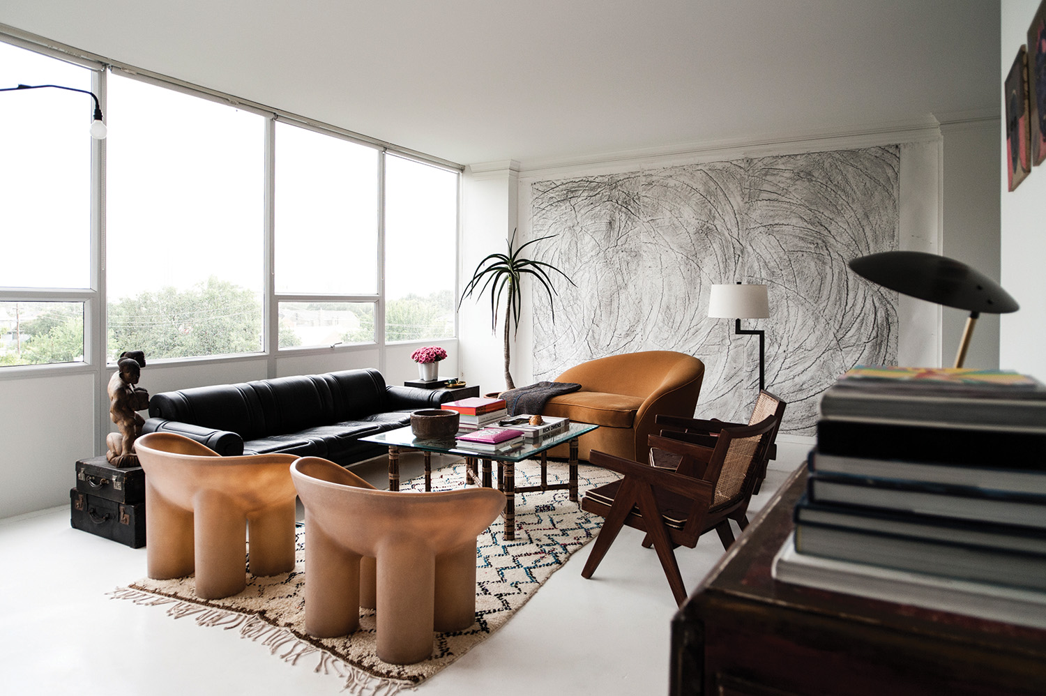
For the home Jaime Loera and I share in a high rise on the edge of Houston’s River Oaks neighborhood, I lean towards an aesthetic that is curatorial and edited, yet exudes a casual tone. The space is composed of a series of pristine light-filled volumes; devoid of extraneous detail with instead an attention to materiality. There are only a handful of elements contributing to the palette: concrete sheathed in white yacht paint, Calacatta marble, black glass and a span of wall-to- wall windows stretching the full length of the south elevation. The rest is comprised of big walls to showcase art. Within such a simple envelope, every piece inserted into the mix commands attention. The cohesion or friction caused from introducing these disparate elements into the space is magnified, and color comes into the equation in the form of the view, the artwork, and the people inside the space. I chose to complement the modernist architecture of the iconic building, but also challenge the clean lines with exotica and a sense of humor.

When one first enters, they are in a foyer-cum-gallery, with black glass sheets laid as flooring, and works on display by Dash Snow, Jules Buck Jones, and Kent Dorn. A piece by John Waters commands the far end of the gallery, pivoting 360 degrees to reveal alternately the numbers ‘7734’ or the word “HELL”. The other end leads into the living room, where a massive eleven foot wide by nine foot tall work on paper by the New York based artist Aaron Young covers the west wall. It speaks to the mix of furnishings in the space, from a leather and steel Maison Jansen sofa from the 1970’s, to a pair of large resin Faye Toogood Roly Poly chairs adjacent to a pair of original Pierre Jeanneret wooden chairs. A Jean Prouvé Potence lamp hovers over the sofa from the east wall, against the wall of glass looking out over the skyline.

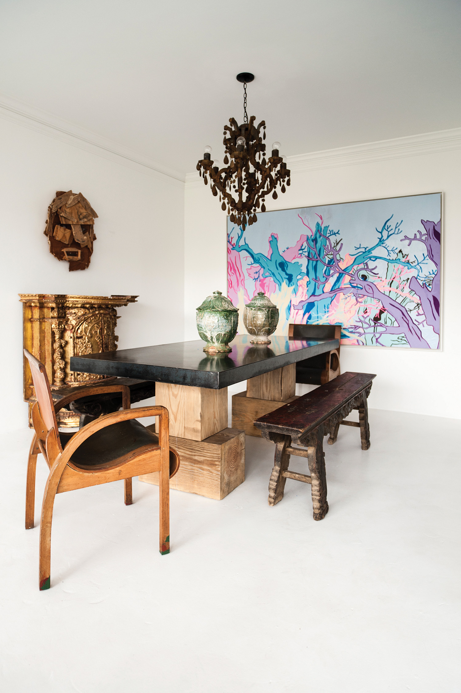
The dining room has a large table made of steel and massive oak planks by James Brummett, and was featured in an exhibition I curated in 2015 called Texas Design Now at the Contemporary Arts Museum Houston. There are antique Chinese benches flanking each side, capped off at each end of the table by two unnamed Viennese modernist chairs of plywood and old, green leather. A large-scale work by San Francisco artist Johanna Jackson in pale blue, lavender, and bubblegum pink looks out over the room, and is from my friend Marsea Goldberg’s Los Angeles-based New Image Art gallery.

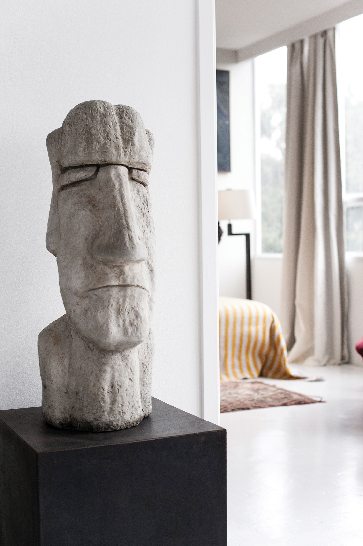
A concrete Easter island head model was a gift from my family sitting on top of a corten steel table.
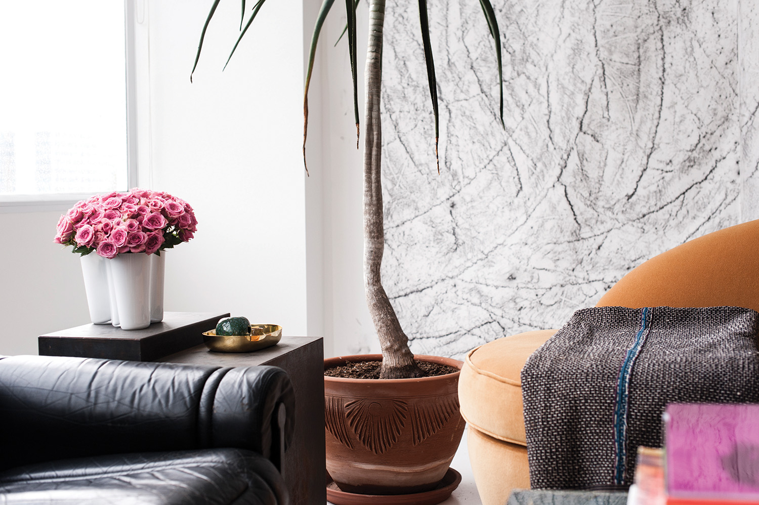
 A Maison Jansen sofa from Tienda X and a vintage French settee in velvet. On the settee is an antique Japanese quilt from Carol Piper textiles. Artwork on the back wall by Aaron Young. 

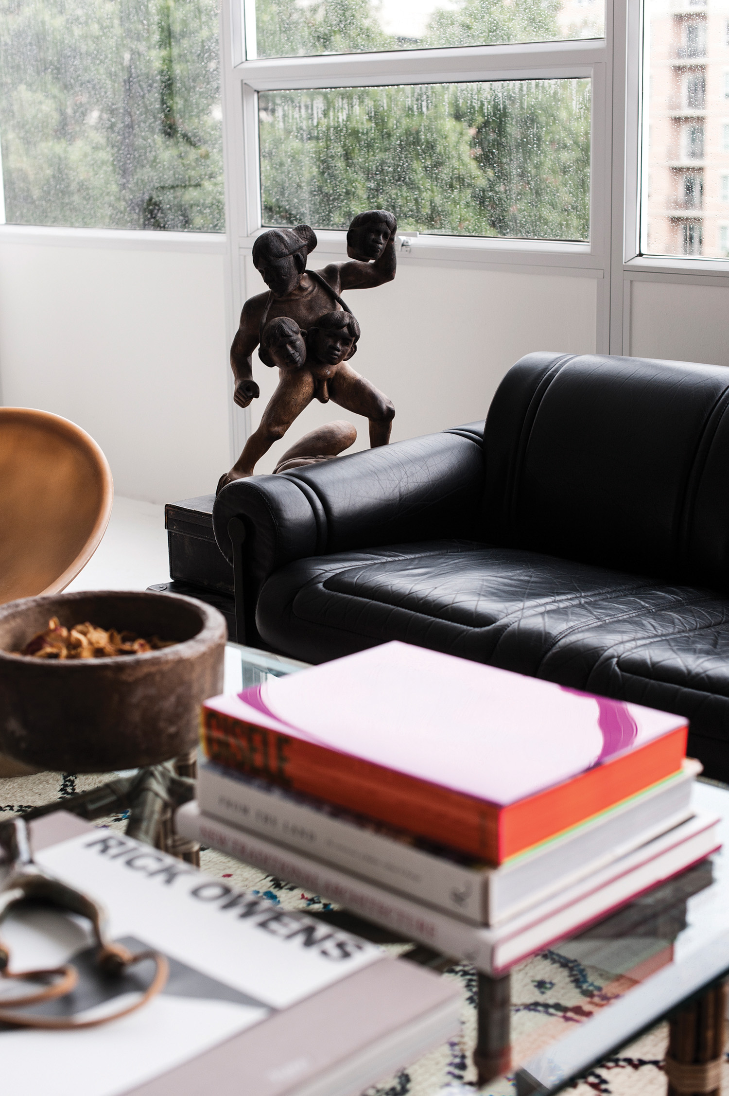
A woodend sculpture of a Polynesian warrior sits atop antique Abercombie & Fitch luggage.

Dining table by James Brummett, the chairs are Viennese modernist, and the benches are 19th C Chinese – all from Tienda X. On the top of the table are Ming dynasty vessels, the gilded console is Peruvian, and painting by San Francisco artist Johanna Jackson from New Image Art in Los Angeles.

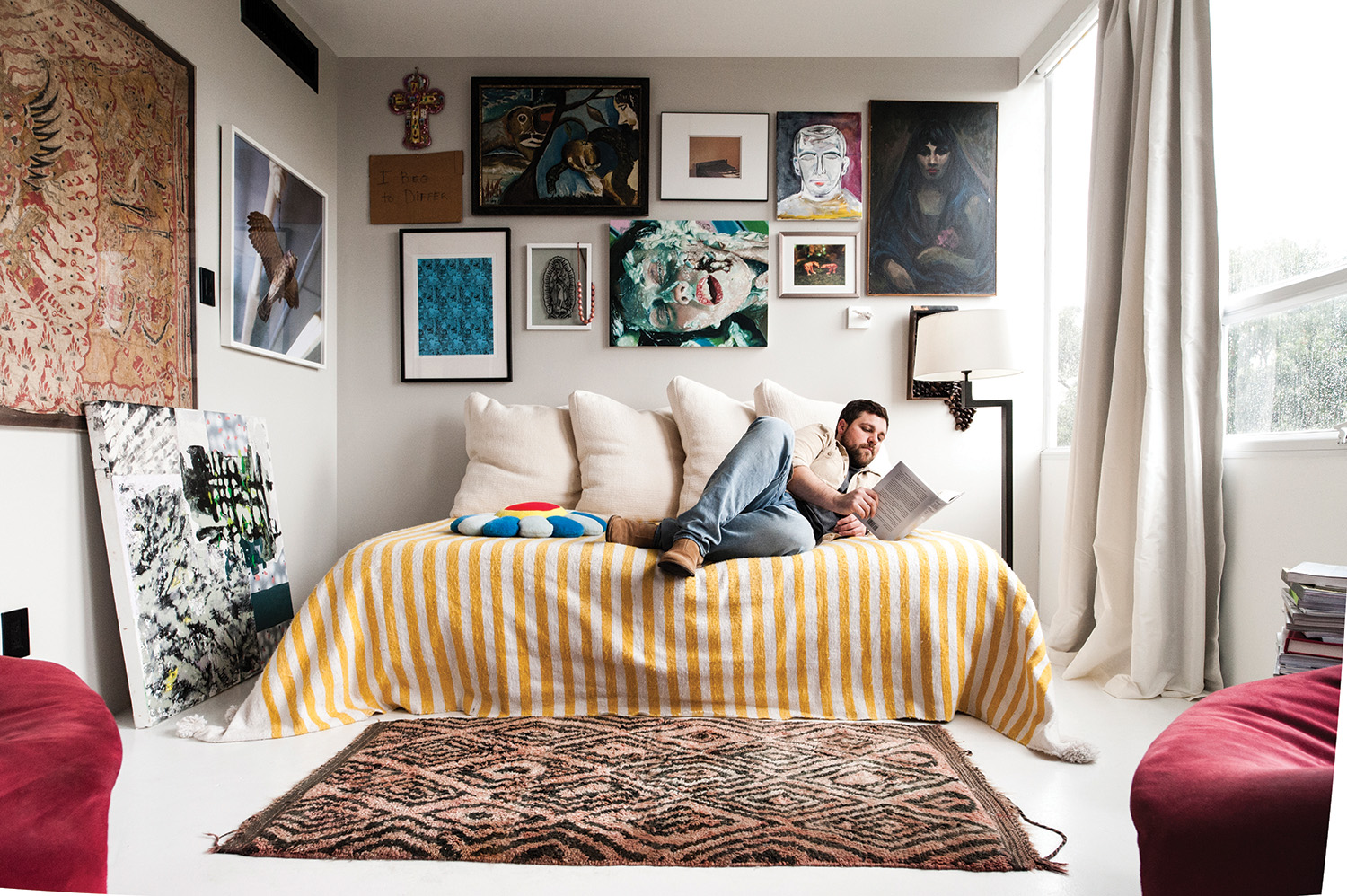
The media room doubles as a guest bedroom, with walls covered salon-style by smaller scale artwork, including pieces by Shane Tolbert, Kelli Vance, Brad Elterman, Jordan Sullivan and a self portrait painting by Jaime. A big, comfy daybed with giant cushions in Larsen wool and a pair of red suede Pierre Paulin chairs are essentially the only furnishings in the room. This room takes on the most intimate feeling of the entire home. I tend to like a moment of compression in the middle of bright, open spaces.

The master bedroom is the sparest room of all, consisting of a bed and a Gio Ponti chair, along with a pair of 1970’s Pace Collection side tables. The bed itself is quite monastic, a platform with no headboard and peach-colored Italian bedding. Centered above is a large antique Indonesian textile housed in a Lucite box. The majority of color in the room comes from a large metal artwork by my mother, photographer Rhonda Hunter. It is a digitally manipulated image of fungi in a forest with intense zaps of red, yellow, and jade.

I must confess, the space is always in a constant state of flux. Around the same time I moved in, architect Michael Landrum and I decided to open a design gallery, called Tienda X. Michael and I frequently collaborate; his aesthetic varies as much as my own, so the gallery is somewhat of a laboratory meets cabinet of curiosities. With a constant rotation of an inventory made up of art, objects, and important design pieces, it allows me to ultimately extend that experimentation into my own home. With that in mind, who knows what it will look like next month?


For more information visit garretthunter.com or email [email protected]
Photography by Jake Toler | Art Direction by Louis Liu | Introduction by Benjamin Price | Words by Garrett Hunter

BROOKSHIRE RESIDENCE – ARISTOCRACY AND ARTISTRY


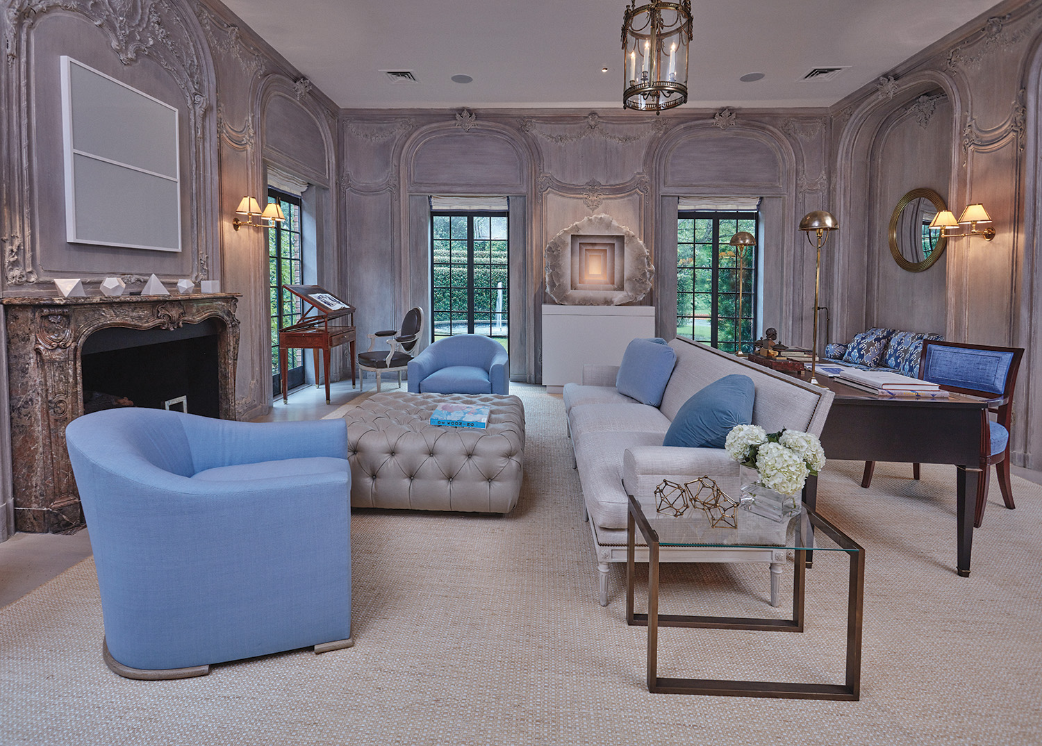
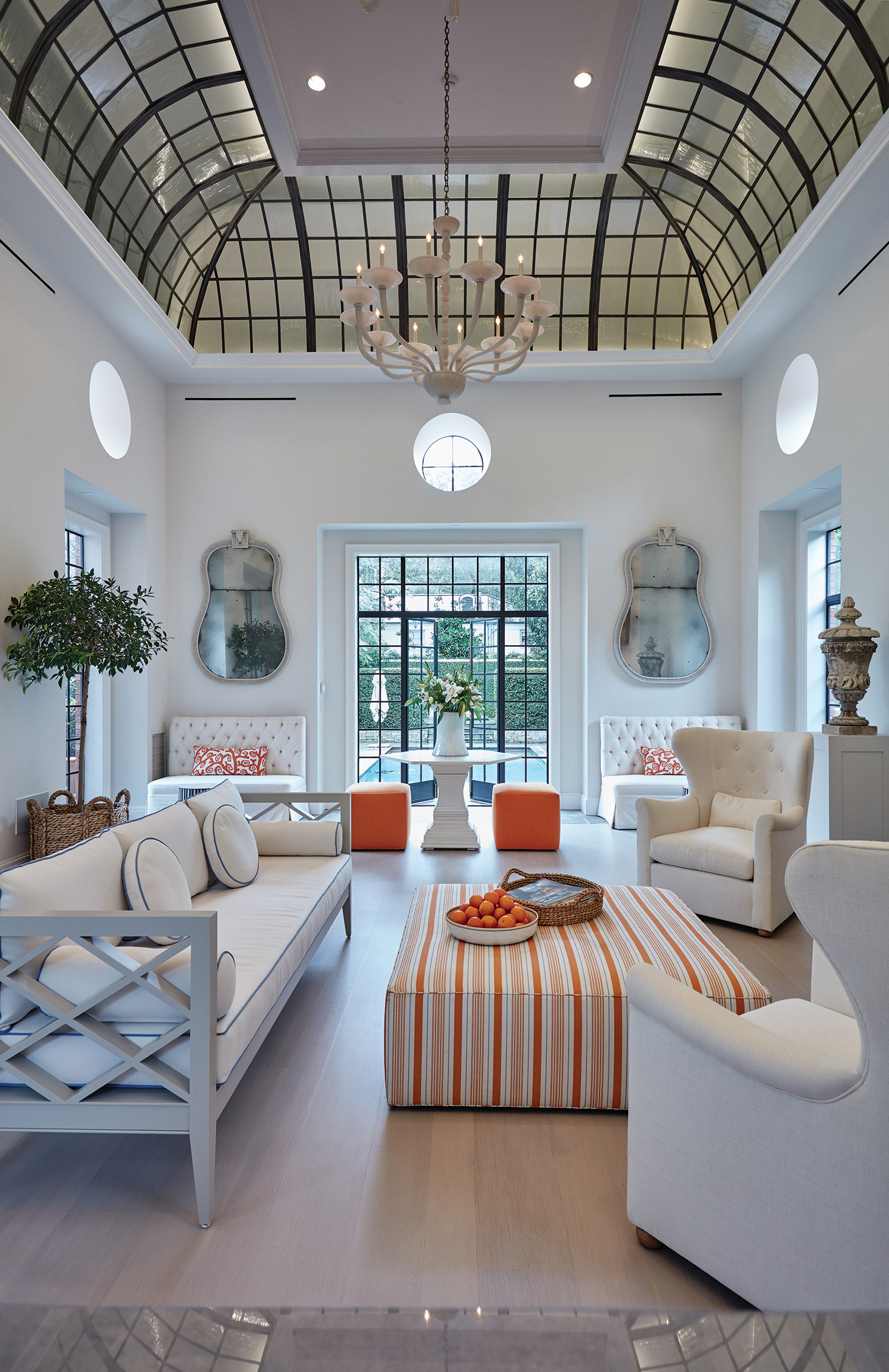
While exploring the private residence of Larry Brookshire, it’s clear to see the inspiration of classical French salons and English gardens, and the innovation of modern art. The Brookshire Home unites old-world architecture with cutting edge contemporary art in a uniquely brilliant way.

Originally designed by John F. Staub in 1933, Larry Brookshire, Bruce Budd, and their large team of designers and workers have taken on the challenge of honoring the beautiful, historic mansion while bringing it into the modern era. The palatial monument to Texas aristocracy sits in a picturesque scene of trees and lush grass, reminiscent of the plantation homes of old.

John F. Staub was a transplant with a master’s degree in architecture from the Massachusetts Institute of Technology (MIT) in 1916. However, by the 1920’s Staub was building some of the most iconic residential and commercial buildings throughout the Houston metropolitan area. Working from the remains of a legend like Staub’s idea, the team had their work cut out for them.

The homeowner, Larry Brookshire, shares with us how the project began and how it has persisted as a crown jewel of architecture and design:

When I started, I did what I knew how to do. I hired the very best people and challenged and encouraged them to do their very best work. We sometimes did things over and over again until the team agreed that this was the best work we could do with a particular issue. I joked with the team that this is the project that would make them famous. We would joke, but at the same time we were serious that our overarching goal was to make this one of the most elegant homes in Houston. That became our standard for which everything was built upon.

We had five stated goals for the project:

Fusion

Modern art is mixed with 19th century antiques throughout the house. We have very chic contemporary art objects mixed with old world craftsmanship to create an interesting blend of the old and the new. The only statue by Georgia O’Keeffe sits in the sprawling lawns, Anish Kapoor’s iconic mirrored sculptures are both outside and inside to produce continuity and a theme of modernity. However, to bring in the old world we also have elements such as the antique-washed walls that were flown in from France, decorated with stunningly detailed molding. The house is all about decade fusion.

Integration

We added numerous doors and windows to open up the spaces to the beautiful landscaping which the house is surrounded by. There are several rooms that now have light from all angles which feels almost like you’re outside. The designer, Bruce Budd, chose soft colors that would accentuate the sea of grass and natural foresting on the property. We created outdoor rooms with the hedge-walls that serve as a seamless link between interior and exterior.

Staub tradition

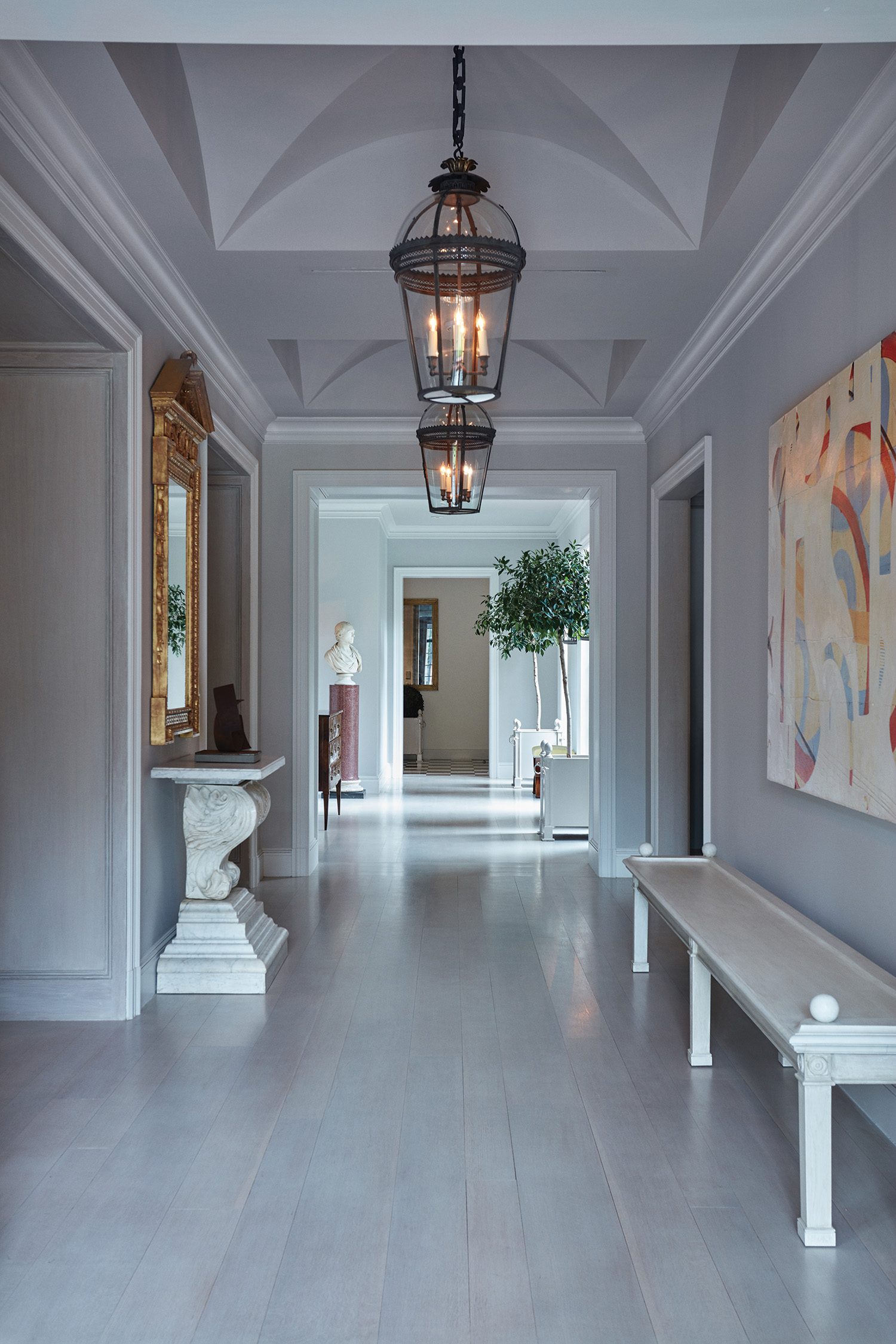
It was very important for us to uphold the traditional, classic architecture of the home. We maintained the original facade by the great architect and replicated the original limestone border in the roofline of the Great Room. We did not tamper with the original plaster walls or the original wiring. We kept the original Staub design with the back of the house facing the street and the front door where you would normally find the back door. Staub had a great sense of pro- portion, so changing the room size was not necessary. Basically, the timeless architecture stayed the same as it’s original design.

Axis

Staub believed in building with strong axis lines. You can stand in the original foyer and can envision a straight line all the way through the house and allée and terminating at the Great room which is at a 90 degree angle. The same strong lines can be seen on the second floor where you can see all the way through the entire length of the house and beyond. The first floor North-South axis terminates in the imposing Georgia O’Keeffe sculpture Abstraction.

Element of Discovery

When you first pass the entrance gate, you see totally natural parkland untouched by man. The trees form a natural canopy and the front lawn is almost always totally shaded. We wanted to keep that zone entirely natural and capitalize on the beauty which grew organically.

As you turn to enter the motor court, the Profiles sculpture peeking out above the Japanese yew is another shocking juxtaposition between modernity and antiquity, nature and man-made craft. Then you see the hedge-walls and topiaries and realize that the back exterior is fully created by man. As you walk down the allée and look through a parting of the hedge-walls, The Spire, by Anish Kapoor, surprises the viewer and seems incongruous with the foliage – a very contemporary statement residing in old world surroundings that catches one by surprise. Just around the corner in its own garden surrounded by terraced hedge walls is the ten feet high Georgia O’Keefe sculpture Abstraction.

Sanctuary

Our ultimate goal with this project was to create a sanctuary, a resting place where no matter how old or feeble I became this would be a place of comfort to me. A place where I could be surrounded with friends and family in a quiet, serene setting yet close to all the amenities of Houston – an oasis amid the frenetic pace of Houston.


Photography by Greg Swales | Art Direction by Louis Liu Introduction by Benjamin Price | Words by Larry Brookshire

MINOTTI

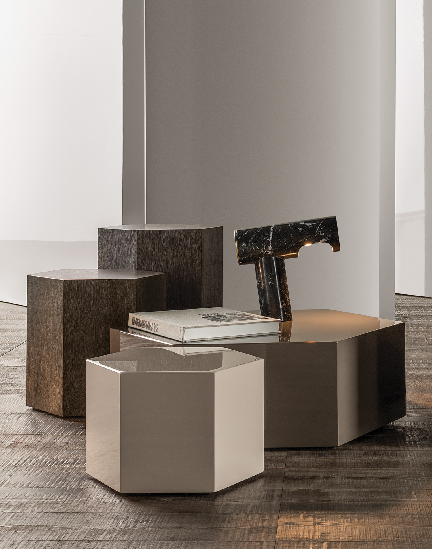
AERON coffee tables are $1,500-3,600 depending on finish and materials, available at select Minotti boutiques

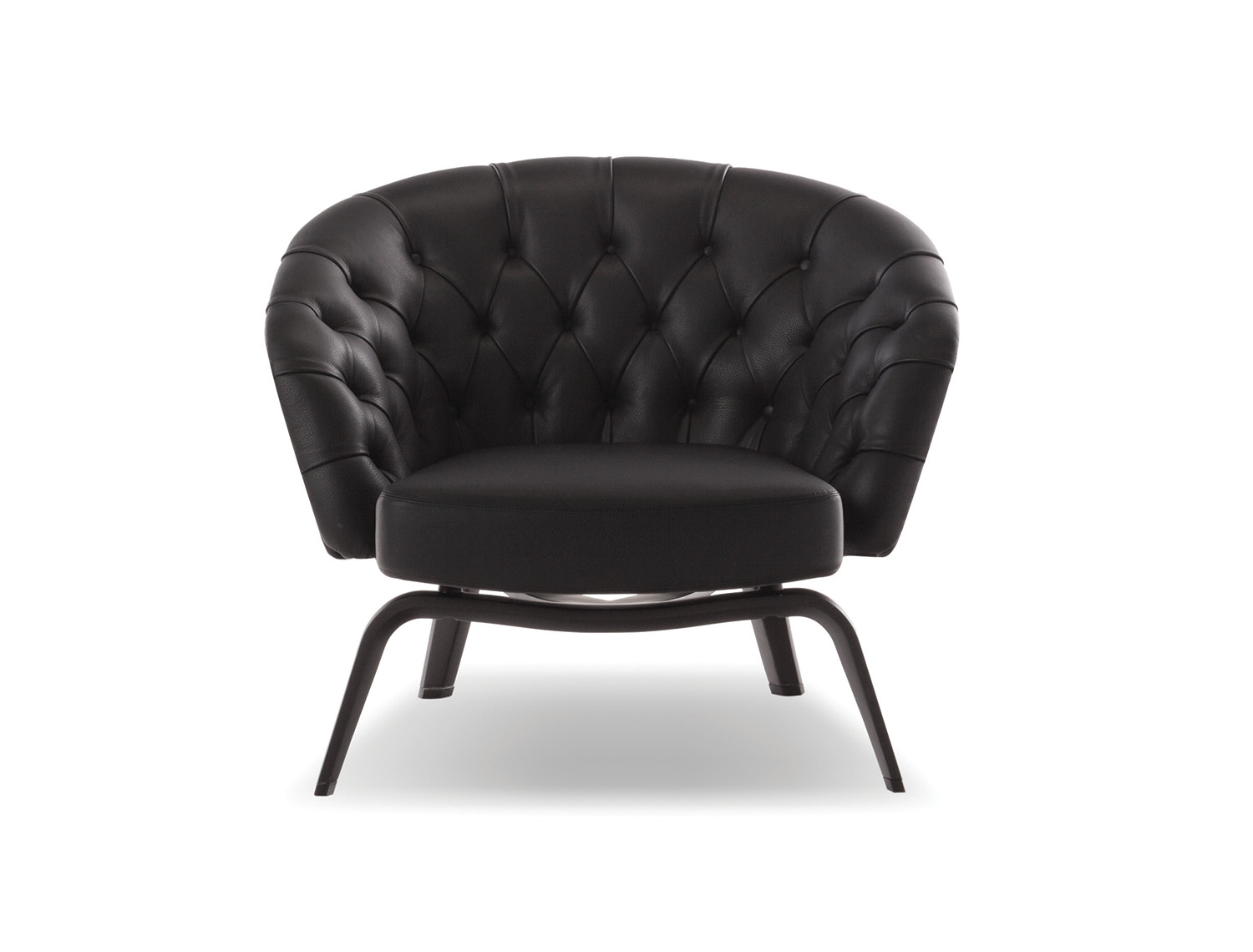
With a focus on technology, tradition, and superior craftsmanship, the Italian artisan furniture company has created beautiful furniture that mixes the precision of high-grade, high-performance machinery with the emotional sensitivity of the manus. Since the 1950’s Minotti has prided itself on timeless design, a focus on function and comfort, and a transcendent element of chic. The brand’s unique method of production and care for raw materials utilized and detailed minutiae can be seen in these amazing pieces that we have selected. The WINSTON armchair, designed by the master Rodolfo Dordoni, is a perfect example of blending top of the line mechanical construction utilizing heat moulded polyurethane structures with the traditional elements of capitonne tufting in exquisite black calf skin. On the left, the hexagonal AERON tables were inspired by the many light-reflecting surfaces of the shape and provide different options in sizes and finishes. Rodolfo Dordoni also designed these fantastic tables which you can arrange in interesting and dynamic displays that provide more texture, light, and dimension to any space.

WINSTON armchair in tufted black leather is $9,000- 10,000 depending on quality of leather, available at select Minotti boutiques

For more information visit: minotti.com